

From Divine Draftsman to Design After the Human Hand
A five-movement history of graphic design: creation, nature, ritual marks, the printed and pixel age, and the age of artificial intelligence.
Graphic design is the practice of giving visual order to meaning. This guide follows that idea backwards and forwards: from stories of a first designer, through nature's patterns and humanity's earliest marks, to Gutenberg, the pixel and the generative model. The profession and its modern name are recent; its visual antecedents reach deep into prehistory. Calling those antecedents “graphic design” is a retrospective lens, not a claim that prehistoric people practised today’s profession.
Visual communication spans tens of thousands of years. It bridges natural order, sacred philosophy, technological revolutions and modern digital ecosystems. The tools have moved from mineral pigments on cave walls to neural networks in the cloud, yet across print, public spaces and global screens, the core purpose stays recognisable: using visual structure to convey meaning, bring order to chaos and communicate ideas.
The structureFive movements
Origin, history & evolutionOne subject, two overlapping histories
Graphic design is the purposeful arrangement of type, images, symbols, colour and space to communicate with an audience. Its history changes depending on whether we mean the long human practice of visual communication or the much later profession that coordinates it. Neither has a single inventor or birthplace — and that is precisely what makes the story worth telling carefully.
The long history: visual communication
Prehistory → writing → manuscripts → print → screens
People made images and marks long before there were graphic-design job titles. Cave images, seals, inscriptions and books are useful historical precedents — not evidence that their makers understood themselves as modern graphic designers. The same caution applies in reverse: traditions that developed independently still belong in this story.
The shorter history: a named profession
Industrial print → commercial art → modern design → digital practice
Specialised design roles emerged alongside mass publishing, advertising and industrial production in the nineteenth and twentieth centuries. The label followed a changing practice; Dwiggins’s 1922 usage is a landmark, not its creation date. Meggs, in Britannica, ties the profession's emergence to the late 19th century, when design was separated from production.
The five movements are a thematic framework, not five consecutive historical periods. Divine creation accounts and nature-as-studio are interpretive lenses; the documented history of human visual communication begins in Movement 3. Dates are approximate, surviving evidence is uneven, and traditions developed both independently and through exchange. Historical overview: Meggs (Britannica) · Terminology: Paul Shaw
At a glanceMaster timeline
↻ Entries are not to scale; early dates are approximate, and the scale jumps from billions of years to days.
The button floats over the timeline and blinks; tap it to glide sideways. It flips direction at the far end of the line.
Movement 1The Divine Draftsman
Creativity as supernatural order
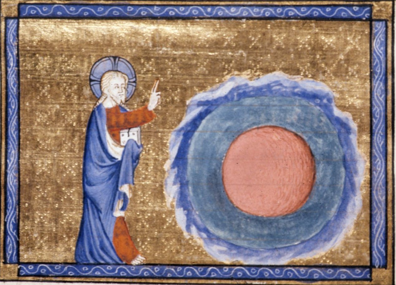
Before “design” was a job, many cultures explained the world as designed: ordered, measured and given form. In this view the first designer is a deity, and making things well is a way of echoing that order. Science offers a different account, in which order arises from physical law. Both frames shaped how people think about pattern, proportion and purpose in visual work — and both continue to influence designers today, whether they invoke a sacred grid or an equation.
Theistic and philosophical frames
- Abrahamic traditions. In Genesis, creation proceeds by separation and arrangement: light from dark, waters from land, then naming and ordering. In Islam, al-Muṣawwir (“the Fashioner”) is among the names of God, and geometric pattern became a major visual language of sacred space.
- Hindu tradition. Vishvakarma is the divine architect and craftsman of the gods.
- Greek philosophy. Plato's Timaeus (c. 360 BCE) pictures a divine craftsman, the Demiurge, shaping the cosmos from a rational pattern.
- Medieval Europe. God appears as geometer and architect with compasses, so measuring and drafting become sacred acts.
- The “watchmaker” argument. William Paley's Natural Theology (1802) argued that complex order implies a designer. Evolution provides a natural explanation of biological adaptation without requiring that inference; the wider theological question is distinct.
Scientific frames
- Cosmology. The Big Bang model dates the universe to about 13.8 billion years ago. Structure then emerged from physical law, from atoms to galaxies.
- Emergent order. Evolution by natural selection explains apparent “design” in living things without a designer, which is why biologists often say “design without a designer”.
- Mathematics as pattern. Symmetry, ratio and fractals recur across physics and biology, and designers borrow them for grids and proportion systems.
Creation as a design workflow: a poetic lens
For many communities, making has been understood as a gift, a sacred responsibility or a reflection of cosmic order. A modern designer can read some creation narratives as acts of separation, naming and arrangement. Not every creation narrative follows the same pattern, and this comparison should not flatten distinct beliefs into a universal theory.
Flowchart · Interpretive sequence
- VoidChaos without form
- Energy / wordA first command or breath
- ElementsLight, water, land, sky
- OrderSeparation and arrangement
- LifeCreatures enter the scene
- MeaningNaming, rest, reflection
Read left to right: an interpretive diagram from this guide, not a scientific timeline or a sequence shared by all traditions.
This six-step lens belongs to this guide, not to the traditions themselves. Traditions differ; scientific cosmology is a different kind of account.
The Biblical Record: The Blank Sheet
Genesis 1 opens with an earth described as formless and void, darkness and the deep. Light is separated from darkness; waters, land, vegetation, luminaries and living creatures enter the narrative, culminating in humanity made in the image of God. Naming occurs within this unfolding, not only at its end.
“The blank sheet” is a metaphor: the passage already describes waters and darkness. Read as a design reflection, its separations suggest contrast, sequence and hierarchy. This does not make Genesis a technical account of graphic design or cosmology. Genesis 1
The Big Bang: The Cosmic Brief
The scientific model describes an early hot, dense universe expanding and cooling. Light-element nuclei formed in the first minutes; neutral atoms and the release of the light now observed as the cosmic microwave background followed about 380,000 years later. Gravity subsequently assembled stars and galaxies. [NASA]
We do not have an established description of “before” the Big Bang. A mathematical singularity is not proof of a physically observed, infinitely dense starting object. “Let there be light” is a literary parallel here, not a scientific equivalence; photon decoupling was not the instant the universe began.
Other voices, distinct accounts
- Vedic thought. The Nasadiya Sukta (Rig Veda 10.129) questions existence and non-existence, evokes a self-sustaining breath, heat and desire, and ends in uncertainty about who can know creation’s origin. It is not a simple recipe for creation from asat.†
- Ancient Egypt. In the Memphite Theology, Ptah creates through heart and tongue — thought and speech. “Conceptualisation before execution” is a useful modern analogy, not a literal design manual.†
- Greek cosmogony. In Hesiod’s Theogony, Chaos comes first, followed by Gaia and other primordial powers including Eros. These figures are not simply interchangeable labels for disorder, form and relationship; nor are Gaia and Eros both described as children of Chaos.†
- Aboriginal Australian traditions. Songlines connect Ancestral journeys with Country, law, ecological knowledge, story and performance. The National Museum of Australia’s Seven Sisters project was developed with custodians across distinct Western and Central Desert communities. This is more specific — and more respectful — than treating all traditions as one story of “singing into emptiness.” [NMA]
Sacred geometry and sacred pages
Belief in cosmic order shaped how people laid out important surfaces.
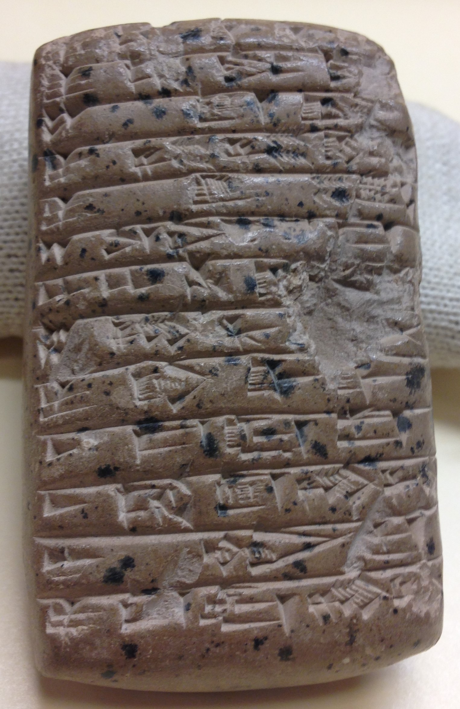
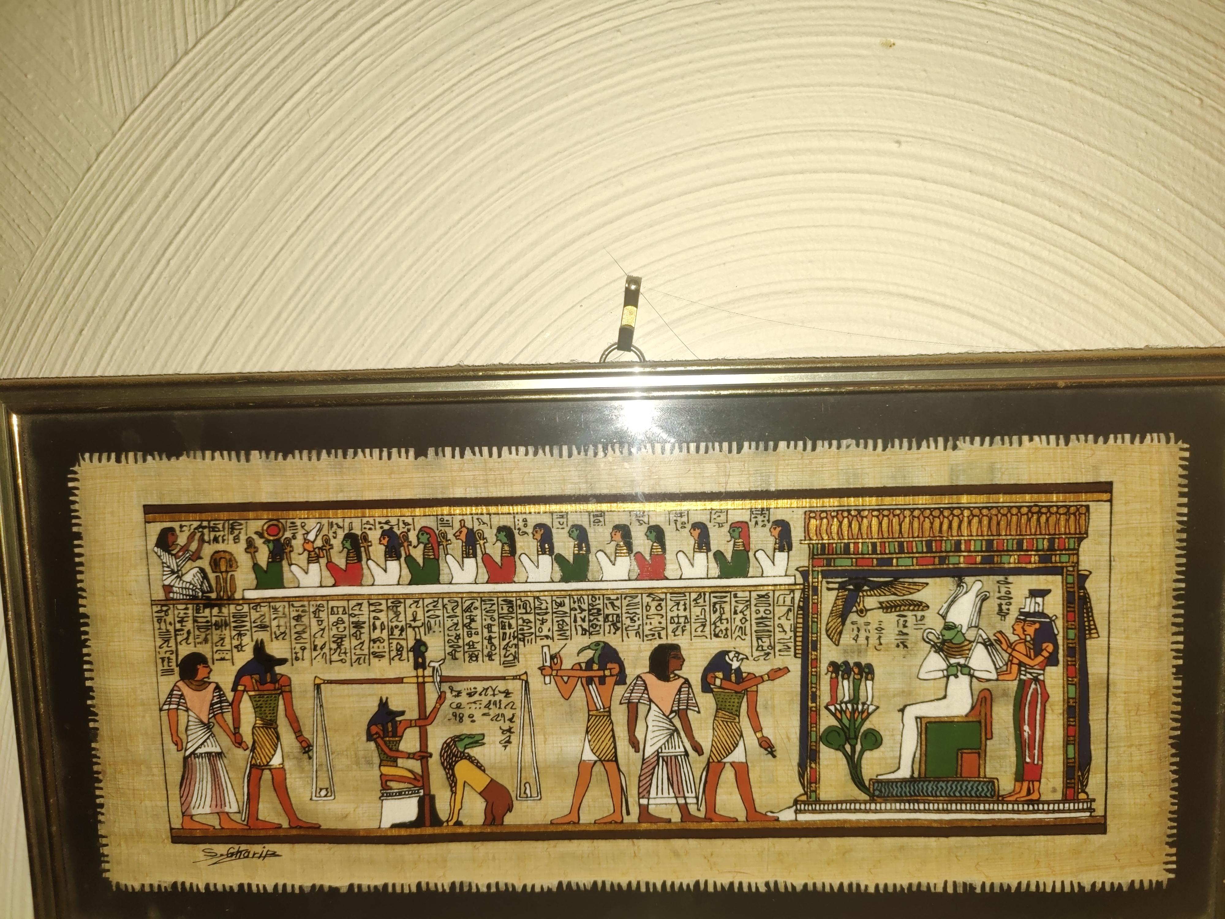
- Egypt and Mesopotamia. Egyptian reliefs and papyri used registers (horizontal bands) to organise figures and text by rank and sequence, and artists worked from a proportion grid for the human figure.† Early Sumerian tablets (see the tablet pictured in Movement 3) divide the surface into ruled compartments.
- Illuminated manuscripts (c. 700–1400). Scribes in Ireland and Britain (Lindisfarne Gospels, c. 700†; Book of Kells, c. 800), in the Islamic world (Kufic and later cursive scripts such as Naskh in Qur'ans†) and in Gothic Europe planned pages with ruled margins, geometric borders, gold leaf and decorated initials. Proportion and ornament were treated as acts of devotion.
† Background knowledge not independently checked in this session; see Fact-check notes.
Whichever frame you prefer, the idea of cosmic order made visible runs through design: the compass and ruler, the golden section, sacred geometry, the grid. Even modernism's claim that form should follow a rational order echoes an older belief that good form reveals deeper order. This guide takes no side on the metaphysics. It only records how each frame influenced what people made.
Movement 2Nature, the First Studio
From microscopic features to flora, fauna, landscapes and outer space
Whatever its origin, nature is the largest pattern library available to a designer. Its forms span scales, from diatoms under a lens to spiral galaxies. Designers study, copy and abstract those forms into visual systems.
“Nature doesn’t try to be beautiful. It simply obeys an underlying order.”
A scarlet macaw against foliage, a bright frog against dark leaf litter, or the amber light of a savannah can teach a designer to notice contrast. But natural colour is produced by pigments, structures, light, perception and biological history — not by a master colourist placing every hue. Nature includes variation, randomness and trade-offs alongside regularity.
Scales of inspiration
| Scale | Natural source | Design echo |
|---|---|---|
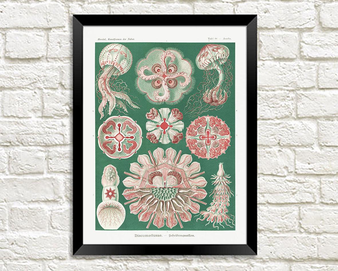
| Microscopic | Diatoms, radiolarians, pollen, cell structure | Ernst Haeckel's Art Forms in Nature (1899–1904) turned microscopic life into ornament and fed Art Nouveau and early modern design |
| Flora | Leaves, vines, flowers, phyllotaxis (spiral growth) | William Morris's botanical wallpapers and textiles; Art Nouveau's sinuous line; Adinkra and Adire plant-dyed and stamped cloth |
| Fauna | Shells, wings, honeycomb, animal markings | Hexagonal grids, camouflage patterns, mascots and logos |
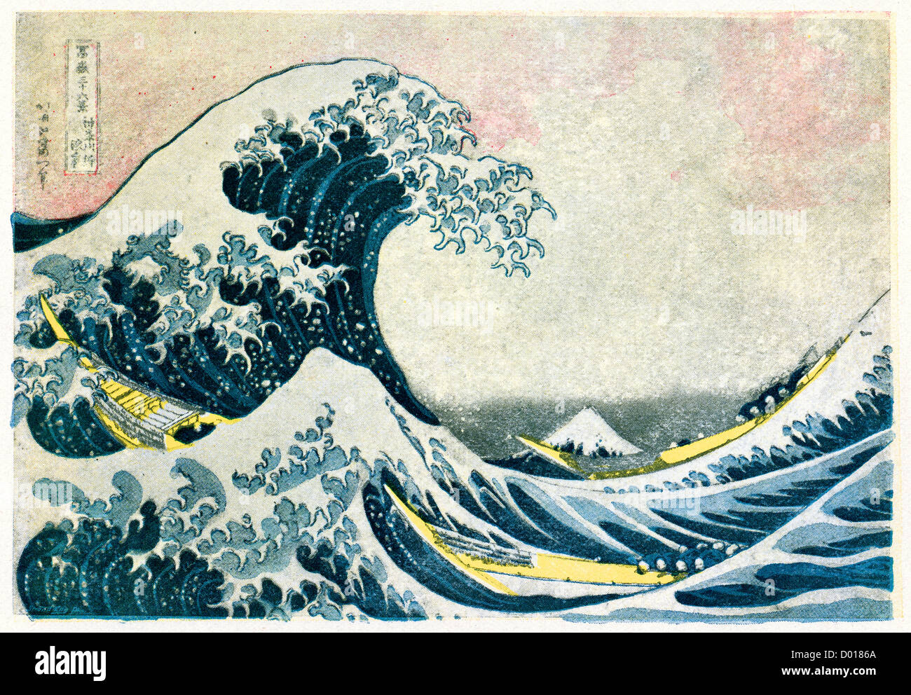
| Landscape | Waves, mountains, weather | Hokusai's Great Wave and ukiyo-e's flat colour shaped the Western poster; travel posters and cartography |
| Cosmic | Constellations, spirals, orbits | Star charts and astronomical diagrams; sci-fi and space-age graphics |
Freeze test: the header row and the first column stay pinned while the rest scrolls — same behaviour as the theme's tables.
Nature across scales: the Quest DigiTech image studies
The article’s natural-world examples become a practical viewing exercise here: observe a form → describe a relationship → translate it into a design decision. This is a designer’s reading of imagery, not evidence that nature has artistic intentions. See the source and rights note for all imported images. The original 28-image set was published by Quest DigiTech (“Origin of Graphics Design”); the studies below reuse openly licensed photographs where the originals could not be verified.
Microscopic features: information, boundaries and branching
The helix suggests sequence; a plant section suggests nested regions; branching suggests connections between levels. Translate these into an information key, a modular diagram or a navigation tree. Do not confuse a vivid scientific illustration with a measured observation: scale, specimen, imaging technique and colour treatment matter.
Animals: repetition, variation and visual signals
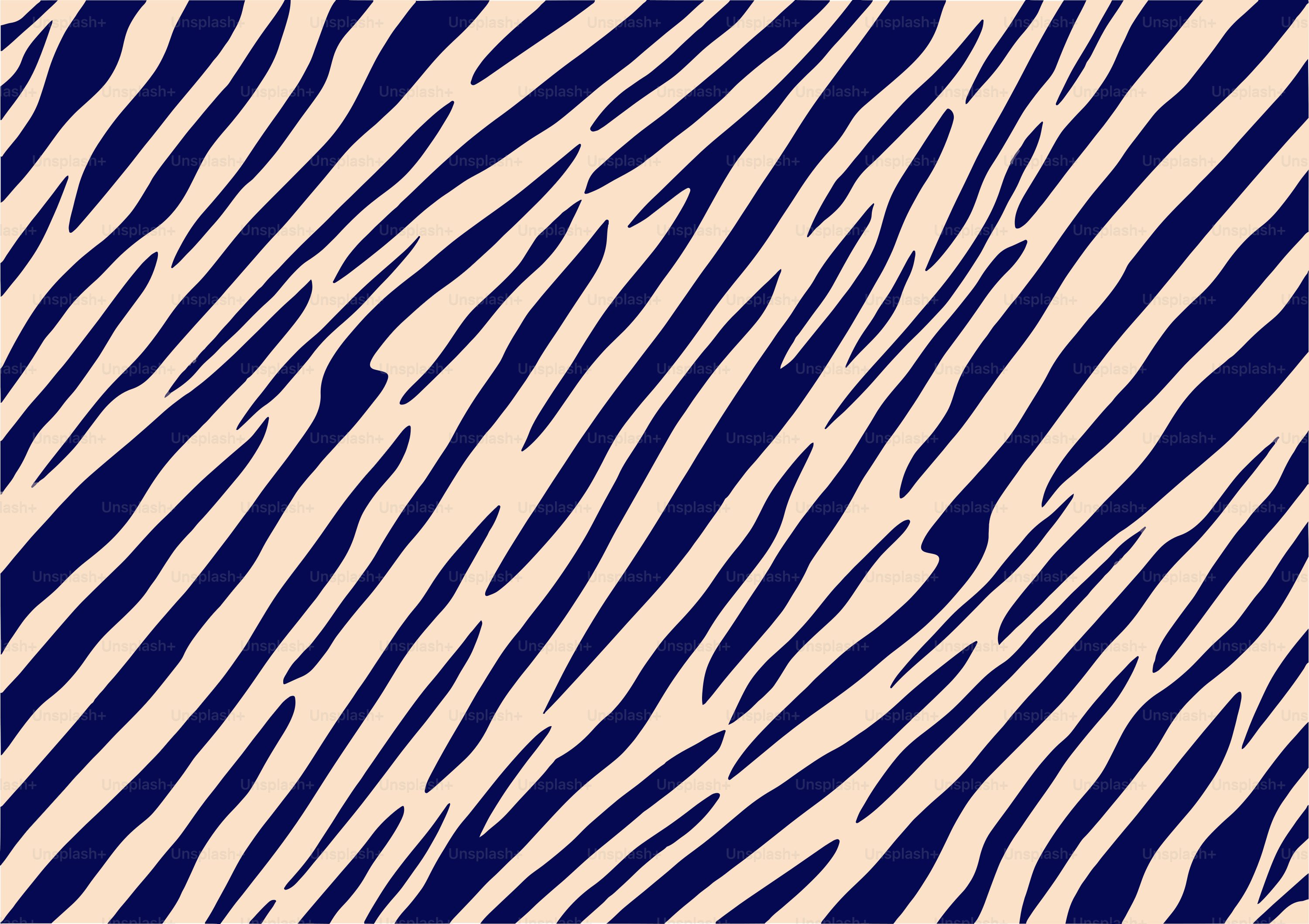
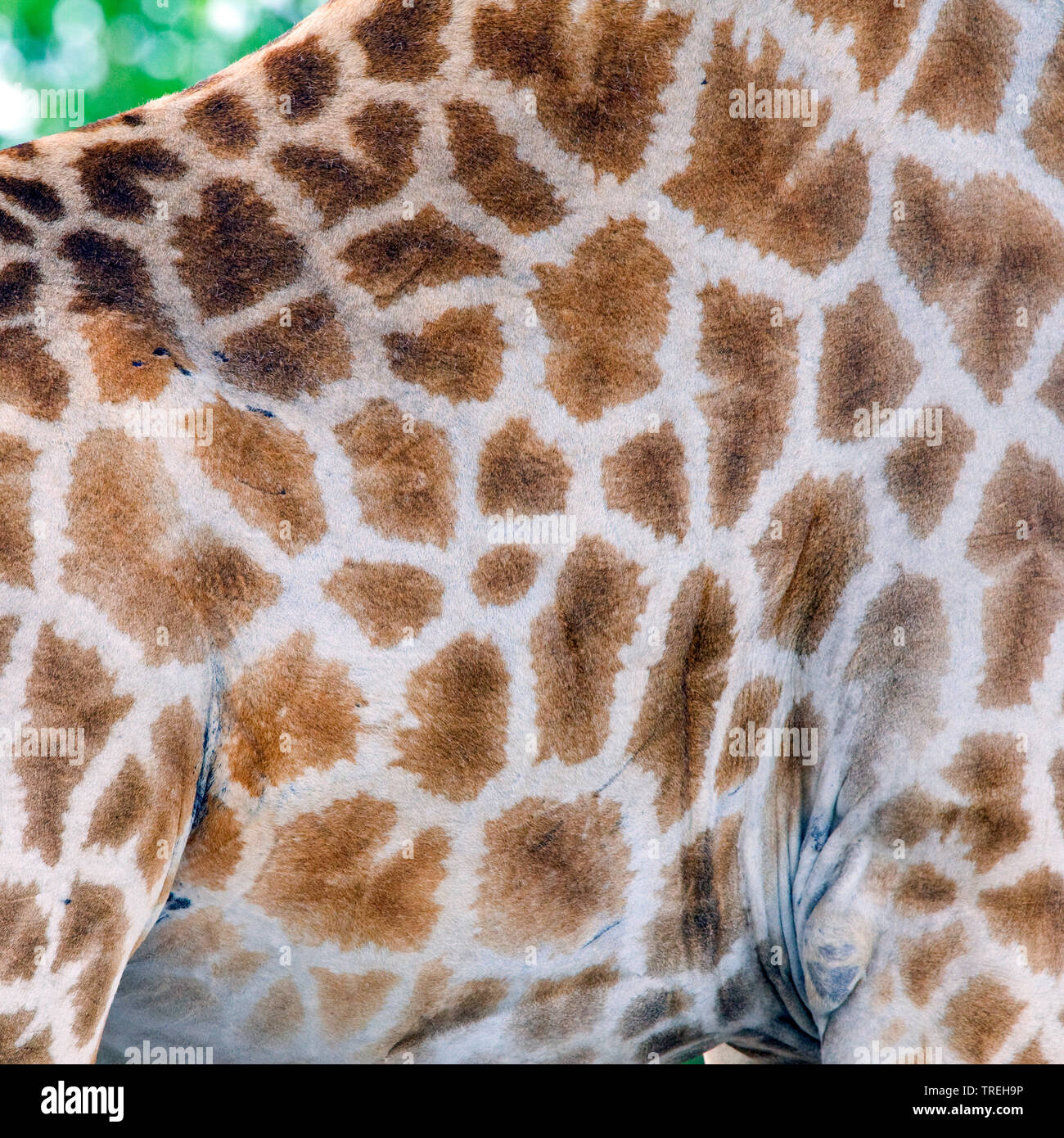
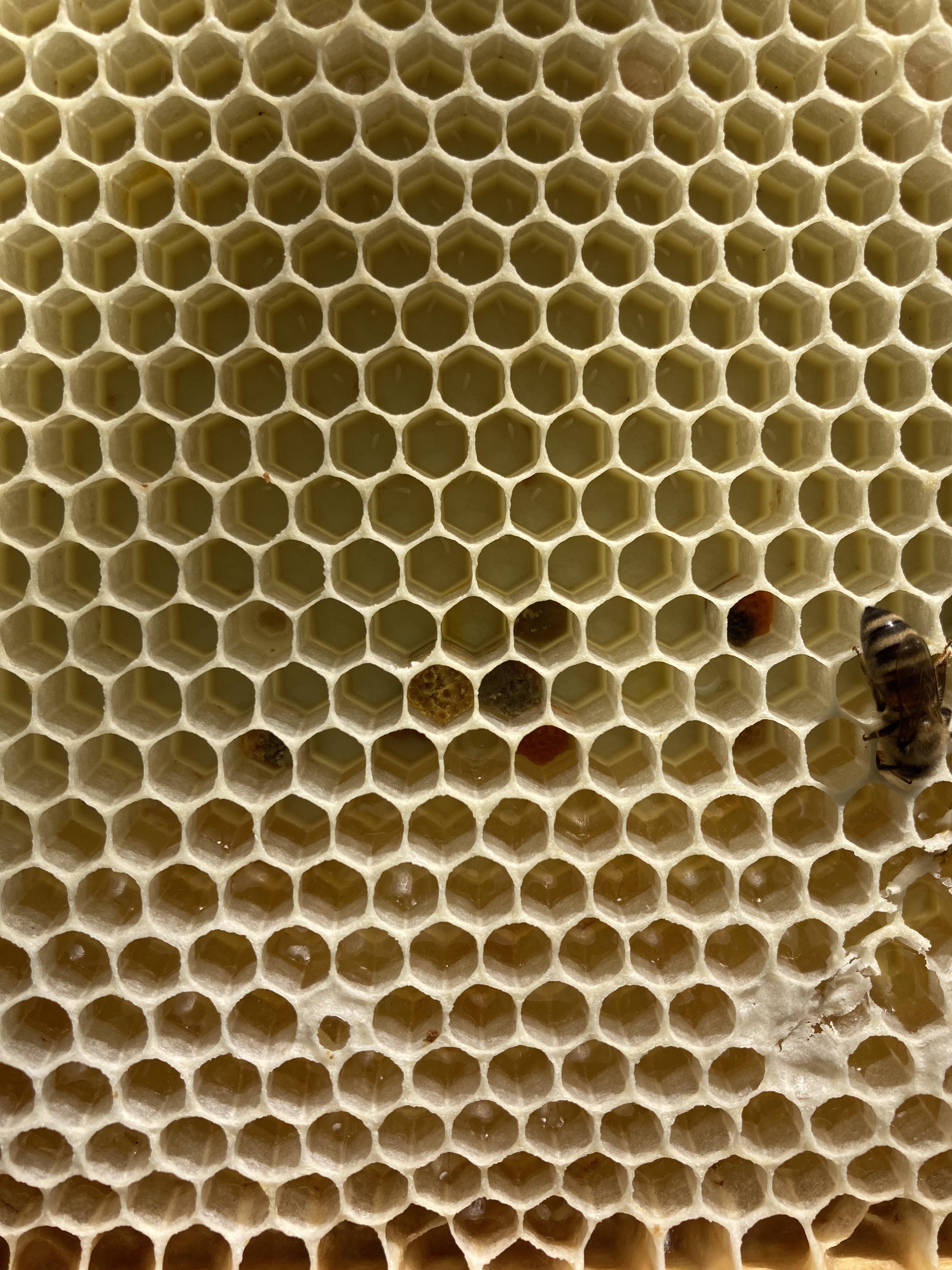
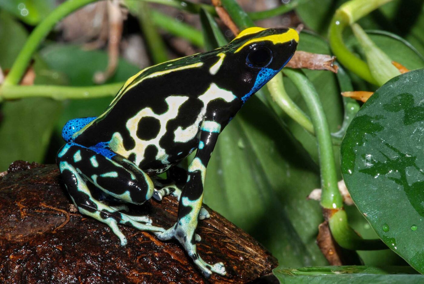
Compare the zebra’s bands with the giraffe’s irregular patches. Both can inspire a visual system that remains recognisable without repeating every detail identically. Honeycomb suggests tessellation; the butterfly and frog invite a study of edge contrast and bilateral organisation. Biological functions must be established independently of how appealing the pattern looks.
Environments: composition depends on the viewpoint
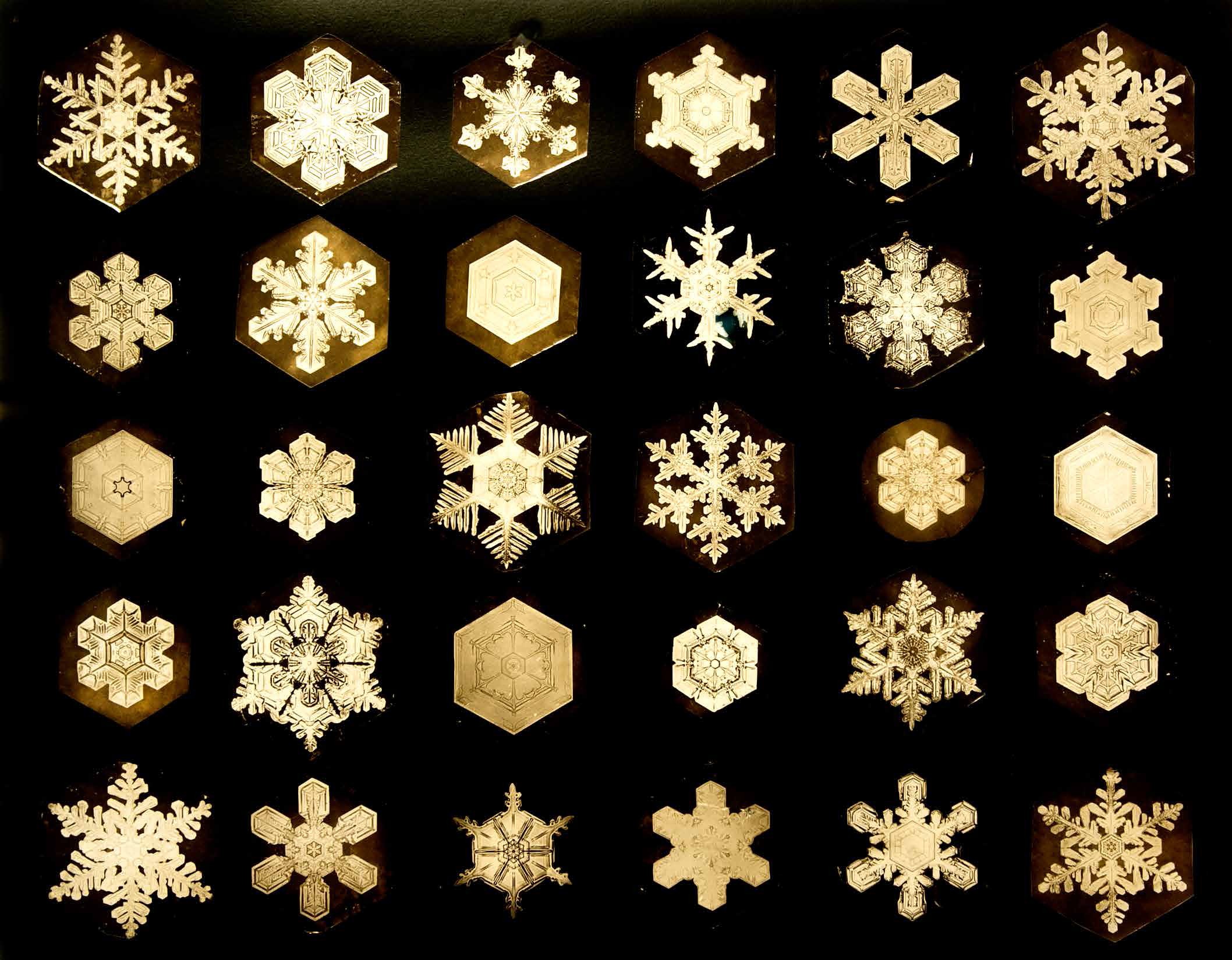
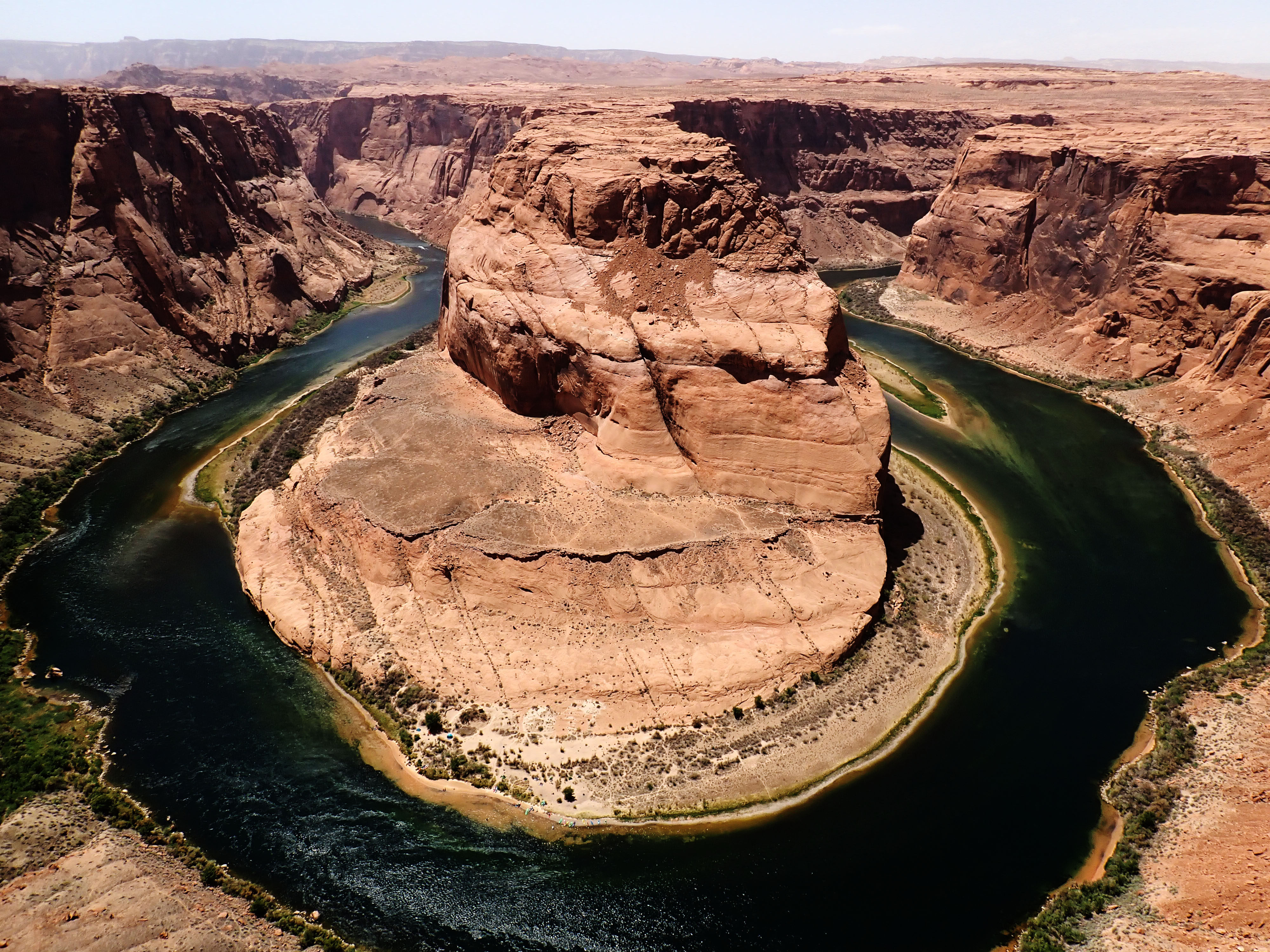
The source moves from snow crystals to valleys, canyons, underwater scenes, coasts and oases. In a photograph or illustration, cropping and perspective can make a river a leading line or a pool an isolated focal point. Light and colour treatment can separate planes. These are properties of the chosen image as well as of the landscape.
A seasonal palette can be a useful design exercise, but the familiar spring–summer–autumn–winter sequence is not universal. In a Lagos context, wet and dry seasons, local vegetation, changing light and street materials can provide a more relevant observational starting point.
Plants: growth, layering and a restricted palette
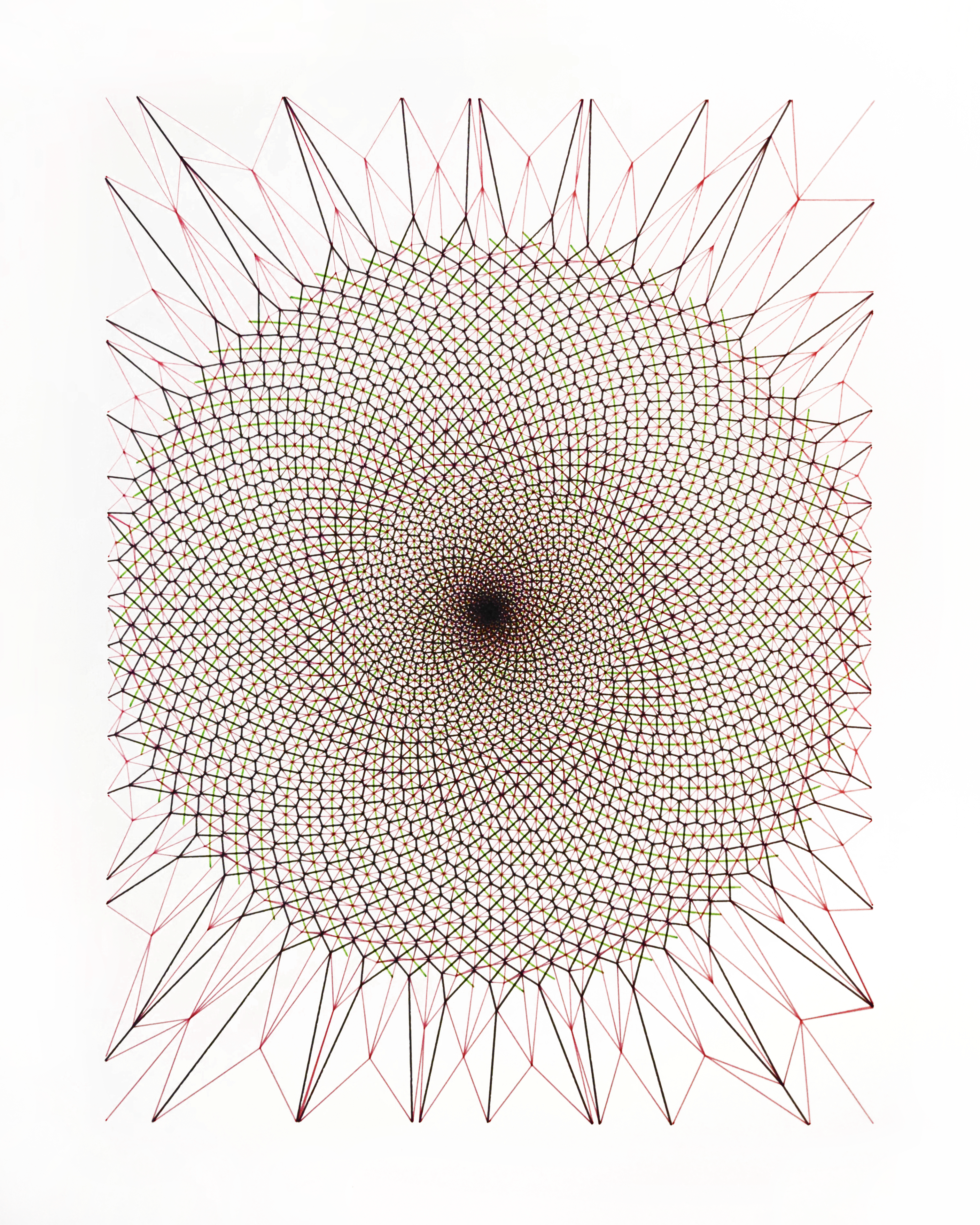
Study any shell-overlay diagram critically before using it as a proportional rule. Then compare foliage compositions: which leaves merge into the background, which colours attract attention, and where does empty space separate the layers? Designers can borrow these relationships without claiming that plants invented colour theory or that all growth follows one mathematical pattern.
Fungi and flowers: from form study to wayfinding analogy
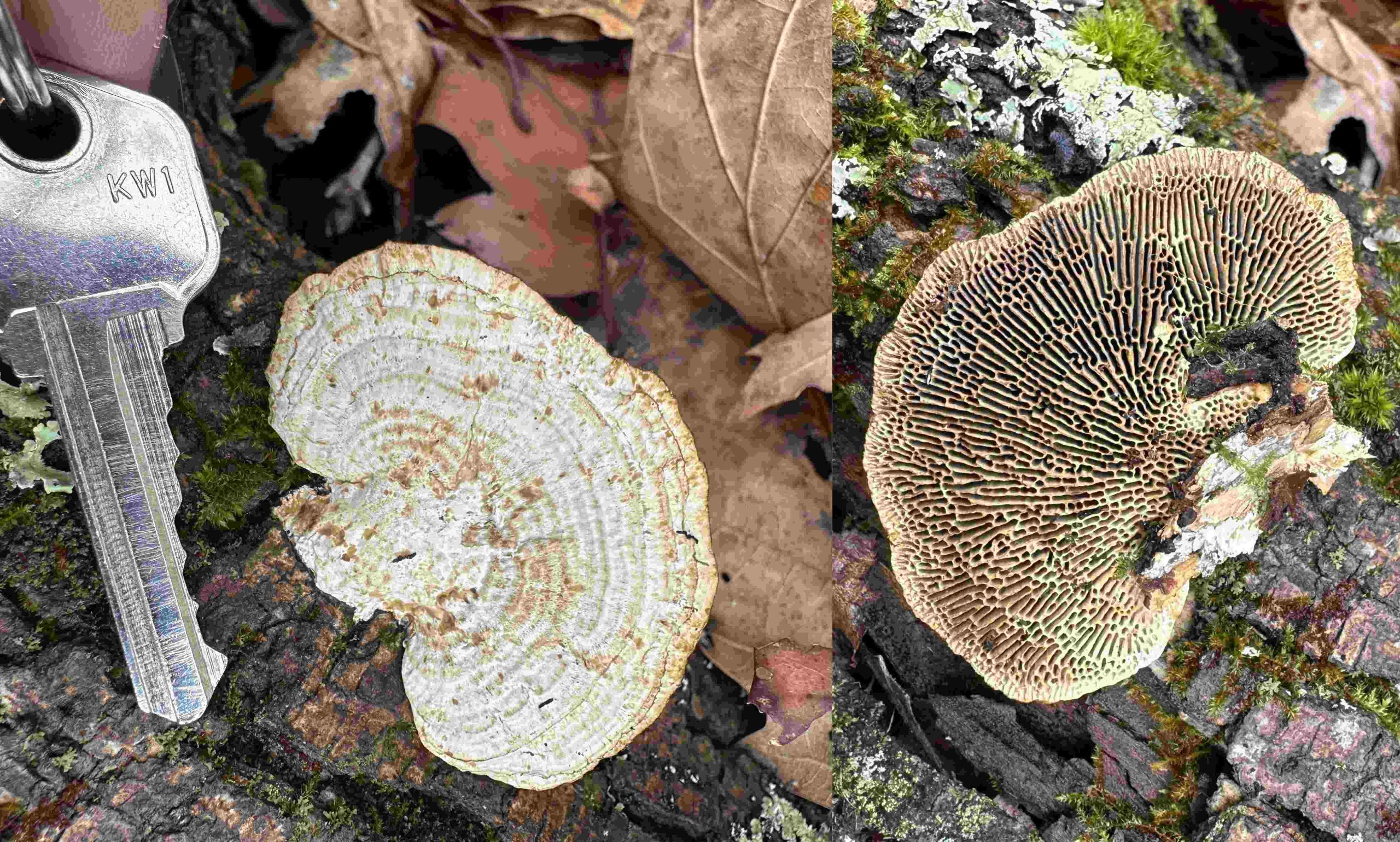
Fungi belong to a separate biological kingdom, not the plant kingdom. The source’s cup-like clusters, spotted caps and fantastical arrangements expand the existing bracket-fungus example into studies of repeated curves, surface texture and scale. Keep visual recognition separate from species identification and safety.
The flower image adds directional markings and colour transitions. Calling a flower a “landing page” is a communication metaphor: it invites a question about guidance and attraction, not a claim that human interface design and pollination are the same process. Pollinator perception also differs from human vision.
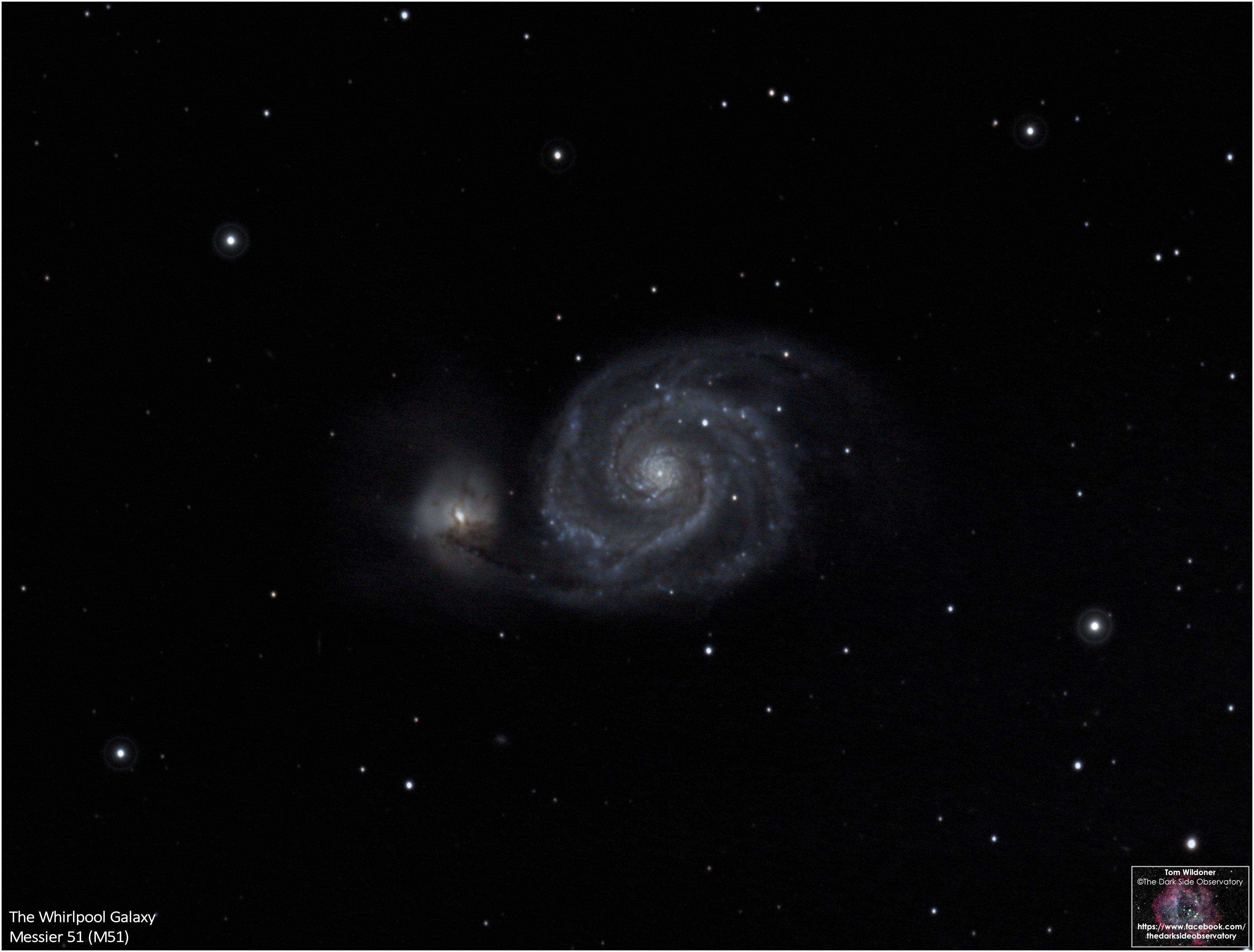
Outer space: geometry without a shared universal formula
The article ends its nature sequence with cosmic imagery. Use such an image to study the distribution of bright points, curved movement and scale contrast. Do not read it as astronomical evidence: an external, imagined view of a galaxy cannot document our view of the Milky Way, and a resemblance between spirals does not establish an identical physical mechanism.
- Choose one source image and identify its strongest contrast.
- Extract five colours and three recurring shapes.
- Build a small poster or interface card from those relationships — not by tracing the whole image.
- Test hierarchy, legibility and meaning with a real audience.
- Record the source and verify permissions before publishing any reused imagery.
The natural design toolkit
| Concept / scale | Natural manifestation | Design reading — and its limit |
|---|---|---|
| Information / microscopic | The DNA double helix; four common DNA bases, A, C, G and T | A powerful analogy for coding and modular information, not literal “typography at the atomic level.” Genes alone do not specify every feature of an organism. |
| Cellular architecture | Packed plant cells and vascular bundles | Nested systems, boundaries and repetition. Fluorescence images may use stains or false colour; the palette is not necessarily visible in the living leaf. |
| Branching / finite-scale complexity | Tree branches, river networks and some neuronal dendrites | Fractal-like models can describe branching over limited scales; no biological structure repeats identically at every scale. |
| Variation within order | Giraffe patches and zebra stripes | Irregular partitions and contrasting bands inspire repeat systems. Pattern function is a separate biological question; fly deterrence has strong experimental support for zebra stripes, while thermal explanations remain debated. |
| Tessellation | Honeycomb | An ideal regular hexagon has 120° interior angles and tiles a plane without gaps. The equal-area perimeter theorem is precise; “zero material waste” in real combs is not. |
| Symmetry / colour as signal | Butterfly wings and conspicuously coloured poison frogs | Bilateral organisation, iridescence and warning signals. Not every butterfly is iridescent and not every bright animal is toxic. |
| Radial structure | Snow crystals | Six-fold tendencies arise from ice crystal structure; temperature and humidity affect growth. Real crystals may be uneven, broken or unlike the familiar six-armed star. |
| Hierarchy / landscape | Alpine peaks, river channels, layered canyons and tropical foliage | A chosen viewpoint can turn a peak into an anchor, a river into a leading line and open sky into negative space. The landscape does not obey the photographer’s rule of thirds. |
| Growth / phyllotaxis | Sunflower florets and pinecone scales | Many arrangements approximate the golden angle (137.5°) and show Fibonacci spiral counts. Fern croziers and nautilus shells are not evidence that this rule governs every spiral. |
| Rhythm / fungi | Zoned bracket fungi and layered fruiting bodies | Curved bands, edge detail and restrained palettes. A band is not automatically one year or one humidity cycle. |
| Cosmic structure | Spiral galaxies, planetary orbits and star fields | Inspiration for maps and diagrams; galaxy arms are not established golden spirals, and orbital models are typically ellipses rather than spirals. |
- Zebra stripes as camouflage. Tested and not supported. UC Davis and Calgary researchers found stripes do not help against lions or hyenas, while field experiments show biting flies land far less often on striped coats (Caro and colleagues).
- Golden-ratio spirals in galaxies and planetary orbits. Galaxy arms look like logarithmic spirals, but nothing ties them to the golden ratio, and orbits are ellipses.† The nautilus shell is also a logarithmic spiral without a golden-ratio growth rate.†
- “Nature gave us colour theory.” Structural colour (as in butterfly wings) is physics of light and nanostructure. It is a lovely design parallel but not the origin of colour theory.
- The golden ratio in design history. Designers have used it as a proportion tool, but claims that it underlies most great work, or that it was used “throughout history” as a rule, are generally overstated.
Biomimicry: nature as engineer
In 1941, Swiss engineer George de Mestral noticed burrs clinging to his dog's fur, studied them under a microscope and saw tiny hooks. That observation led to Velcro. Designers now use “biomimicry” for products, buildings and even typefaces and patterns. The Carnegie Museum keeps the story in its biomimicry teaching collection. [Carnegie MNH]
A note on myths
Real spirals and Fibonacci-like patterns do occur in nature, especially in plant growth. The sweeping claims do not hold up well (see the box above). Use proportion systems as tools, not as proof of cosmic perfection.
Movement 3The First Marks in the Prehistoric
Design as ritual: caves, pictographs and the first records
Long before alphabets, people made deliberate marks on walls and objects. Researchers often link these to ritual, belief, storytelling and group identity, though what they meant to their makers is unknown. “Ritual” is an interpretation, and one of several.
“Before it was an industry, before it was a degree, graphic design was an act of reverence.”
The source’s early-mark examples
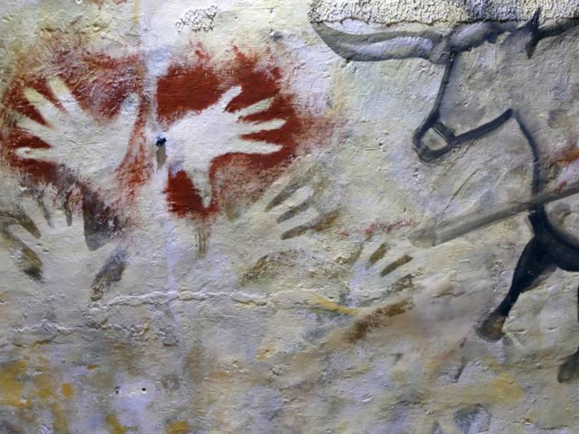
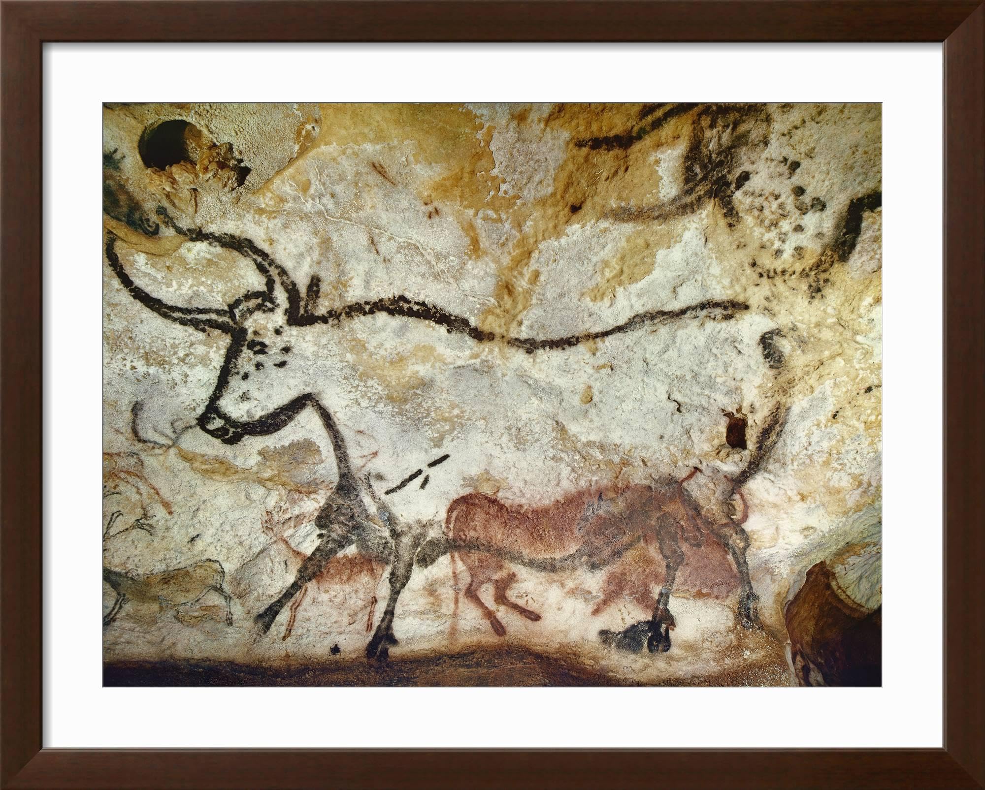
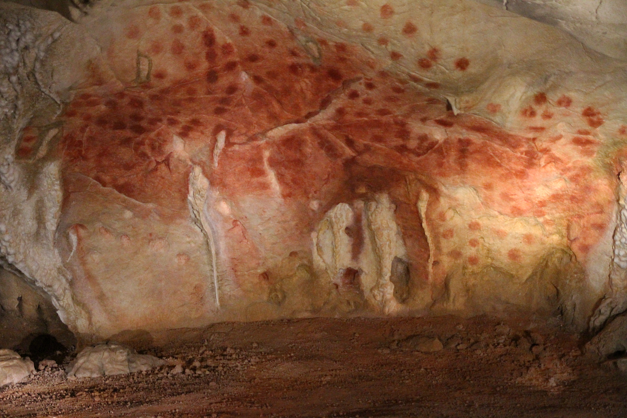
Three images accompany the article’s discussion of cave marks and Egyptian writing. They illustrate different communication contexts, not a documented direct lineage from one to the other. The source’s Lascaux attribution is unverified for the pictured hand stencil; the two small Egyptian images retain their stock-photo watermarks. The originals belong to the Quest DigiTech image set; the replacements below show comparable material from museum and archive sources.
What the evidence shows
- Hand stencils. A faded stencil at Liang Metanduno, Muna Island (Sulawesi), was dated to at least 67,800 years ago (reported January 2026). It is possibly the world's oldest known rock art. The hands were made by spraying ochre and water around a hand pressed to the wall, and the fingers appear to have been deliberately altered to look narrow and pointed. Ochre wall markings in Spain have been dated to at least 64,000 years ago and attributed to Neanderthals. [Guardian]
- Storytelling. At Leang Karampuang, Sulawesi, a scene of three human-like figures and a wild pig is dated to at least 51,200 years ago, the oldest known narrative scene (Oktaviana et al., Nature, 2024). Another Sulawesi panel shows part-human, part-animal figures hunting. These “therianthropes” suggest imagined or supernatural beings. [Archaeology Mag]
- Europe. Chauvet (France) holds some of Europe's oldest known paintings. A 2020 radiocarbon recalibration puts the oldest at about 36,500 years ago, and most of the black drawings belong to the earlier of two periods of use (about 37,000 to 33,500 years ago). Lascaux, roughly 17,000 to 22,000 years old, has nearly 6,000 figures of animals, humans and abstract signs, painted with mineral pigments such as iron oxides. Altamira (Spain) is another celebrated site.† The cited Sulawesi finds are older than these European examples; surviving evidence does not identify one birthplace of cave art.
- Pictographic representation. Simplified signs standing for objects, actions or ideas (dots, lines, hand stencils, stylised animals) appear long before writing. Cuneiform later shows how pictographs became abstract script.
- From marks to writing. Cuneiform (c. 3200 BCE) grew out of clay counting tokens, and is strongly associated with early record-keeping in Mesopotamia; this is not a single origin story for all writing. Early signs pictured grain, fish and animals. Writing was used mainly for accounting until the third millennium BCE. [Schmandt-Besserat]
- Sign systems outside Europe. Nsibidi in south-eastern Nigeria is an ideographic system used on walls, calabashes, cloth and skin, and associated with Ekpe society. Its age is uncertain, with some estimates of at least 400 CE. Egyptian hieroglyphs, Chinese characters and Mesoamerican scripts are other independent traditions. [Encyclopaedia Africana: Nsibidi]
From marks to scripts
Popular summaries often call cave art “not decorative” and treat it as hunting guides or ritual records. Archaeologists debate this, and no single explanation fits every site. The better-documented route from marks to records runs through early writing systems:
| Date | Place | Artifact or system | Design significance |
|---|---|---|---|
| c. 3300–3100 BCE | Mesopotamia (Sumer) | Clay tokens, then cuneiform tablets | Pictographs become abstract wedge script, first for accounting |
| Late 4th millennium BCE† | Egypt | Hieroglyphs on papyrus, stone and reliefs | Pictorial and phonetic signs; registers and colour conventions |
| c. 3100 BCE† | Mesopotamia | Blau Monuments | Among the earliest objects pairing carved figures with proto-cuneiform signs |
| c. 1200 BCE† | China (Shang) | Oracle bone script | Characters carved on bones and shells for divination and records |
| c. 520 BCE† | Persia (Achaemenid) | Bisotun inscription | Trilingual cuneiform (Old Persian, Elamite, Babylonian) beside a relief: a public political message |
| c. 500–300 BCE† | Mesoamerica (Zapotec) | Monte Albán carved stones | Early calendar glyphs and imagery in stone |
| From c. 221 BCE† | China (Qin, then Han) | Small Seal and Clerical scripts | Script standardisation; clerical script suited brush writing |
| 105 CE (traditional)† | China | Paper credited to Cai Lun | A cheaper surface; archaeological finds suggest earlier paper |
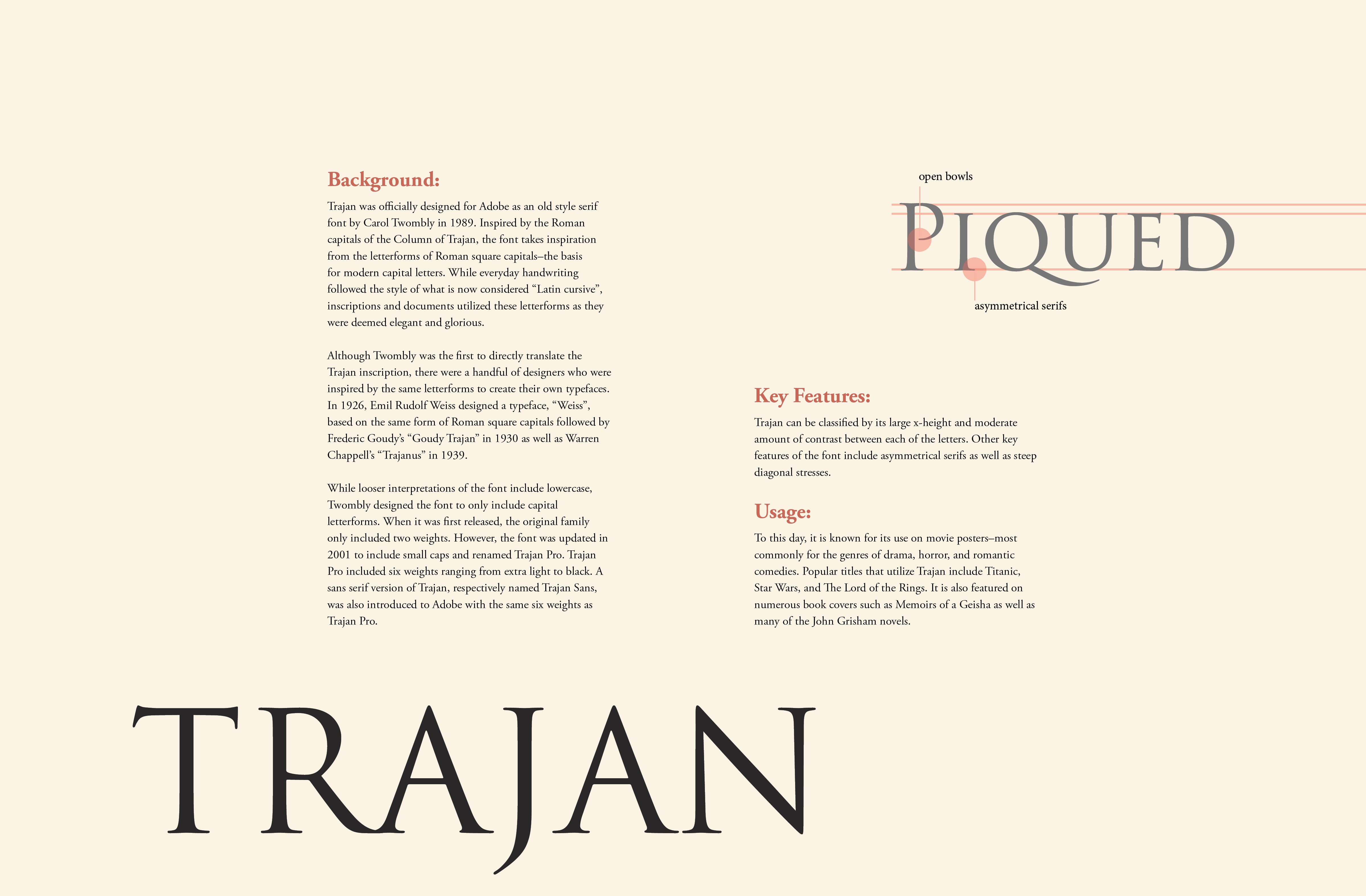
| c. 113 CE† | Rome | Trajan's Column inscription | Capitalis monumentalis: proportioned capitals that shaped Latin letterforms |
† Background knowledge not independently checked in this session.
Bisotun: public communication in stone
Baseline opens its history with the Bisotun inscription in present-day Iran: a monumental combination of carved figures and writing. Read it alongside the earlier script table. Its scale, placement and pairing of text with an ordered scene help us ask how visual communication asserts authority — not just how it decorates a surface. Baseline: historical foundations
The modern label “graphic design” is retrospective here. A royal inscription and a modern public-information campaign can share visual techniques without sharing their purpose, audience or political conditions.
Repetition, identity and public lettering
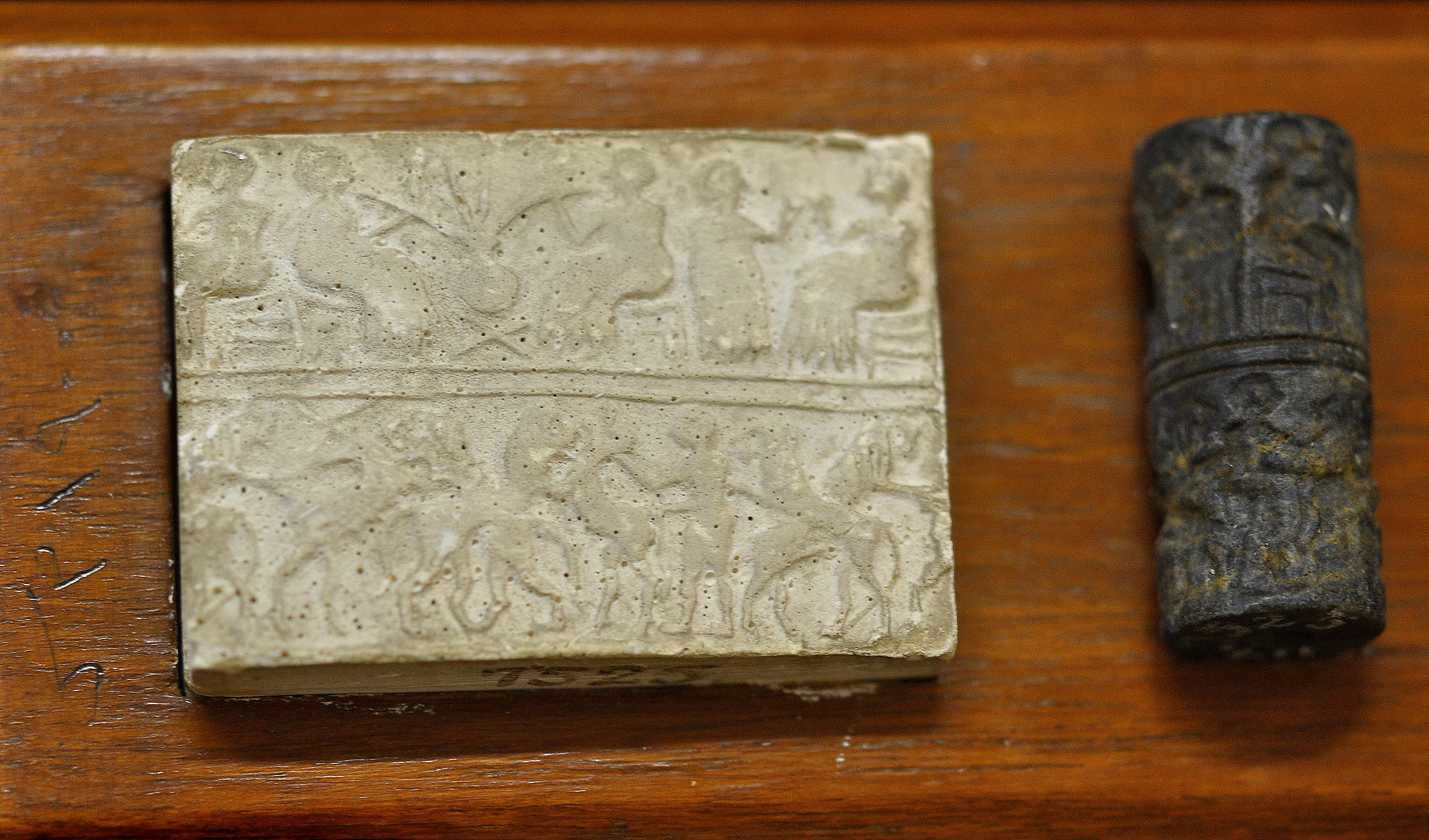
Ancient communication was not confined to pictures on walls. A seal turns a carved object into a repeatable impression; an inscription makes words part of a building or monument. Seen through a contemporary design lens, these raise familiar questions: How is a mark recognised? How does a surface guide reading? How can a message carry authority?
Look closely: the rolled seal repeats a compact scene; the Roman inscription distributes letters across a fixed stone field. These are comparisons of visual organisation, not claims that seals were simply “the first logos” or that Roman capitals explain the development of all writing. The script traditions above have different linguistic and cultural histories.
Egypt: visual form, semantic meaning and authority
Hieroglyphic writing combines signs for sounds with signs that convey or clarify meaning. Across stone inscriptions and papyrus, writing could preserve names, religious texts and royal authority. Egyptian record-keeping also used more cursive scripts. Treating hieroglyphs as merely “picture writing” misses their linguistic complexity.†
Composition (figures placed in relation to each other), abstraction (dots, lines and stencils), material choice (ochre, charcoal, clay) and shared code (signs a community could read) are all present before writing. Ritual, storytelling, identity and record-keeping offer several ways to understand this material. They are not an exhaustive set of origins or a single straight path to advertising and information design.
the instruments behind those marks — reed stylus, brush, reed pen, metal stylus, quill, pencil and stencil — are examined in detail in 4.7 Tools before screens.
Movement 4The Historic Era
Gutenberg, the great democratisation, and pixels
Baseline contributes a visual history of movements and practitioners; Adobe’s 2018 overview contributes examples from protest, advertising and entertainment. This update integrates selected examples into the existing chronology rather than reproducing either essay.
both articles repeat the overstated 1922 coinage claim. Earlier uses documented by Paul Shaw are retained here. Baseline’s 1968 grid-book date is corrected to 1981. Reproduction rights for the imported image files are not verified; source credits are not reuse licences. Some source files already combine multiple works, and those arrangements are preserved.
From the first printed pages to the browser, each wave of technology cut the cost and skill needed to make and distribute visual messages. Meggs, in Britannica, ties the profession's emergence to the late 19th century, when design was separated from production.
Flowchart · The great democratisation
Concept map, not a complete genealogy. East Asian printing precedes Gutenberg; cheaper production does not mean equal access for everyone.
4.1 Manuscripts and the first printing (to c. 1450)
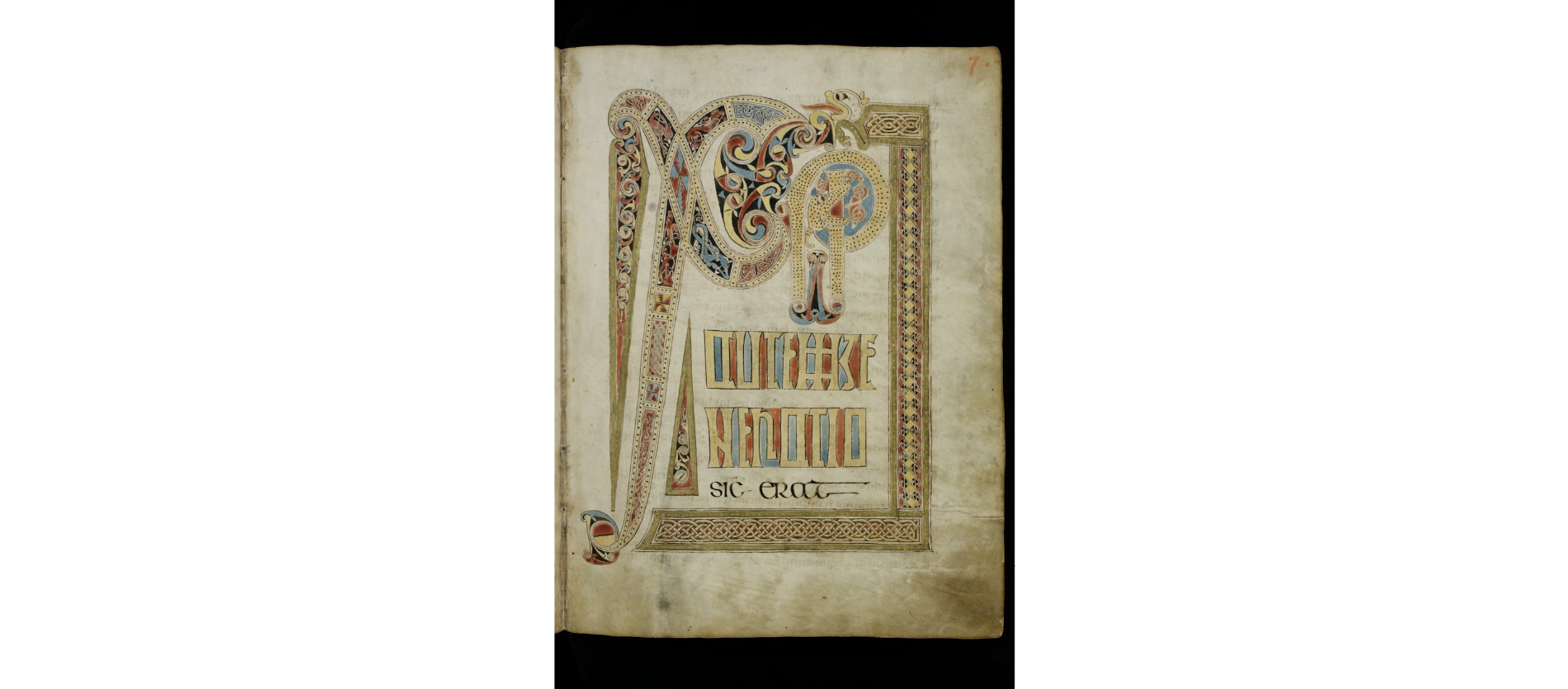
Lindisfarne: hierarchy before typesetting
Baseline’s page from the Lindisfarne Gospels, around 700 CE, complements the highly ornamented Book of Kells example. Notice the enlarged opening, the regular columns and the space that holds them together. Similarity to a modern page does not mean this manuscript was typeset: it was written and decorated by hand. Baseline
Britannica cites the Egyptian Book of the Dead as a superb early example of text and image working together. In the Insular tradition, the Book of Kells (c. 800) turned letters into ornament. In East Asia, woodblock printing on paper began in Tang China by the 7th century.
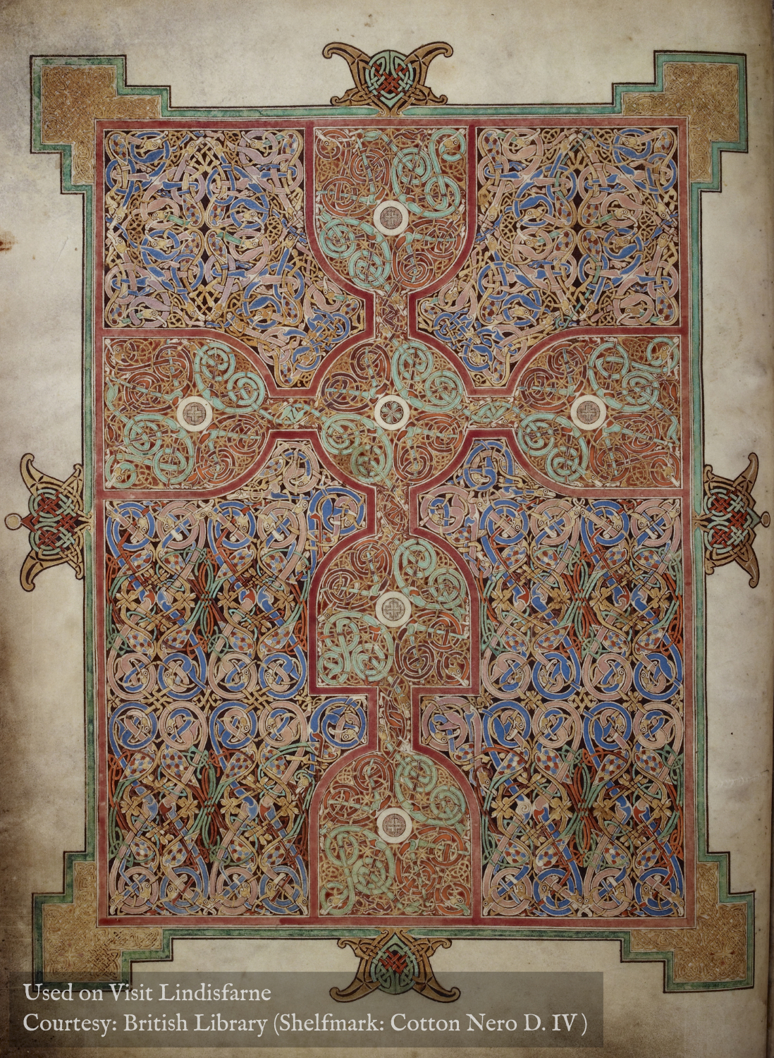
The Lindisfarne Gospels (c. 700)† paired carpet pages and interlace with text. In the Islamic world calligraphy became the central visual art of the book. Kufic styles were joined by cursive scripts such as Naskh and Thuluth, usually dated from about the 10th century onward†, with gold illumination and geometric borders.
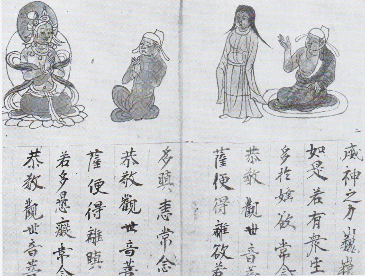
The Diamond Sutra, dated 11 May 868, is the earliest securely dated printed book. Bi Sheng made ceramic movable type around 1040, and Korea's Jikji (1377) is the oldest surviving book printed with movable metal type. The thousands of Chinese characters kept woodblocks dominant in East Asia for centuries. [Library of Congress: From Jikji to Gutenberg]
A page is a coordinated object
Manuscript making brought together writing, image-making and the physical book. In many European workshops, scribes left space for illuminators; initials, borders, margins and changes of scale organised attention before mechanised typesetting. Production could be collaborative even when every page was handmade. Meggs: manuscript design
The Limbourg brothers’ January page presents courtly life within a calendar scheme. Read it alongside the Book of Kells rather than as its replacement: different patrons, readers and uses lead to different visual solutions.
Beyond one tradition: Persian manuscript painting also integrated calligraphic text, figures, architecture and colour. Sacred calligraphy was important in Islamic book arts, but not all manuscripts were religious or without human figures.
4.2 Gutenberg and wider European access (1450–1800)
Gutenberg did not invent printing. He built a commercially scalable movable-type system for European alphabets, completed around 1454–55 in Mainz. Texts became cheaper and more abundant. Printer-compositors, not “designers”, made decisions about type, margins and spacing.
The mechanical shift. Gutenberg’s European system joined metal type, repeatable casting, ink and a press. His Bible’s blackletter echoed manuscript forms; standardisation did not mean a single shape for every letter, since printers also used variants and ligatures. Manuscript copying continued alongside print.
Message and medium. The press changed who could reproduce and distribute messages. It did not prove that the message is always more important than the medium: format, paper, type, price and distribution help shape meaning. Wider access developed unevenly alongside schooling, language, commerce, patronage and censorship.
Page geometry. Margins, columns and proportions link manuscript and print practice. The “Van de Graaf canon” is a later reconstruction of page proportions, not a documented grid invented by Gutenberg. No one layout formula explains all early books.†
| Date | Innovation | Design impact |
|---|---|---|
| 1496–1501 | Aldus Manutius with punchcutter Francesco Griffo | Refined roman, italic type, small portable books |
| 1500s | Garamond and other Paris punchcutters | “Old style” faces become models for centuries |
| 1700s | Baskerville, Fournier, Bodoni, Didot | High-contrast “modern” faces; Fournier's point system |
| 1796 | Senefelder invents lithography | Drawing and lettering can print freely, not locked to the type grid |
A replica makes the printing process visible
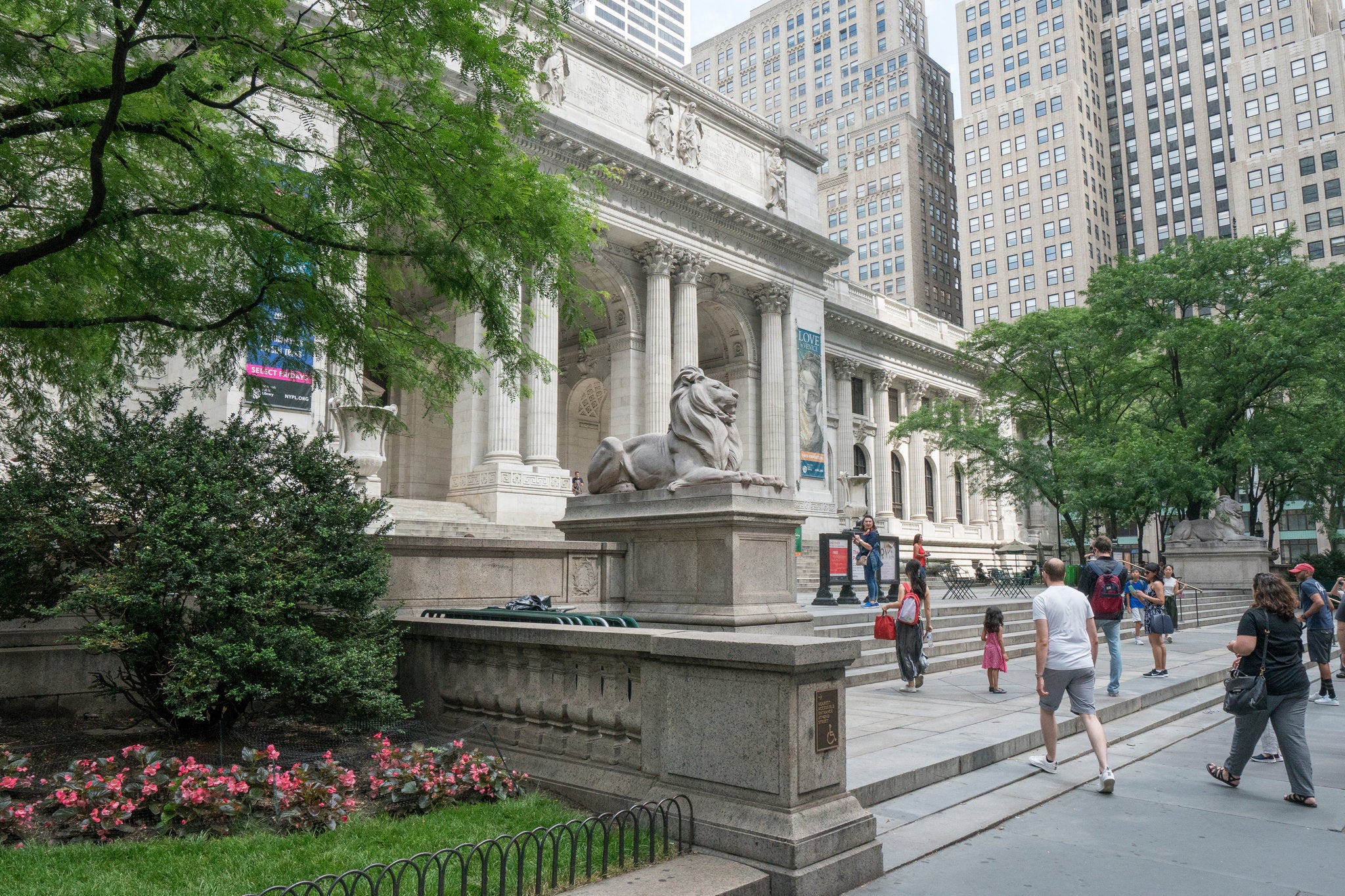
Baseline’s photograph shows a working reproduction of a Gutenberg-style press at the Crandall Printing Museum in Utah, not an original fifteenth-century machine. It helps connect the historical milestone to a physical workflow: compose the page, ink the type, position the sheet and apply pressure. Baseline
From Renaissance reading to the type specimen
Renaissance printers did more than multiply manuscript pages. Aldus Manutius and Francesco Griffo developed influential roman and italic types for new reading formats; French designers such as Geoffroy Tory and Claude Garamond refined the relationship between letterforms, ornament and page. Later, Baskerville’s restrained pages and Bodoni’s high-contrast types offered a different kind of typographic order. These were overlapping choices, not a universal march from ornament to simplicity. Renaissance book design · Neoclassical typography
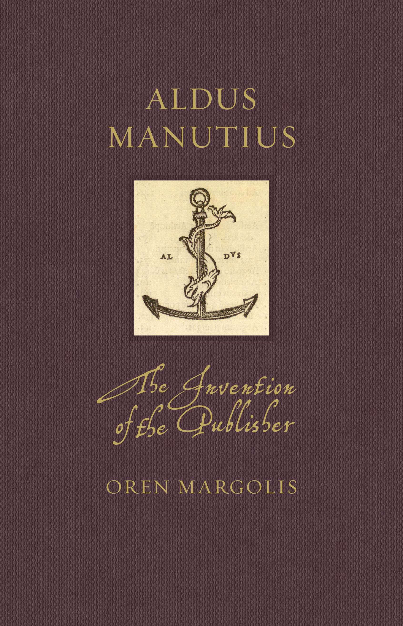
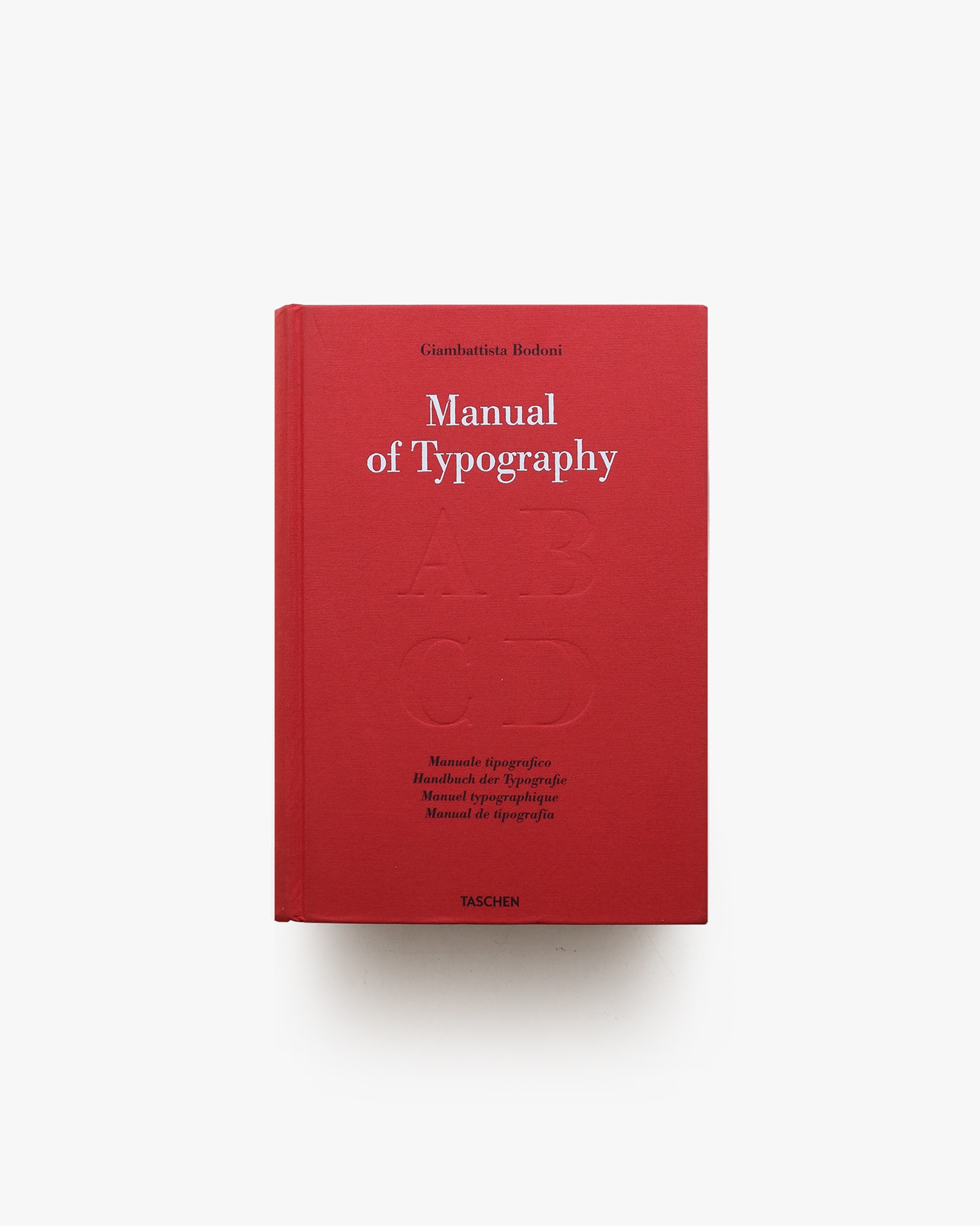
Look closely: the Aldine device turns a printer into a recognisable publisher; the Bodoni manual asks the viewer to inspect letterforms themselves. A typeface becomes a reusable resource across many publications, while the page designer still decides its size, spacing and relationship to other elements.
4.3 Industry, commercial art and advertising (1800–1900)
Steam presses and cheaper paper supported growing print markets. Lithography (1796) enabled direct drawing on a printing surface; nineteenth-century colour lithography — including Godefroy Engelmann’s 1837 chromolithography patent — expanded colour advertising. Full-colour lithography was a later development, not a finished invention delivered all at once in 1796.† Victorian printers produced fat-face and slab display types. Henry Cole's Journal of Design and Manufactures (1849) and the Great Exhibition (1851) pushed design reform in Britain. Mergenthaler's Linotype (1886) cast whole lines of type from a keyboard. Advertising agencies, publishers and magazines began hiring art directors, and the “commercial artist” emerged.
Display type. William Caslon IV's Two Lines English Egyptian (shown in a specimen of about 1816) is generally cited as the first sans serif typeface. It did not catch on at once. Sans serifs became common in advertising and headlines in the following decades, after founders such as Vincent Figgins cut their own. [Commercial Type]
Jules Chéret helped make colour lithographic posters a feature of the nineteenth-century street. Posters, newspapers, labels and packaging brought commercial imagery into daily life; affordability and literacy nevertheless varied by place and audience.†
Arts & Crafts reaction. William Morris's Kelmscott Press (books from 1891) treated the whole page as a design unit. The 556-page Kelmscott Chaucer (1896) carries 87 Burne-Jones woodcuts.
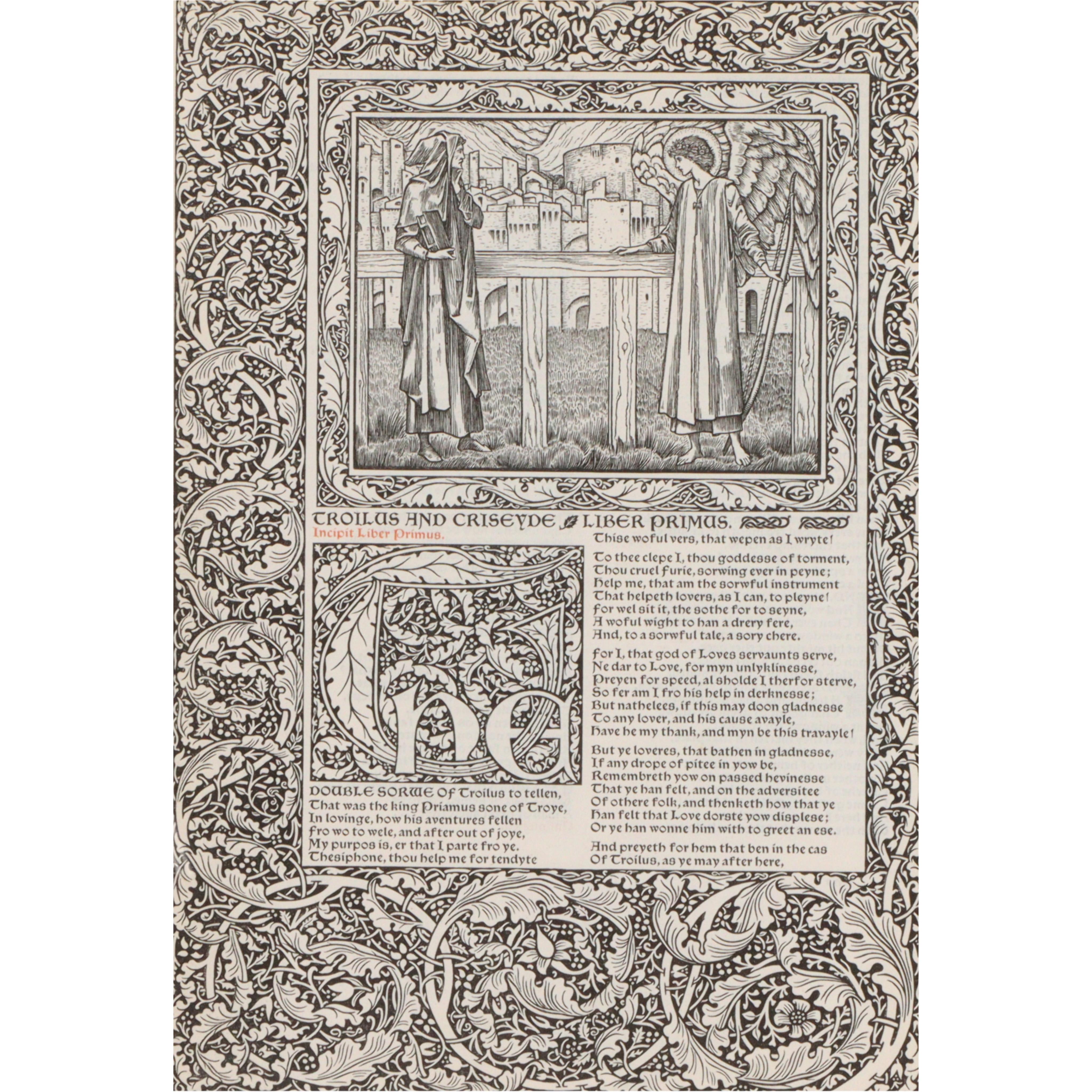
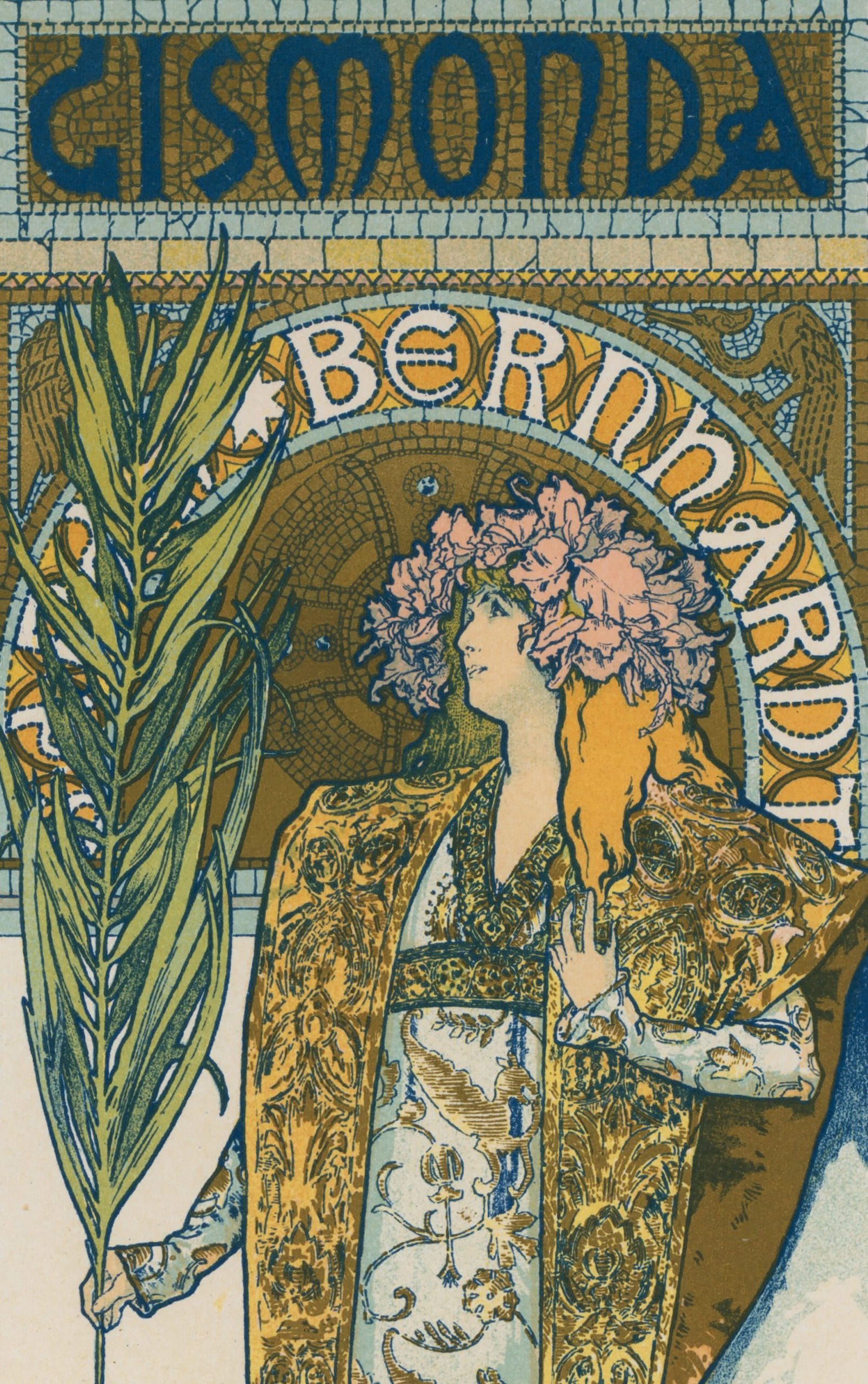
Art Nouveau and the poster boom. Inspired by ukiyo-e, designers used flat colour and sinuous line. Toulouse-Lautrec's Jane Avril poster (1893) and Mucha's Gismonda (1894) made the poster a mass medium. Photoengraving, perfected by the 1890s, enabled accurate reproduction of artwork.
The street becomes a reading surface
Toulouse-Lautrec’s Moulin Rouge: La Goulue (1891) was a large advertisement printed in four colours on three sheets. The Met identifies it as the commission that launched his poster career. Museum object record
Its repeated venue name, silhouettes and bright central dancer create distinct levels of attention. Unlike a book held at reading distance, a street poster must compete with its surroundings. This is a change in communication conditions as much as a change in style.
Labels, trade cards and packaging brought similar coordination of name, image and lettering to commerce. Industrial printing expanded reach; Arts & Crafts challenged what mass production could do to quality. Both belong in the history of the profession.
Morris across media: from textile to page
Baseline pairs Morris’s textile work with his book design. This broadens Arts & Crafts beyond a single printing style: repeated natural motifs, material quality and the relationship between a detail and the whole connect textiles, interiors and books. Compare the Strawberry Thief pattern (1883) with the Kelmscott Chaucer already shown. Baseline
Read together, the poster and the textile show one era’s shared vocabulary — bold silhouette, flat colour, repeating motif — adapting to two completely different production worlds: stone-litho paste-up on the street, block printing on cloth.
4.4 Modernism and the naming of the field (1900–1945)
- Plakatstil (1905) and the Vienna Secession reduced images to flat shapes with bold names.
- Peter Behrens for AEG (1907): Britannica calls it the first cohesive visual identity system.
- WWI propaganda: colour posters raised funds and recruited, so design was a political tool.
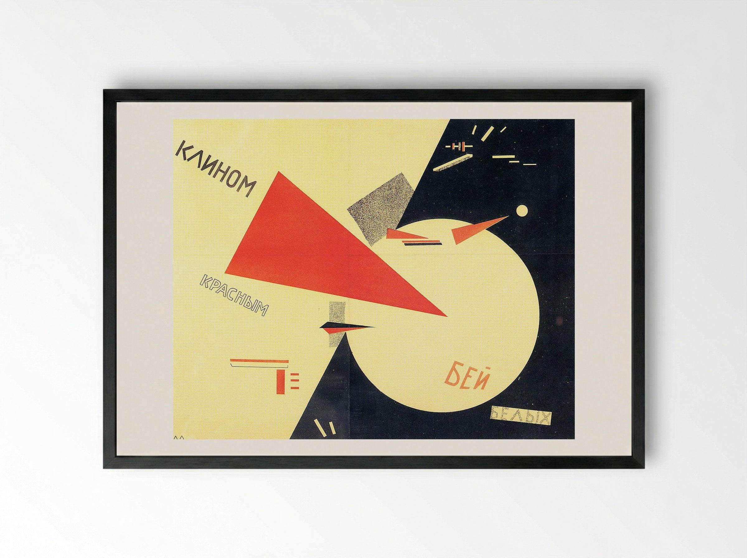
- Avant-gardes: Cubism, Futurism, De Stijl, Suprematism and Constructivism supplied geometry, asymmetry and photomontage. El Lissitzky's Beat the Whites with the Red Wedge (1919–20) uses pure shape and colour as message.
- Bauhaus (1919–33): Moholy-Nagy promoted photomontage; Herbert Bayer ran the printing and advertising workshop from 1925; Tschichold's Die neue Typographie (1928) codified the style.
- Art Deco: Cassandre's posters (1923–36) used Cubist-derived geometry and airbrushed gradients.
Graphic comes through Latin graphicus from Greek graphikos, connected with graphein, “to draw” or “to write.” [Dictionary.com] Design ultimately comes from Latin designare, “to mark out” or “devise”; Italian disegno / disegnare and French forms connect drawing with planning and intention. The English history is not a direct jump from Latin to a modern job title. Etymonline
A landmark use, not an official birth: 1922
William Addison Dwiggins used “graphic design” in “New Kind of Printing Calls for New Design,” Boston Evening Transcript, 29 August 1922. It is a useful landmark for the integrated handling of type, image and page. But historian Paul Shaw documents a 1917–18 “Graphic Design and Lettering” course at the California School of Arts and Crafts, predating Dwiggins. The expression was not officially coined in 1922, and no one article created the profession. [Paul Shaw]
Earlier and overlapping occupations — engraver, printer, illustrator, lettering artist, compositor and layout artist — did not disappear when a broader professional label became established.
Modernism in view: different answers to the same page
Baseline’s visual timeline makes the existing movement table tangible. The examples compare ways of organising attention: a diagonal thrust, a projected voice, a disruptive collage, a geometric system or a controlled typographic hierarchy. These movements overlapped and crossed borders; they were not successive universal styles. Dates and identifications in these captions follow Baseline unless a correction is noted. Read Baseline’s timeline
| Date | Movement | Key figures | Visual character |
|---|---|---|---|
| 1860s–1900s | Arts & Crafts | William Morris (Kelmscott Press from 1891), Ruskin as an influence† | Craft, natural motifs, fine printing; the page as a unit |
| 1890s–1900s | Art Nouveau | Mucha, Toulouse-Lautrec, Bradley, van de Velde | Sinuous line, flat colour, ukiyo-e influence |
| 1900s | Vienna Secession; Plakatstil | Moser, Hoffmann; Lucian Bernhard (1905) | Geometric structure; product reduced to a flat shape plus a bold name |
| 1909–1930s | Futurism† | Marinetti, Depero | Speed, dynamic diagonals, expressive type |
| 1910s–1920s | Constructivism and Suprematism | Rodchenko, Lissitzky, Malevich | Primary colours, strict geometry, photomontage, asymmetry |
| 1916–1920s† | Dada | Hannah Höch, Tristan Tzara | Collage, absurdity, chaotic typography, political critique |
| 1917–1920s† | De Stijl | Mondrian, van Doesburg | Primary colours with black horizontal and vertical lines |
| 1919–1933 | Bauhaus | Gropius, Moholy-Nagy, Bayer, Joost Schmidt | Art plus technology; functionalism, sans serif, asymmetry |
| 1920s–1930s | Art Deco | Cassandre | Streamlined symmetry, airbrushed gradients, luxury and travel imagery |
| 1928 | The New Typography | Jan Tschichold | Asymmetric layout and functional hierarchy codified |
| 1940s | Wartime propaganda | J. Howard Miller, “We Can Do It!” (1943)† | Bold figure plus short slogan. The poster was made for Westinghouse workers and became linked to “Rosie the Riveter” later.† |
| 1950s–1960s | Swiss / International Typographic Style | Müller-Brockmann, Hofmann, Miedinger | Grids, flush-left text, objective photography, Helvetica and Univers |
| 1950s–1970s | Corporate identity | Paul Rand (IBM, ABC, UPS)†, Saul Bass (AT&T, film titles)† | Reductive marks that scale across print, broadcast and signage |
| 1950s–1960s† | Pop Art | Warhol, Lichtenstein | Screenprint, comic dots, repetition, consumer culture |
| 1970s–1980s | Punk and New Wave | Jamie Reid†, Neville Brody†, Wolfgang Weingart | DIY, photocopy, torn paper, layered and rotated type |
| 1980s–1990s | Postmodern and digital expression | April Greiman, David Carson (Ray Gun)† | Broken grids, layering, expressive and sometimes near-illegible type |
† Background knowledge not independently checked in this session.
4.5 Swiss Style and the corporate age (1945–1975)
Swiss designers codified a neutral, rational system: modular grids, asymmetry, sans-serif type and objective photography. Josef Müller-Brockmann's Zürich concert posters are paradigms, and Univers and Helvetica both appeared in 1957. Multinationals adopted the style for identity programmes. In the US, Brodovitch's Harper's Bazaar (1934–58) and Push Pin Studio (1954) pursued expressive alternatives. In Japan, Kamekura Yusaku and Yokoo Tadanori fused modernism, tradition and Pop. Lemi Ghariokwu's hand-painted Fela Kuti covers (26 albums, from 1974) are a Nigerian counterpoint. [Lemi Ghariokwu]
The grid as a service to the reader. Swiss systems make alignment, grouping and hierarchy repeatable. Calling a grid “democratic” is an ethical aspiration, not an intrinsic property: legibility also depends on language, type size, contrast, disability access and the reader’s context.
Corporate identity. Paul Rand’s IBM, ABC and UPS marks exemplify a logo within a wider identity programme. His 1966 Ford redesign was a proposal, not an adopted Ford identity — an important distinction between a famous commission and a deployed brand. [The Drive]
Postwar practice: identity, cinema, grids and mass culture
Baseline connects individual practitioners with different applications of modern design. Rand’s marks show economical recognition; Bass’s film posters condense narrative into a strong motif; Müller-Brockmann’s work treats scale and spacing as systems. Pop Art, meanwhile, turns the imagery of mass culture back into art. These are related exchanges, not one homogeneous “postwar look.” Baseline
Baseline places Grid Systems in Graphic Design in 1968. This guide retains 1981, as listed for the Niggli publication by William Stout Architectural Books. The grid method predates the book — and this correction itself shows why link colours and source notes matter: see the matching fact-check entry.
Adobe’s decade lens: who is the message for?
Adobe’s The Evolution of Graphic Design, published 8 June 2018, adds examples from protest, advertising, entertainment and branding. Its decades are a convenient viewing route, not the birth dates of each technique. Statements about “recent changes” belong to the article’s 2018 context, not automatically to 2026. Adobe article
1965: a flyer as an organising tool
The Montgomery Improvement Association’s School’s Out! flyer invited students to join the Selma-to-Montgomery march as it reached Montgomery. Its handwritten message, small illustration and meeting details show that effective design need not resemble a polished corporate campaign. Civil Rights Movement Archive
The archive explains that campaign leaflets were distributed through streets and neighbourhoods, with some urgent notices made on mimeograph machines. Distribution, timing and trust were as important as visual form. This is a history of communication infrastructure as well as composition.
1977: the celebrity, the product and the proof
Adobe uses a Craig car-stereo advertisement featuring Ray Charles to show a different hierarchy: a famous face draws attention, a short headline makes the promise, and smaller copy explains the offer. Read the movement from image to headline to details — not just the styling of a decade. Adobe
Television and print advertising could reinforce a campaign, but neither celebrity endorsement nor cross-cultural influence began in the 1970s. The guide’s earlier ukiyo-e and postwar Japanese examples remain part of the longer story.
4.6 Pixels: the second great democratisation (1975–today)
| Year | Milestone | Effect |
|---|---|---|
| 1970s–80s | Postmodernism: Weingart, Greiman, Memphis | Broken grids, layering, hybrid imagery |
| 1981 | IBM PC | Personal computers legitimised in business |
| 1984 | Apple Macintosh with MacPaint and Susan Kare's bitmap icons†; Adobe PostScript | WYSIWYG graphical computing reaches designers |
| 1985 | LaserWriter; Aldus PageMaker | Desktop publishing without a typesetter or paste-up studio |
| 1987–89 | Illustrator and QuarkXPress (1987)†; FreeHand (1988); CorelDRAW (1989) | Vector drawing and professional page layout broaden the desktop toolkit |
| 1990 | Photoshop 1.0 (Thomas and John Knoll; Adobe) | Raster editing replaces much darkroom retouching. Version 1.0 offered tools such as levels, curves and a clone tool; layers came in a later version.† |
| 1989–93 | The Web proposed (1989); Mosaic (1993); CERN releases it to the public domain (30 Apr 1993) | Layout moves to screens; the web designer emerges. [CERN] |
| 1995–2005† | Flash and Dreamweaver (Macromedia products; Adobe acquired Macromedia in 2005); Kyle Cooper's Se7en titles (1995) | Web animation, interactive sites, kinetic title design |
| 2010 | Marcotte, “Responsive Web Design” (25 May) | Fluid grids and media queries; design for any device. [A List Apart] |
| 2013–2016† | Flat interfaces (iOS 7, 2013), Material Design (2014), Figma (2016), variable fonts (OpenType 1.8, 2016) | Design systems, collaborative cloud tools, adaptive typography |
† Background knowledge not independently checked in this session.
Desktop publishing reduced reliance on skilled tradespeople and widened who could make professional-looking documents. The cost was that polish no longer signalled expertise.
GUI, WYSIWYG and the page on screen
The Macintosh (1984), PostScript, LaserWriter and PageMaker (1985) were a powerful combination — not one simultaneous 1984 release. Graphical interfaces made layout visible on screen; a page-description language helped translate it into print.
WYSIWYG means “What You See Is What You Get,” but screens and printed sheets still differ in colour, resolution and material. Fonts, bleed, separations, proofing and output settings remain production concerns.
Bézier curves: shape as editable mathematics
Vector paths store geometry rather than a fixed mosaic of pixels. In a cubic Bézier segment, endpoints and two control points define a curve. Moving a handle changes the contour, enabling editable illustration and type outlines. Not every font format uses the same kind of curve, and many modern workflows combine vectors with raster images.
From the grid to expressive editorial design
Baseline’s New Wave and postmodern examples complicate the idea that computer software suddenly created experimental layout. Its Weingart and Greiman examples are from the 1970s. Layering, disruption and photographic collage precede widespread desktop publishing; digital tools later changed their speed and possibilities. Baseline
1980s–1990s: style, software and genre are different histories
Adobe’s entertainment examples show saturated display lettering and distressed surfaces. A film campaign’s mood is not proof that an entire decade had one style — or that Photoshop invented layering. The 1984–85 desktop-publishing combination already described above mattered because it linked editing, page description and output; access widened unevenly, not to “everyone” at once. Adobe’s decade examples
2005: a static mark that suggests movement
Adobe dates the AT&T globe identity to 2005 and uses it to discuss implied motion. Curved bands, shading and alternating blue and white make a flat image suggest a turning volume. That is depicted movement, distinct from an animated logo or interactive behaviour. Compare the mark with the earlier Bass and Rand references: identity design is more than an isolated logo, and later redesigns must not be attributed automatically to an earlier designer. This image documents the version selected by the 2018 article, not necessarily the current mark.
From pages to interfaces
On the web, content must survive changing screens, user input and time. CSS separates many presentation rules from content; responsive systems rearrange layouts rather than merely shrinking a printed page. UI addresses the interface; UX also includes research, information architecture, usability and the wider experience.
Glossy Web 2.0 graphics and skeuomorphic interfaces — digital controls borrowing familiar physical cues — coexisted with simpler styles. Flat design reduced visual ornament but could make clickable elements less obvious. This was not a clean, universal march from gloss to minimalism.
April Greiman’s digital experiments began in the 1980s; David Carson’s 1990s editorial work helped popularise expressive, disrupted typography. Their work should not be compressed into a single “1990s grunge” origin.† Motion graphics, responsive typography and interactive systems add behaviour to the designer’s composition.
A printed poster normally has one fixed arrangement. A mobile interface must also account for loading, error, selection and completion; portrait and landscape screens; touch and keyboard use; and translated or enlarged text. Responsive layout is therefore not simply a smaller poster.
From artifact to system: designers specify reusable components, spacing rules, type scales and interaction states. Visual hierarchy still matters, but so do readable contrast, visible focus, meaningful labels and motion that does not obstruct use. UI, UX, development and accessibility are related practices — not interchangeable job titles.
Social publishing adds another constraint: the same identity must remain recognisable across a feed image, a vertical video, a small avatar and a landing page. Faster production does not remove the need for editing, testing and cultural understanding.
Personalisation is a design responsibility. Adobe’s 2018 conclusion anticipates increasingly interactive and personalised experiences. In practice, changing content for a particular person also raises questions about consent, privacy, accessibility and clarity. A personalised interface is not automatically a better one; the outcome must be tested with its users.
4.6a Design in the pocket: the smartphone era (2007–today)
Smartphones did not replace desktop design software, but they moved many everyday design tasks — photo correction, text-on-image graphics, quick flyers, social posts and sketches — into a device people already carried. A camera, touchscreen, internet connection and app store now sat in one hand. For many first-time designers, especially where a phone was more affordable or available than a laptop, the phone became the first studio.
Flowchart · The smartphone design stack
Original explanatory diagram redrawn as HTML for this edition; app names identify typical uses, not fixed categories. No app logos or screenshots are reproduced.
Mobile and template design tools: an approximate chronology
| Date | Tool | What it added to design practice | Status note |
|---|---|---|---|
| 17 Sep 2009 | SketchBook Mobile (Autodesk) | Brought a desktop-derived drawing engine to iPhone and iPod touch; suited to concept sketches, lettering roughs and illustration. source | Full app made free in April 2018 [Autodesk]; spun off to Sketchbook, Inc. in 2021. “Autodesk skeleton” in the request is treated as SketchBook. |
| 2011 | Snapseed (Nik Software) | Touch-based photo adjustment — including selective, local edits — rather than only one-tap filters. source | First on iOS; Google acquired Nik in 2012 and released Snapseed for Android in December 2012. |
| Nov 2011 | PicsArt | Combined photo editing, drawing, collage, stickers and a social creative community on Android. source | Later expanded to iOS, Windows Phone, web and AI-assisted tools. |
| Nov 2011 | Photoshop Touch (Adobe) | Layer-based image compositing and effects for Android tablets; iPad followed in 2012 and phones in 2013. source | Discontinued in 2015 [PCMag]; later Adobe mobile apps took different approaches. |
| Founded 2012; public launch 2013 | Canva | Browser-first templates, drag-and-drop layout and shared brand assets made common formats — posters, presentations, social posts — faster to produce. source | Co-founded by Melanie Perkins, Cliff Obrecht and Cameron Adams; it later expanded into mobile, workplace and AI products. |
| 1 Oct 2014 | Affinity Designer (Serif) | Professional vector illustration with a one-time purchase model; first released for Mac. source | Windows 2016; separate iPad version July 2018. Canva bought Serif in 2024; Designer was replaced by the unified freemium Affinity app in 2025. |
| Apr 2015 | PixelLab — Text on pictures | Android-first text effects, 3D-styled lettering, stickers, shapes and backgrounds; widely used for quick flyers, thumbnails and social graphics. [AppBrain] | Version 1.0 appeared on Google Play on 10 April 2015 (third-party listing record). Developer listings show Imagin Studio; AppBrain now lists App Holdings. iPhone: see the naming caution below — there is no single verified Android-to-iPhone release date. |
| Dates not verified | Vector Ink | A vector editor for browser use and Android: pen, shape-building, gradients, text-to-path, SVG import/export and a stylus-oriented draw tool. [Google Play] [Vector Ink] | Its Google Play description lists version 6.1 with an AI Assistant, AI Image Editor, new image-generator styles, Smart Fill, and .AI/.EPS export. The pages checked describe web and Android, not a native iPhone app; first-release date not verified. |
| Dates not verified | Photopea and Vectorpea in a mobile browser | Photopea says it can run on any device including tablet and phone, though a large screen, precise pointing device and keyboard are more comfortable. [Photopea] | Not a dedicated app. See the browser/cloud tool section below. |
| Dates not verified | Pixlr | Browser-based photo editing and generation tools, including background removal, generative fill, expansion, upscaling and a sticker maker. [Pixlr] | The pages checked do not give a first-release date or complete mobile feature parity. |
| Dates not verified | Photoroom | Background removal and product-photo workflows aimed at online sellers; its page describes handling photo edits “from any device”, with batch and API options. [Photoroom] | Date and platform-by-platform details not verified. |
PixelLab on iPhone: check which app you mean
“PixelLab” on the App Store is not one clearly documented lineage in the records checked. They show different publishers, release dates and feature sets:
- PixelLab: AI Photo Editor — publisher PIYUSH SHIYANI; iTunes record release date 30 July 2021. [App Store]
- PixelLab: Drip & Text on Photo — publisher ZipoApps; iTunes record release date 15 December 2022; the App Store page describes text on photo, stickers, collage, drip and neon effects and an “AI-powered” background eraser. Version history includes an AI photo-to-sketch update in September 2023. [App Store]
- PixelLab - Text on Pictures — an iPhone listing page shows publisher Riccardo Bozzoli Parasacchi and version history back to February 2020, including a background-remover option in version 6.0 (October 2021). This is a third-party app-listing mirror, not Apple. [AppPure]
The Android PixelLab record above lists Imagin Studio / App Holdings. The sources checked do not prove that every iPhone listing is the same product, company or release lineage as that Android app. Treat “PixelLab came to iPhone” as true in the sense that PixelLab-named iPhone apps exist, and avoid using one date unless you identify the exact listing.
Dates are first public releases as reported by the linked records; many of these apps changed platforms, owners, features and pricing afterwards. Inclusion is not an endorsement or a ranking.
What smartphones changed
- Access: lower cost of entry, free tiers and app stores brought design tools to new users.
- Speed: capture → edit → publish could happen in minutes, matching the pace of social media and messaging.
- Format: vertical canvases, square posts, stories, thumbnails and status images became everyday design briefs.
- Templates: pre-built layouts lowered the barrier to entry and made consistent branding easier for small teams.
What still requires a designer’s judgement
- Hierarchy and legibility: a phone preview can hide small text or weak contrast that fails in print or on other screens.
- Originality: heavily reused templates and effects can make different businesses look alike.
- Production: print needs correct size, resolution, bleed and colour expectations; many quick mobile exports are screen-oriented.
- Rights: fonts, stock elements, photos and templates have licence terms; available in an app does not mean free for every use.
In many Nigerian creative economies, phone apps such as PixelLab, PicsArt and Canva are associated with quick event flyers, church and community announcements, small-business promotions, birthday graphics and WhatsApp statuses. This is a practical observation, not a measured market share. The opportunity is real: phone-first designers can respond quickly to local clients. The professional step is to add a brief, a grid, consistent type, accessible contrast, print-ready files and respect for licences.
4.6b The browser becomes the application: web and cloud design tools
Smartphone apps were not the only way design moved beyond the installed desktop program. Browser-based tools turned a link into a studio: open a page, start with a template, upload a file, collaborate, export and share. This reduced installation friction, especially when the same tool could be reached from different devices. Cloud services also created new questions about file ownership, privacy, subscriptions, ads, internet access and the availability of a tool.
Flowchart · Installed software vs browser and cloud design
- Installed on one computer
- Files usually saved locally
- Updates managed by user
- Strong offline workflows
- Exports shared with others
- Opens from a link
- Works across screen sizes
- Some tools run locally
- Some require an account
- Offline support varies
- Shared files
- Comments and versions
- Libraries and templates
- AI services online
- Data policy matters
Original comparison diagram, rebuilt as HTML. It describes workflow differences, not a ranking of products.
A selected map of browser and cloud design tools
| Tool | Design role | What the checked pages state | Device / offline note |
|---|---|---|---|
| Canva | Template-led layout, social and presentation design | Official feature pages list tools such as PDF editing, text-to-image, AI video and video background removal. Earlier in this guide: founded 2012, public launch 2013. [Canva features] | Works from a browser; mobile availability is discussed in the smartphone section. |
| Photopea | Image editing across raster and vector files | Says it opens in a web browser, works with raster and vector graphics, and supports colour spaces and 8-, 16- and 32-bit depth. A Photopea social post names PSD, Sketch and XCF support. Independent coverage says it began around 2012–2013 and is made by Ivan Kutskir. [Photopea] [XDA] | Official guide says it runs on any device, runs in the user’s device, does not upload files, and can be used offline after loading. Large screen and precise input are recommended. |
| Vectorpea | Browser vector editor from the Photopea team | Official social post: first version released 16 October 2023. Independent coverage calls it early and not a complete Illustrator replacement. [Photopea post] [XDA] | Reported to work in browsers, including from a phone or tablet; free use with optional paid storage, ad removal and AI credits. |
| Vector Ink | SVG design canvas, logo work and AI vector workflows | Describes a cloud-based web application with pen, shape, gradient, text and draw tools, an icon library, AI generation and AI image/vector editing. [Vector Ink] [AI icon-editing tutorial] | FAQ says desktop, tablet and mobile browsers are supported, but full functionality requires an internet connection. |
| Figma | Interface design, vector illustration, prototyping and collaboration | Official page describes multiplayer files, comments, cursor chat, vector editing, motion, prototyping and an AI agent in the canvas. [Figma] | Cloud collaboration is central; offline capability not verified here. |
| Penpot | Open-source design and prototyping platform | Official page describes UI design, design systems, code-oriented standards, AI workflows and self-hosting. [Penpot] | Offers a hosted service and self-host option; device-specific behaviour not verified. |
| Pixlr | Browser photo editing and AI generation | Describes Express and Editor products plus AI tools for image generation, background removal, object removal, expansion, upscaling and layer extraction. [Pixlr] | The home page says it works in the browser; mobile specifics not verified. |
| VistaCreate | Template-based social, web and print design | Lists resizing, text on photo, filters, layers, photo grids, an AI background remover and an AI object remover. [VistaCreate features] | Template and resize tools are web-based; device details not verified. |
The tools are selected examples, not a market ranking. Descriptions come from company pages unless otherwise noted. Features, ownership and pricing change; “works in a browser” does not guarantee that every function behaves the same on every phone, tablet or computer.
What web and cloud tools changed
- Immediate access: a link can replace a download.
- Cross-device continuity: some tools let work move between phone, tablet and computer, subject to screen size and input method.
- Collaboration: comments, shared files and live editing became part of the design process.
- Format bridges: online editors open, convert and export files from other programs, though compatibility is rarely perfect.
- Template ecosystems: layouts, fonts, icons and stock elements are integrated with editing.
What deserves a checklist
- Privacy: does the tool process locally or upload files? Photopea’s official guide says it runs locally; AI cloud tools commonly send images for processing, so check each service’s terms.
- Rights: verify licences for templates, fonts, stock images and AI outputs.
- Continuity: save exportable source files. Services can change plans, merge, or close — as the remove.bg example below shows.
- Production: check colour mode, bleed, resolution and fonts before sending a design to print.
A phone browser, shared data bundle and free tier can allow a designer to produce an event poster, product image or logo draft without installing heavy software. That is an accessibility gain, but not a substitute for a brief, source files, backups and client-ready exports. This is a practical observation, not market research — and it has not been confirmed in the pages checked as a measured market claim; it stays a lens, not a statistic.
Features outlast products: the same capabilities spread across tools
Looking only at tool launch dates hides the larger pattern: capabilities migrate. Background removal began as a specialist cutout task, then appeared as a button in editors, template platforms, mobile photo apps and vector tools. Similarly, a vector editor can start with paths and Boolean shape tools, then add image generation, vectorisation and AI editing. The category stays recognisable while the feature set changes.
A verified feature snapshot
| Feature | Pixlr | Vector Ink | VistaCreate | Photoroom | Adobe Firefly | Canva | PixelLab iPhone (ZipoApps) |
|---|---|---|---|---|---|---|---|
| Background removal | ✓ | ✓ | ✓ | ✓ | ✓ | ✓ | ✓ |
| Object removal / erase | ✓ | ✓ | ✓ | — | ✓ | — | — |
| Generative fill, expand or in-painting | ✓ | ✓ | — | — | ✓ | — | — |
| Upscaling / resolution enhancement | ✓ | ✓ | — | ✓ | ✓ | — | — |
| Image or sketch to vector (SVG) | — | ✓ | — | — | — | — | — |
| Text to image | ✓ | ✓ | — | — | ✓ | ✓ | — |
| Natural-language editing assistant | ✓ | ✓ | — | — | — | — | — |
| Photo to sketch | — | — | — | — | — | — | ✓ |
✓ means the feature was listed on the official or store page checked for that product. “—” means not confirmed in the pages checked, not that the feature is absent. Names, availability, pricing and quality change frequently. Photopea, Vectorpea, Figma and Penpot are omitted because the pages checked describe different strengths: editing, vector work, collaboration and design-system workflows; Photopea’s official guide reported here does not list AI features, while independent coverage says Vectorpea has minimal AI features. Sources: [Pixlr] [Vector Ink] [VistaCreate] [Photoroom] [Firefly] [Canva] [PixelLab App Store]
Case study: Vector Ink’s feature expansion
Vector Ink began in this guide as a mobile and browser vector tool. Its own pages show how the product’s identity has widened from drawing tools into AI-assisted vector work. The Google Play update note for version 6.1 lists an AI Assistant that builds a described change on the canvas, an AI Image Editor to add, remove or recolour parts of an image or vector, new image-generator styles and a Smart Fill tool. The website adds AI tools for upscaling, image-to-SVG conversion, sketch-to-SVG conversion and background removal; its FAQ says its generator creates vector results from text prompts that can be edited. [Google Play] [Vector Ink]
Before the AI additions
- Pen, shape and path tools
- Boolean shape building
- Gradients, text-to-path and custom fonts
- PNG/JPG import and SVG import/export
Expanded feature set
- Prompt-driven canvas assistant and image editing
- Generation of vector assets from prompts
- Image and sketch conversion to SVG
- Upscaling and background removal
- .AI and .EPS export in the Android release notes
What changed for the designer? A traced or generated vector can speed up exploration, but production still requires path clean-up, sensible anchor points, licensing review, type decisions, colour planning and testing at small sizes. A tool that makes shapes quickly does not decide whether a logo is distinctive or appropriate.
AI background removal: from skilled cutout to a button
Flowchart · Simplified AI background-removal workflow
Simplified: services differ in models, controls, privacy rules and output quality. Original explanatory diagram; it does not show any provider’s internal system.
Why it matters. Product photographs, profile pictures, thumbnails, flyers and posters often need a subject separated from its surroundings. Traditionally this could mean a hand-made selection, mask or pen path. AI tools estimate the subject boundary and return a transparent or replaceable background, reducing both skill and time barriers for common images.
| Date | Development | Evidence and caution |
|---|---|---|
| 2018 | remove.bg founded; widely reported as an automatic web tool from December 2018 | The company’s own page says it was founded in 2018. The exact December 2018 launch date comes from an independent product review. [remove.bg] [review] |
| 2021 | remove.bg becomes part of Canva | The company’s official FAQ states that remove.bg became part of Canva in 2021. [remove.bg FAQ] |
| 2023–2026 | Background removal appears across mobile apps, vector tools and AI editing suites | The pages checked list it in Pixlr, VistaCreate, Photoroom, Adobe Firefly, Vector Ink and a PixelLab iPhone listing, among others. See the feature snapshot above. |
| 1 Dec 2026 | remove.bg’s standalone website is scheduled to become unavailable | Its official page says background-removal functionality is moving into Canva and the standalone service will no longer be available from 1 December 2026, 9:00 CET. This is a scheduled change, not a historical event as of 4 October 2026. [remove.bg FAQ] |
The company’s About page also states that remove.bg processes more than 150 million images monthly and serves over 32 million monthly active users. These are the company’s own usage claims, not independently audited figures. source
Where AI cutouts often need review
- Hair, fur, smoke, lace and semi-transparent objects.
- Low contrast between subject and background, such as a white logo on a white surface.
- Shadows, reflections and glass, which may need rebuilding.
- Product edges that must be precise for catalogues or print.
- Any photo that must be accurate documentation rather than a stylised image.
One public App Store review for a PixelLab iPhone listing complains that the background eraser erased a whole white-logo-on-black image. This is a single user report, not evidence of general performance. [App Store reviews]
Professional checks
- Zoom to 200–400% and inspect the edge.
- Test on both light and dark backgrounds.
- Keep the original and the cutout as separate files.
- Do not upload confidential, client-restricted or private images without permission and a data-policy check.
- Do not alter evidence, news photography or identity documents in misleading ways.
- Do not assume a tool’s output grants rights beyond the image’s original licence.
After remove.bg: the lesson is workflow resilience, not a recommendation of one replacement. Canva’s background remover, Photoroom, Pixlr, VistaCreate, Adobe Firefly, Vector Ink and phone apps each package the capability differently. Choose by privacy terms, edge quality, export format, price, bulk needs, API access and whether the result can be edited afterwards.
4.7 Practice, tools and the changing designer
As commerce grew through the 20th century, graphic design became a business discipline. It supports brand identity, packaging, advertising and public information, and it is usually practised with other specialists such as writers, strategists, developers and UX researchers.
| Tool | Main function | Typical deliverables |
|---|---|---|
| Adobe Illustrator | Vector drawing and typography | Logos, icons, packaging dielines, infographics |
| Adobe Photoshop | Raster editing and compositing | Photo retouching, ad banners, digital artwork |
| Adobe InDesign | Multi-page, grid-based layout | Brochures, magazines, books, reports |
| UI/UX and prototyping tools (e.g. Figma†) | Interface layout and interaction prototypes | Web and app screens, design systems |
- Brand identity systems: logos, style guides, colour palettes, type hierarchies.
- Packaging and print: dielines, folding cartons, prepress preparation.
- Digital campaign assets: ad banners, social carousels, landing pages.
Commercial branding, agency workflows and global outreach
Contemporary agencies may combine identity, packaging, social content, websites and paid media. Design gives the campaign a recognisable visual language; strategy defines the audience and promise; media specialists manage distribution and measurement.
Flowchart · Agency workflow 101: from 01 Discover to 06 Learn
- DiscoverAudience, problem, research
- DefinePositioning, message, success measures
- DesignIdentity, content and prototypes
- ProduceFormats, localisation, accessibility
- PublishChannels, approvals, media plan
- LearnTests, results and revision
Illustrative agency workflow — the loop closes when “Learn” feeds the next “Discover”.
PPC (pay-per-click). Search campaigns can involve keyword research, ad copy, creative, landing pages, bidding and ongoing optimisation. Other advertising platforms use different targeting and charging models. Better visual hierarchy and message consistency can support a campaign, but neither design nor PPC guarantees visibility, conversions or a return on investment.
Across global screens. Plan for language expansion, local scripts, reading direction, cultural meanings of colour, mobile bandwidth and accessibility — not simply the same artwork exported at more sizes. Engagement metrics should be read alongside meaningful business or communication outcomes.
The agency’s own site lists branding, graphic design, website design, video production and social media marketing, with location pages including Ahmedabad, Vadodara and Surat. This illustrates an integrated service offering; it is not independent evidence of quality, offices in every listed city, client satisfaction or guaranteed results. [1] No endorsement is implied.
Software changes faster than degree syllabi, so many designers add short courses and vendor training to formal study.
Flowchart · How the designer’s role re-stacked
These are overlapping roles, not an inevitable replacement chain. “Architect of intent” and “AI director” are framing devices; craft and art direction remain valuable.
4.7 Tools before screens: brush, pen, stylus and stencil
A mark is a meeting of hand, instrument and surface. Long before software, the choice of tool already decided how wide a line could be, whether a stroke could swell or taper, whether a mistake could be undone, and whether an image could be repeated across many objects. Treating these instruments as design technologies — not background craft — explains why the letterforms, page layouts and repeat patterns of earlier centuries look the way they do.
The writing materials in common use did not arrive in a single sequence that passed from one culture to the next. Clay and reed styluses in Mesopotamia, brushes and reed pens in Egypt, brush-and-ink traditions in China and Japan, quills in Europe, cut reed pens (qalam) in Islamic calligraphy and paper stencils in Japan were developed and borrowed in parallel, often centuries apart and sometimes with no contact between them. Similar solutions — a flexible nib, a tapered brush, a repeatable stencil — appear more than once because they answer similar physical problems.
Flowchart · From hand and ochre to digital brush — what each tool changed
Top rows: instruments. Bottom rows: surfaces and supports. Every change altered four variables — stroke shape, writing speed, repeatability and correction. The surface sets the limit, and the tool works within it; software brush engines, stencil and clip layers imitate the same variables. Timeline positions are approximate and overlapping; several tools were in use at the same time. See the table below for sources.
A working map of tools, materials and their design consequences
| Tool or material | Where and roughly when | What the description emphasises | Design consequence |
|---|---|---|---|
| Hand, pigment and ochre spray | Rock and cave surfaces; hand stencils ≥67,800 years ago at Liang Metanduno, Muna Island (Sulawesi) | A hand held against the wall and pigment sprayed around it, with fingers shaped to look narrow and pointed | A negative shape and a repeatable signature made without a drawn outline; the body itself is the template |
| Reed stylus or pointed tool on damp clay | Mesopotamia, c. 3300–3100 BCE | Wedges pressed into soft clay tablets for accounting and records | The tool’s cut shape becomes part of the script: cuneiform wedges are tool geometry made into writing |
| Reed brush and cut reed pen on papyrus | Egypt, late 4th–3rd millennium BCE | Scribal palettes holding red and black ink wells and slots for reed pens, some found with pens still in place | Two inks on one palette separates a main text from emphasis; the surface and nib together set the finest available line |
| Brush, ink stick and inkstone | China; the Met describes ink ground in water on a stone surface to produce liquid ink | Ink density controlled by how much water and solid ink are used; dramatic effects from simple tools | Pressure, speed and ink load become expressive variables; clerical script was suited to brush writing |
| Cut reed pen (qalam) | Islamic calligraphy traditions around the Mediterranean and beyond | A broad nib that is trimmed and re-cut, with proportioned scripts built around measured letterforms | Writing becomes a discipline of measurement and proportion, close to what later typography would codify |
| Chisel on stone | Public monuments: Bisotun relief and inscription, Trajan’s Column | Permanence and authority; Roman capitals cut into the letterforms of a monument | Letter proportions developed for carving and public reading, later revived as a model for type |
| Metal or bone stylus on wax tablets | Greek and Roman practice, continuing into medieval Europe for notes and planning | A point to write with and a flat end to erase; tablets often hinged in pairs | An early correctable surface: drafts, exercises and page plans could be revised before a permanent copy |
| Quill and iron-gall ink on parchment or vellum | Europe, broadly c. 600–1800; steel nibs largely take over by the 1850s | Scribes are shown holding a quill and a knife used to sharpen it, scrape away mistakes and steady the page; iron-gall ink darkens then fades toward brown | Faster cursive hands on smooth vellum; ruling, margins and short lines standardise the page; the knife makes correction part of writing |
| Graphite pencil, steel nib and fountain pen | Wood-cased pencils generally dated to the 1790s; steel nibs improve through the 1800s; Waterman fountain pen 1884; ballpoints in wide use from the 1940s | Cheap, portable instruments that no longer needed cutting or dipping | Drafting, sketching and annotation become everyday activities; design work separates more cleanly from its final production |
| Katagami paper stencils | Japan; used by the end of the Muromachi period and at their height in the Edo period (1603–1868) | Layers of mulberry-tree (kozo) paper bonded and stiffened with persimmon juice, then carved as openwork | Repeat patterns applied to cloth at scale without drawing each motif; the stencil prefigures pattern libraries, masks and templates |
| Stencil lettering and industrial marking | Nineteenth and twentieth century signage, shipping, military and industrial marking | Letters cut with bridges so the stencil keeps its shape | A legible style produced by a manufacturing constraint: the “stencil” look still signals utility and transport |
| Digital stylus and brush engine | Graphics tablets and styluses from the 1980s; touch styluses on phones and tablets from the 2000s–2010s | Pressure, tilt and stroke smoothing; brush presets, erasers, stencil and clipping layers | Every earlier variable becomes a setting: nib sharpness, ink load, texture and correction are adjustable and reversible |
† Where a date is approximate or comes from general reference histories rather than an object record, it is described as approximate or “generally dated”. Object-level records (British Museum, Brooklyn Museum, V&A) were used for the palette, reed pens and stencil descriptions; the writing-materials histories were used for eras and materials only. The guide does not claim a single origin, a single sequence, or that any tool replaced one that came before it everywhere at once.
What changed when the instrument changed
- Letterform: pressed wedge, flexible brush and cut nib each produce different stroke endings.
- Speed: smooth surfaces and stable nibs allowed faster cursive writing.
- Correction: wax erase, scraping, paint-out and, finally, unlimited undo.
- Repetition: a seal, a stencil or a printing surface separates the making of a shape from its many copies.
- Access: pencils and metal nibs reduced the cost and training needed to make marks.
What did not change
- Legibility and hierarchy: ruling, margins and line length regulate reading in any medium.
- Proportion: measured letterforms in calligraphy precede grid systems and type design.
- Surface awareness: a tool suited to clay fails on vellum, and a screen has no grain of its own.
- Support work: sharpening, mixing ink, cleaning and finishing remained part of the craft.
- Judgement: no instrument decides what deserves to be said or how clearly to say it.
A tool leaves traces. A pen knife appears in medieval images of writing almost as often as the quill itself, because sharpening, scraping and holding the page were part of producing text. A stencil’s bridges show in the letterforms of stencil type. Iron-gall ink darkens then browns, so the “black” of an old manuscript is not the colour the scribe saw.
How this connects to later sections: the smartphone and browser tools described in 4.6a and 4.6b mostly imitate these earlier instruments at one remove. Vector Ink’s pen-pressure brushes, PixelLab’s simulated text and drip effects, and the brush presets in phone editors all present familiar tools as software settings. The feature history in 4.6b’s feature history shows what happens when those settings become automatic. The output side — duplicators, printers, screens and fabrication — follows in 4.8.
4.8 Output across eras: duplicators, printers, screens, tablets and makers
Section 4.7 followed the instruments that make a mark. This section follows the machines that multiply, colour, display or fabricate the result. For most of design history the output device set the brief: a stencil duplicator allowed one ink colour and a typed look; a photocopier made black-and-white collage cheap enough for fanzines; a PostScript laser printer made the page on screen and the page on paper match; a liquid-crystal panel turned the screen itself into the final surface; and laser cutters, 3D printers and garment printers let the same vector file become an object, a sign or a shirt.
As with writing tools, the families overlap. Mimeographs and spirit duplicators were still in schools when photocopiers arrived; CRT televisions outsold flat panels for decades after the first LCD demonstration; screen printing from 1907 still coexists with direct-to-garment inkjet. The practical rule for a designer has not changed: design for the device that will actually produce the work, and know what that device cannot do.
Flowchart · Five lanes of output — how a design left the desk
Lane 1 · Duplicate
Lane 2 · Print
Lane 3 · Display
Lane 4 · Input
Lane 5 · Make & finish
Each lane changed what a finished design could be: how many copies, in what colours, on what surface, at what size and how fast. Positions are ordered, not to scale. † = widely repeated reference date not independently checked in this session; others are from the sources listed in the references.
Lane 1 · Duplicating and office printing
| Technology | Dates in the sources | How it works | Design consequence |
|---|---|---|---|
| Hectograph (gelatin duplicator) | Late nineteenth century † | An original written in aniline ink is pressed onto a gelatin pad; blank sheets lift copies off the pad until the dye is exhausted | Short runs of a few dozen copies with soft, fading colour; the home-made look of early newsletters and worksheets |
| Mimeograph (stencil duplicator) | Edison patent 8 August 1876 (flatbed press and electric pen for cutting stencils); A.B. Dick Model 0 flatbed duplicator 1887 | Ink is forced through a cut or typed wax stencil; motorised rotary models followed | Dominated small-run publishing for a century: church bulletins, school handouts, fan magazines; one colour per pass and typewriter-based layout |
| Spirit duplicator (“Ditto”, “Banda”) | Invented 1923 by Wilhelm Ritzerfeld; common until photocopiers spread in the 1980s | A wax-dye master transfers to paper moistened with alcohol; purple was the most common dye | Hand-cranked, cheap and limited to roughly a hundred legible copies; master could be hand-drawn, so sketches and lettering reproduced directly |
| Xerography and the plain-paper copier | First xerographic image by Chester Carlson, 22 October 1938; Haloid obtained rights 1947; Xerox Model A 1949; Xerox 914, the first automatic plain-paper office copier, 1959 | Electrostatic charge on a photoconductive drum attracts dry toner, which is fused to ordinary paper | Any existing page could be reproduced without a master; cut-and-paste layouts, enlargement and reduction, and the photocopied zine and flyer aesthetic of the 1970s–80s |
| Colour copier | Xerox 6500, 1973 | Xerographic process repeated with colour toners | Colour reproduction in offices and copy shops long before colour desktop printers were affordable |
| Dot-matrix and daisy-wheel printers | 1970s–80s office and home computing † | Pins or a type wheel strike an inked ribbon | Low-resolution text and crude graphics; banner software and ASCII art reflect the pin grid |
| Laser printer | Gary Starkweather’s idea at Xerox Webster 1967–69; working system at Xerox PARC 1971; Xerox 9700 commercial launch 1977; HP LaserJet 1984 (about US$3,500); Apple LaserWriter 1985 | A laser writes the image onto a copier drum, so a computer can print any image | Combined with PostScript and page-layout software, the LaserWriter made desktop publishing practical (see the 1984–85 timeline entry) |
| Inkjet printer | HP ThinkJet 1984, the first thermal inkjet product (about 192 × 96 dpi, 150 characters per second); Canon’s bubble-jet research ran in parallel, with the BJ-80 in 1985 | Tiny heated chambers or piezo elements fire droplets of ink | Quiet, cheap colour at home and in studios; proofs, comps and photo prints without a press |
| Digital production presses | Xerox DocuTech 1990 (135 pages per minute, scanner and finisher); Indigo E-Print 1000 and Xeikon DCP-1, 1993 | High-speed xerographic or liquid-toner engines driven directly from files | Print-on-demand and short-run colour: no plates, variable data, and the economics behind self-publishing and personalised print |
Lane 2 · Printing in colour and at scale
| Technology | Dates in the sources | How it works | Design consequence |
|---|---|---|---|
| Colour woodblock and early colour intaglio | East Asian multi-block printing and Le Blon’s three-colour mezzotints (early eighteenth century) † | One block or plate per colour, registered by hand | Colour separation as a design discipline existed long before photomechanical process work |
| Chromolithography | Godefroy Engelmann awarded a patent in July 1837 (also in the timeline) | Lithographic stones, one per colour, often a dozen or more for a single image | Mass-produced colour posters, labels and reproductions of paintings; the poster era of Movement 4 depends on it |
| Offset lithography | Ira Washington Rubel’s offset press for paper, 1903–04 | The image transfers from plate to a rubber blanket and then to paper | Became the dominant commercial printing method of the twentieth century; four-colour (CMYK) halftone reproduction is the norm designers still prepare files for |
| Thermal inkjet, colour inkjet and dye-sublimation | ThinkJet 1984; colour inkjets and desktop dye-sublimation photo printers followed in the late 1980s and 1990s † | Droplets of dye or pigment, or heat-transferred dye through a colour ribbon | Photographic-quality proofs and fine-art “giclée” prints without a press |
| Pen plotters and electrostatic plotters | CalComp (founded 1959, Anaheim) made drum and flatbed plotters; by 1969 it produced about 80 per cent of plotters worldwide | A pen moves across paper on a drum or flat bed, drawing vectors line by line | Engineering drawings, maps and the first computer art; the plotter is the ancestor of vector output |
| Wide-format inkjet | HP DesignJet introduced 1991; wide-format printers and cutters are still a CalComp successor business | Inkjet heads on a roll-fed carriage, later with solvent, latex and UV-cured inks | Posters, banners, vehicle wraps and exhibition graphics printed in one piece; “large format” becomes a design category |
| Digital colour presses | Indigo E-Print 1000 and Xeikon DCP-1, 1993 | Liquid toner or dry toner engines running at press speed | Short-run colour brochures and packaging prototypes with no plates |
Lane 3 · Screens and projection
| Technology | Dates in the sources | How it works | Design consequence |
|---|---|---|---|
| Projected images before electronics | Magic lantern (seventeenth century), slide projectors and overhead projectors (mid-twentieth century) † | Light through a transparent image onto a wall or screen | Lecture, classroom and presentation graphics; the overhead transparency is the ancestor of the slide deck |
| Cathode-ray tube and television | Mechanical television demonstrated 1926 (Baird) and electronic television 1927 (Farnsworth) †; colour sets on sale 1954: Westinghouse H840CK15 in March (about 500 made) and RCA CT-100 from April (about 4,400 made, US$1,000) | An electron beam scans phosphors on the inside of a glass tube | Title cards, idents and broadcast graphics designed for low resolution, overscan and interlace; colour TV adds colour to brand identities on air |
| Liquid-crystal display | RCA press conference 1968 (George Heilmeier’s group); RCA abandoned the research in 1976; small LCDs appeared in calculators and watches in the 1970s †; flat-panel televisions became mainstream in the 2000s † | An electric field changes how liquid crystals pass polarised light; backlit, later with thin-film transistors | Flat, portable screens; laptops, phones and tablets as the final surface for most design work today |
| Large-area video displays | Sony JumboTron shown at Expo ’85, Tsukuba, May 1985 (about 40 × 25 m, around 450,000 pixels) using flood-beam CRT modules; LED video walls became practical once bright blue and pure green LEDs were developed (Shuji Nakamura at Nichia, 1990s) | Modules of CRTs, then clusters of red, green and blue LEDs, tiled into one surface | Stadium, concert and billboard graphics designed to read at distance with coarse pixel pitch; later, digital out-of-home advertising |
| Digital projectors | Epson VPJ-700, the first compact full-colour LCD projector, January 1989 (3LCD technology licensed from 1988); DLP projectors from Texas Instruments followed in the mid-1990s † | Three small LCD panels or a micromirror chip modulate a lamp | Presentations, projection mapping and cinema from files rather than film or transparencies |
| OLED and electronic paper | 2000s onward † | Self-emitting organic pixels; reflective microcapsule ink | Deeper blacks and flexible screens; e-readers that behave like print |
Lane 4 · Stylus and tablet input
| Technology | Dates in the sources | How it works | Design consequence |
|---|---|---|---|
| Early pen input | Stylator (1957) and the RAND Tablet (1963–64), the earliest stylus-based inputs | A stylus position is sensed by a grid beneath the drawing surface | Hand gesture enters computing; Sketchpad-era drawing and handwriting experiments |
| Home-computer tablets | KoalaPad 1983, for the Apple II and most competitors, also accepting finger touch | Pressure pad reporting coordinates | Inexpensive drawing for hobbyists; closer in spirit to the laptop touchpad than to the professional tablet |
| Wacom pen tablets | Company founded July 1983; WT series (WT-460M) launched 1984 with a cordless stylus, aimed first at CAD and drafting; used in product design from 1988 | Electromagnetic resonance between tablet and pen; later pressure and tilt reporting | Natural-media software becomes usable; pressure-sensitive brushes in paint and photo editors assume a tablet |
| Pen displays | Wacom Cintiq 2001 | Digitiser bonded behind an LCD so the pen draws directly on the image | Removes the hand–eye offset of a desk tablet; studio illustration and retouching on screen |
| Phone and tablet styluses | Capacitive touch tablets from 2010 and active styluses such as the Apple Pencil (2015) †; see also 4.6a | Capacitive sensing, with pressure, tilt and low-latency prediction in active pens | The sketchbook and the final file live on the same device; the smartphone design tools in 4.6a assume this input |
Lane 5 · Fabrication, finishing and textiles
| Technology | Dates in the sources | How it works | Design consequence |
|---|---|---|---|
| Engraving and engraving machines | Hand intaglio from the fifteenth century; pantograph and later computer-controlled engravers † | A burin, a guided cutter or a rotating tool removes material to form lines | Fine lines for banknotes, certificates and nameplates; the engraved look is still a cue for formality and security |
| Embossing, debossing and foil stamping | Blind embossing and hot-foil presses are long-established finishing processes †; the first personal handheld tape embosser was launched by Dymo in 1958 (patent filed by David W. Souza, 1959) | A die presses a relief into paper, leather or plastic tape, with or without heated foil | Tactile hierarchy on stationery, packaging and book covers; the Dymo label became a graphic style of its own |
| Lamination | Film lamination of printed sheets is a mid-twentieth-century office and print-finishing process; dates not verified in this session † | Plastic film bonded to paper with heat or pressure-sensitive adhesive | Durability and gloss or matt finish; menus, cards and signage that survive handling and weather |
| Laser cutting and engraving | CO2 laser invented by Kumar Patel at Bell Labs, 1964; first industrial use 1965, when Western Electric drilled holes in diamond dies; gas-assisted cutting experiments by Peter Houldcroft at TWI the same year | A focused beam vaporises or marks the material along a vector path | Signage, acrylic lettering, packaging prototypes and engraved products cut straight from design files |
| Vinyl cutters and craft cutters | Computer-driven sign cutters from the 1980s; consumer die-cutting machines from the mid-2000s † | A drag knife follows vector outlines on self-adhesive vinyl or card | Vehicle and window lettering, stencils and stickers without printing |
| 3D printing | Hideo Kodama’s work in 1981 and a French patent of January 1986 preceded Chuck Hull; Hull printed a first part on 9 March 1983, filed his stereolithography patent on 8 August 1984 (granted 11 March 1986), co-founded 3D Systems and delivered the first SLA machines in 1987; fused deposition, selective laser sintering and open-source desktop printers followed † | Material is added layer by layer from a digital model | Designers prototype packaging, signage, type in three dimensions and products directly; a design file becomes an object |
| Textile roller printing | Patented 1783 by Thomas Bell | An engraved metal cylinder prints cloth continuously | Repeat patterns at industrial speed; the repeat unit becomes the textile designer’s basic format (compare Morris’s Strawberry Thief, 1883) |
| Screen printing | Stencil printing in East Asia is far older; the modern process was patented by Samuel Simon in England in 1907; John Pilsworth’s multicolour method 1914; Michael Vasilantone’s rotary garment press 1960 (patent granted 1969) | Ink is pushed through a mesh screen masked by a stencil | Posters, art prints and the T-shirt industry; flat colour, bold shapes and limited palettes are built into the method |
| Dye-sublimation and direct-to-garment | Heat-transfer sublimation printing from the late 1950s †; the first commercial direct-to-garment printer, the “Revolution”, 1996 (Matthew Rhome; patent granted 2000); Rhome’s later design became the first Brother DTG printer shown in 2005 | Dye vaporised into polyester, or inkjet ink applied directly to fabric | Single-piece garment and merchandise printing with no screens or minimums; the production base of print-on-demand |
† Widely repeated reference dates that were not independently checked in this session; treat them as approximate. Dates without the mark come from the sources listed under the output references. Several “firsts” depend on definitions: the first demonstration, the first patent, the first product and the first widely used product are often decades apart (see the fact-check notes).
What output technology changed for designers
- Quantity: a stencil duplicator gave dozens of copies, a photocopier thousands, a digital press any number on demand.
- Colour: from one ink per pass to chromolithography, four-colour offset, colour copiers and inkjet; colour stopped being a luxury.
- Fidelity: PostScript laser printing and later screens closed the gap between the design file and the output.
- Size and surface: wide-format inkjet, vinyl cutting, LED walls, textiles and 3D printing moved design beyond the page.
- Place of viewing: television, LCD and projection made the screen the final output rather than a preview.
What each lane still demands
- Resolution and pitch: a stadium screen, a phone and a press each need different detail; one file rarely serves all.
- Colour management: screens emit light, print reflects it; proofs and profiles remain part of the job.
- Material behaviour: ink spreads on cloth, toner sits on paper, lasers char edges; the surface still sets the limit.
- Finishing: lamination, embossing, binding and mounting are where many designs fail or succeed physically.
- Verification: vendor histories are promotional; check museum and patent records before quoting a “first”.
Three output technologies show why a single date misleads. Xerography: first image 1938, Haloid licence 1947, awkward Model A 1949, the 914 in 1959, and common office use only in the 1960s–70s. Liquid-crystal displays: RCA announcement 1968, RCA withdrawal 1976, calculators and watches in the 1970s, flat televisions decades later. Stereolithography: a first part in 1983, a filing in 1984, a grant in 1986, machines delivered in 1987 and a patent challenge by DuPont in 1988 that cited Hideo Kodama’s earlier work. Where this guide gives one date, the table states which event it refers to.
How this connects: the browser and phone tools in 4.6a and 4.6b export to most of these lanes, and the print-on-demand and merchandise services around them depend on digital presses, wide-format inkjet and direct-to-garment printing. The AI tools in Movement 5 generate files; these machines are still what turns a file into a thing.
Movement 5The Horizon
Design after the human hand? AI, generative models and the evolving role of designer intention
Generative AI changes not just tools but the act of making. Adobe’s Firefly beta announcement on 21 March 2023 is one milestone in a much longer story, from symbolic drawing programs to learned generators and AI embedded in familiar design software. Adobe announcement
The Quest DigiTech article treats AI as the next step in a visual lineage — see the companion page on this blog and the original source article. That is a thematic framing, not proof that a model has intentions or can deliver a complete, legally usable identity system without review. The chronology below distinguishes actual research milestones and released tools from imagined studio imagery.
5.1 From AARON to AI inside the design suite
| Date / kind | Milestone | What changed — and what not to infer |
|---|---|---|
| Late 1960s–early 1970s Symbolic AI art | Harold Cohen’s AARON | British-born artist Harold Cohen conceived the software in the late 1960s and named it AARON in the early 1970s. The Whitney describes it as the earliest AI program for artmaking. It encoded knowledge about drawing and representation rather than learning from a large image dataset. This is a landmark in AI art — not a claim that all computer-generated imagery began with AARON. [2] [Smithsonian] |
| 2014 Research | Generative Adversarial Networks (GANs) | Ian Goodfellow and co-authors introduced adversarial training: a generator produces samples while a discriminator learns to distinguish generated samples from training data. The generator learns through that competition. The paper was submitted on 10 June 2014. It introduced an influential framework; “the first truly sharp, realistic images” is too subjective and sweeping to use as a historical fact. [1] |
| 2015 Research | Diffusion probabilistic models | Jascha Sohl-Dickstein, Eric Weiss, Niru Maheswaranathan and Surya Ganguli proposed gradually destroying structure through a forward diffusion process and learning a reverse process that restores it. The paper was submitted on 12 March 2015. This was a foundation for later image-generation systems, not the launch of today’s text-to-image products. [1] |
| 2020 Research bridge | Denoising Diffusion Probabilistic Models | Jonathan Ho, Ajay Jain and Pieter Abbeel demonstrated high-quality image synthesis with denoising diffusion models. This helps explain the gap between the 2015 research foundation and later widely used generators. Text conditioning and subsequent engineering were additional developments. Paper |
| 12 July 2022 Public launch | Midjourney open beta | Midjourney, founded by David Holz, opened its beta to the public, with image creation through a Discord bot. The date marks open-beta access, not the invention of AI image generation or the start of all Midjourney development. [3] |
| August 2022 Cultural event | Jason M. Allen, Théâtre D’opéra Spatial | Allen’s Midjourney-assisted work won first place in the Colorado State Fair’s digital arts/digitally-manipulated photography category, in the emerging-artist division. Contemporary reports describe his prompting and selection, followed by Photoshop touch-ups and enlargement. The award prompted debate over effort, disclosure and competition categories; winning a prize does not establish copyright authorship. [2] [3] Reporting |
| 30 November 2022 Public launch | ChatGPT research preview | OpenAI launched ChatGPT as a conversational text system, initially based on GPT-3.5. This is a milestone for natural-language interaction, not an image-generator launch. In a design workflow, such tools can assist with draft briefs, copy, coding and critique; their claims still need checking. Original announcement |
| 23 May 2023 Software integration | Photoshop Generative Fill beta | Adobe introduced Firefly-powered Generative Fill in the Photoshop beta app, following the separate Firefly beta announcement in March. Selections, text prompts and generated content on a new generative layer brought AI into an existing editing workflow. The May 2023 beta launch should not be confused with later feature upgrades or general availability. [1] |
| 3 March 2026 Software integration | CorelDRAW Graphics Suite 2026: AI Generate | Corel announced the AI Generate docker/inspector in CorelDRAW and Corel PHOTO-PAINT, creating images from text or reference content, with variations, styles and palettes. This release also included AI remixing, background removal and masking. The March announcement concerned image generation; editable text-to-vector followed later. [1] |
| September 2026 Software integration | CorelDRAW: Text-to-vector AI | The September update added Text-to-vector within AI Generate, producing editable, scalable vector objects with nodes and curves from prompts or reference artwork. It complemented the earlier Text-to-image tool and was distinct from PowerTRACE’s bitmap-to-vector conversion. Generated vectors can be refined with normal design controls; they still need human quality and production checks. Corel release notes |
Selected milestones, not an exhaustive list of AI models or products. Product capabilities are described for the releases above, checked against sources on 3 October 2026; vendor announcements are not independent performance or rights guarantees.
Three approaches, three different mechanisms
Flowchart · AARON — GAN — Diffusion
SymbolicAARON · Encode drawing knowledge
Cohen’s program manipulated symbols and knowledge about representation. It was not a modern text-prompt image model. [2]
AdversarialGAN · Learn through competition
The discriminator sees real training examples as well as generated ones. Its training signal helps improve the generator; the discriminator need not accompany the trained generator at image-making time. [1]
DenoisingDIFFUSION · Learn to restore structure
This is a simplified picture of diffusion generation. Later systems can condition the process on text, and many operate in a compressed representation rather than directly on pixels. [1] Latent diffusion paper
Original explanatory schematics, not historical artworks or screenshots. AARON, GANs and diffusion models are not three versions of one algorithm; product names such as ChatGPT, Midjourney and Photoshop belong to a different level of this history.
The central question is not only “Can the system make an image?” but “What can the designer inspect, change and deliver?” A generated bitmap, a selection on a Photoshop generative layer and a set of editable vector paths offer different kinds of control. Output format, typography, colour management, rights and accessibility remain part of the work.
What changes, and what may not
| Dimension | Before generative AI | With generative AI |
|---|---|---|
| Making | The designer draws, sets and composes by hand or by tool | The designer specifies, generates, selects and edits |
| Skill emphasis | Craft execution | Concept, taste, critique and direction |
| Speed and volume | Few options, slow iteration | Many options, fast iteration, a risk of sameness |
| Authorship | Clear human author | Contested; depends on human creative control |
| Ethics | Credit, licensing, client briefs | Training data, consent, disclosure, bias |
From production to curation
Where generation becomes cheap, some value may shift from executing assets (cropping, node editing, layout assembly) toward creative direction, brand strategy, ethical curation and problem framing. “Prompt engineering” is often listed as a new skill, but the US Copyright Office’s finding that prompts alone do not make someone the author of an output is a reminder that selection, editing and arrangement carry the human contribution. Spatial computing (AR and VR) adds 3D, context-aware layouts. How widely these will be adopted, including “metaverse” platforms, is uncertain.
Generative, agentic and automated: three different things
| System | Illustrative design task | Human checkpoint |
|---|---|---|
| Rules-based automation | Variable-data print merges, template resizing, parameterised dielines, preflight checks | Validate inputs, dimensions, bleed and production tolerances. These techniques need not involve AI. |
| Generative AI | Explore visual concepts, create draft assets, propose variations or assist image editing | Check text, factual accuracy, rights, bias, consistency and whether the output answers the brief. |
| Agentic workflows | Coordinate a sequence of permitted tool actions: create variants, place approved assets, export proofs and request review | Define permissions, keep a reviewable record and require human approval before publishing, spending money or sending production files. |
Automated output is not automatically print-ready. Packaging still needs structural and production expertise; generated lettering may need rebuilding as real type. “Millions of historical design patterns” is not a reliable description of every model’s training data: models and datasets differ, and provenance may be incomplete.
Spatial and interactive media
AR places information in a view of the physical world; VR can place it inside a fully simulated environment. Both introduce depth, scale, motion, input and embodied viewing. Legibility, comfort, captions, alternative controls and context matter as much as spectacle. UX, UI and motion graphics are established practices being extended by these technologies — not all newly emerging inventions.
Frame → Generate → Critique → Refine → Validate → Release. Define the audience and constraints, explore alternatives, test the hierarchy, edit the result, check rights and accessibility, then approve the final output. Use sacred geometry if it serves the concept; it is not a compulsory foundation of every effective design.
Authorship and law (US)
The US Copyright Office's January 2025 report concluded that copyright requires human authorship. Prompts alone, given current technology, do not give users enough control to be authors of the output. Human selection, arrangement or modification of AI output, or human-made material visible in it, can be protected, but only for the human contribution. In May 2025 it released a pre-publication report on training, saying some uses of copyrighted works for training will be fair use and some will not. Law elsewhere differs and is still evolving. [Library of Congress] [CRS]
Other emerging technologies
Beyond generative models, designers are working with spatial and immersive interfaces (AR/VR), adaptive and personalised layouts that respond to user and context, variable and generative typography, voice and multimodal interaction and automated design systems. Treat these as active directions rather than settled outcomes.
History suggests the hand keeps moving further back from the surface. Scribes, printers, desktop tools and generators now occupy overlapping parts of visual culture rather than a clean succession. Each time, craft changed and some jobs vanished, but intention (deciding what a message is for, who it serves and what it should feel like) remained the human part. The open questions are who is accountable when the hand is a model, how to keep work distinctive, and how to credit and compensate the people whose work trained the tools. The honest answer today is that nobody knows how this will settle, but the human role is shifting from maker toward author of intent, editor and ethical steward.
“The future of graphic design isn’t about tools — it’s about intention.”
If nature is called the first studio and humanity its apprentice, AI can be understood as another tool for making patterns — not proof of a machine inheriting human or divine intention. A model’s output does not settle questions of consciousness, authorship or responsibility.
A guided viewing routeRead the history through its objects
Use these stops to revisit the illustrated examples. Ask what each object communicates, who could encounter it, and what its medium makes possible.
PatternsWhat ties the five movements together?
| Movement | Core question | Representative shift |
|---|---|---|
| 1 Divine Draftsman | Is the world ordered, and who or what orders it? | Order as sacred geometry → order as law and grid |
| 2 Nature | What can pattern in the world teach form? | Imitation → abstraction → biomimicry |
| 3 First Marks | Why mark the world at all? | Ritual and story → records and writing |
| 4 Historic Era | Who gets to make and read messages? | Scribe → printer → art director → anyone with a computer |
| 5 Horizon | What remains human when machines can generate? | Maker → director of intent |
Creative vision (story, mood, voice) + design principles (colour, type, grid, hierarchy) + technical toolset (pigments and presses, then Adobe, Figma and AI). Tools change. Balance, contrast, hierarchy, structure and storytelling persist.
Recurring principles, changing contexts
These are useful tools for comparing the objects — not a claim that every culture used the same design theory or that colour and symbols have universal meanings.
| Principle | What to look for in the examples | A contemporary application |
|---|---|---|
| Hierarchy & contrast | Enlarged manuscript initials; a poster’s dominant name and figure | Make the main message or action distinguishable without relying on colour alone |
| Alignment & proportion | Inscription lines, margins and typographic columns | Give text and images coherent relationships across screen sizes |
| Repetition & rhythm | Seal impressions, recurring letters, borders and patterns | Build recognisable identities and consistent components |
| Figure, ground & space | Poster silhouettes; open space around a type specimen | Separate content clearly and avoid accidental crowding |
| Audience & shared meaning | Religious books, royal inscriptions and commercial advertisements | Research language, setting and cultural associations before choosing symbols |
| Medium & access | Carved stone, rolled clay, printed sheets and interactive screens | Design for actual reading conditions, abilities and production constraints |
Key takeaways
- Ancient and divine foundations.
Visual communication served many purposes, including ritual, identity, record-keeping and representations of order, long before the modern industry. Prehistoric intentions remain partly unknown.
- Nature as pattern library.
Natural forms inspire design at every scale, but check claims about “perfect” ratios.
- Professionalisation.
W. A. Dwiggins's 1922 use of “graphic design” is often cited as a landmark, though not as the definitive coinage. The field formalised alongside mass commerce.
- Art and industry cross-pollinate.
Constructivism, Bauhaus, Pop, New Wave and postmodernism all blurred function, art and commentary.
- Intent endures.
Each technology shifted who makes visual messages. Deciding what a message is for has stayed human so far.
AccuracyFact-check notes on common claims
Several popular statements about design history are shaky. Where this guide differs from common summaries, it is listed here.
| Common claim | What the sources say |
|---|---|
| PixelLab was released on iPhone as a single, clearly dated product | The records checked show multiple PixelLab-named iPhone listings by different publishers, with iTunes release dates of 30 July 2021 and 15 December 2022 and third-party version history from 2020. Their relationship to the Android app is not verified here. |
| Writing tools developed in one continuous line from culture to culture | Clay and reed styluses in Mesopotamia, brushes and reed pens in Egypt, brush-and-ink traditions in China and Japan, quills in Europe, cut reed pens in Islamic calligraphy and Japanese paper stencils were developed and borrowed in parallel, sometimes without contact. Similar solutions recur because the physical problems were similar. |
| The quill pen was the only writing instrument in medieval Europe | Most European writing used quills, but reed pens remained useful for broader marks, and metal or bone styluses on wax tablets were used for notes and for planning page layouts. |
| The photocopier was invented in 1959 | 1959 is the launch of the Xerox 914, the first automatic plain-paper office copier. Chester Carlson made the first xerographic image on 22 October 1938, Haloid licensed the process in 1947 and sold the hard-to-use Model A in 1949. “Invented” and “became usable” are different dates. |
| The Sony JumboTron was the first giant LED screen | The 1985 JumboTron at Expo ’85 was built from flood-beam CRT modules, not LEDs, because bright blue and pure green LEDs did not yet exist. LED video walls became practical after the nitride blue LED work at Nichia in the 1990s. |
| 3D printing was invented in 1986 | 1986 is the grant date of Chuck Hull’s stereolithography patent. He printed a first part in 1983 and filed in 1984; Hideo Kodama published earlier work in 1981 and a French team secured a patent in January 1986. Commercial SLA machines shipped in 1987. |
| Museum objects prove a single date for a tool | Museum records are object-level: the British Museum palette, the Brooklyn Museum ivory palette and the V&A stencil each document one surviving example. General dates for quills, pencils and steel nibs come from reference histories and are approximate. |
| Browser design tools always need an internet connection | Not always. Photopea’s official guide says it runs in the user’s device and can be used offline after loading; Vector Ink’s FAQ says full functionality requires an internet connection. |
| Vector Ink is available on iPhone | The pages checked describe web and Android access, plus mobile-browser support. A native iPhone app was not verified. |
| AI background removal is a perfect replacement for masking | It can remove much of the routine work, but fine edges, transparency, shadows, privacy and rights still need human review. |
| remove.bg is permanently a standalone service | Its official FAQ says the standalone website is scheduled to stop on 1 December 2026, with functionality moving into Canva. |
| Canva was “developed” in a single year | Canva was founded and funded in 2012 and launched publicly in 2013; its product has kept developing since. |
| Mobile apps made professional skills unnecessary | Apps lowered cost and production barriers. Briefing, hierarchy, typography, print preparation, accessibility and licensing still require judgement. |
| Each decade had a single style, and new software created it | Adobe’s examples are a selective overview. Techniques coexist; experimental collage and typography predate desktop publishing. Wider access was not universal access. |
| “Recent changes” in the Adobe article describe the present | The article was published on 8 June 2018. Its trends and predictions are presented in that historical context, not as a 2026 survey. |
| Graphic design began with one person, place or invention | Ancient visual communication and the modern profession are different, overlapping histories. Independent traditions, exchanges, technologies and specialised occupations all matter. |
| Cave art dates from about 38,000 BCE and was “functional ritual records and hunting guides” | Sulawesi art is at least 51,200 years old (narrative scene), and a hand stencil may be at least 67,800 years old. Chauvet is about 36,500 years old. What the art was for is debated. |
| Zebra stripes are camouflage | Tested and not supported. Evidence favours deterring biting flies (UC Davis; Calgary). [UC Davis] [CBC] |
| Galaxies and planetary orbits follow the golden spiral | Spiral arms resemble logarithmic spirals, not specifically golden ones, and orbits are ellipses.† The nautilus is also not a golden spiral.† |
| Hexagonal honeycombs are the most efficient shape | True in the sense proved by Thomas Hales (1999): regular hexagons give the least total perimeter for equal areas. [Honeycomb conjecture] |
| Butterfly structural colour is the foundation of colour theory | It is optics and nanostructure, an inspiring parallel rather than the origin of colour theory. |
| Caslon IV's 1816 sans serif launched bold headline design | It is cited as the first sans serif, but it did not catch on immediately. Use in advertising grew in the following decades. |
| “Arts & Crafts career launch, 1856” | Morris's design firm dates from 1861 and the Kelmscott Press from 1891, so 1856 was dropped.† |
| Photoshop 1.0 offered non-destructive multi-layer blending | Photoshop 1.0 (1990) had tools such as levels, curves and a clone tool. Layers arrived in a later version.† |
| Small Seal and Clerical scripts were standardised under the Han | Small Seal standardisation is usually tied to the Qin dynasty (c. 221 BCE).† |
| Monte Albán is “Zapotec / Olmec” | Monte Albán is a Zapotec site.† |
| Flash and Dreamweaver as “Adobe” tools in 1995–2005 | They were Macromedia products. Adobe acquired Macromedia in 2005.† |
| “We Can Do It!” was a wartime morale poster of “Rosie the Riveter” | It was made in 1943 for Westinghouse workers, and the Rosie association came later.† |
| Grid Systems in Graphic Design is dated 1968 | The edition is listed as Niggli, 1981, by William Stout Architectural Books. [2] |
| Prompt engineering makes the user the author | The US Copyright Office (Jan 2025): prompts alone do not give sufficient human control for authorship. |
| Every creation narrative follows one workflow | The six-step diagram is a modern interpretive lens. Traditions differ; scientific cosmology is a different kind of account. |
| Light decoupled at the instant of the Big Bang | Neutral atoms and the decoupling of the cosmic background light came about 380,000 years later. A state “before” the Big Bang is not established. |
| Every ridge on a bracket fungus records a season | Banding varies with species and growth. Treat it as visual inspiration, not a universal dating method. |
| Dwiggins officially coined the term in 1922 | His article is a landmark, but a 1917–18 course title predates it (Paul Shaw). |
| Paul Rand designed Ford’s adopted identity | His 1966 redesign was an unused proposal. |
| Gutenberg’s press proved that message outranks medium | This is a value judgement, not a historical result. Media shape cost, circulation, form and interpretation. |
| All automated prepress is AI | Templates, rules-based generation, data merges and preflight predate current generative models. Keep the categories separate. |
| AARON was the first computer image generator | The Whitney identifies it as the earliest AI artmaking program. That narrower classification should not erase earlier computer graphics or algorithmic art. [2] |
| Goodfellow alone created the first sharp, realistic images in 2014 | The GAN paper has eight authors and introduced a training framework. “First truly sharp” is not a clear historical or technical benchmark. [1] |
| CorelDRAW launched AI image and editable vector generation together in March 2026 | AI Generate’s image tools arrived in March; Text-to-vector was added in the September update. [1] September release notes |
| Bauhaus coined “form follows function” | The phrase is usually credited to Louis Sullivan. Britannica describes the Bauhaus moving from an Expressionist, utopian view toward functionalism.† |
SourcesReferences & image credits
Earlier draft passages contained bracketed numbers without a matching bibliography; those were not copied as evidence. Later supplied links were checked, with original papers, museum accounts and launch announcements preferred where available. Links here identify the sources actually consulted. Numbered links retain the relevant search-result identifiers; the same number can appear for different searches, so the linked title and URL identify each source. General design explanations and metaphors are synthesis, not separately verified historical claims. Entries marked † require specialist checking before formal citation.
Quest DigiTech Academy — this page belongs to a series. Read the source article it grew from: Origin of Graphics Design (OUI/TPI-GD-4.1), and the companion edition: Origin, history & evolution of Graphics Design. Explore more guides at questdigitech.com.ng — including the colour-theory companion, Colour and Gradient as Graphic Design Elements, and the academy’s design-history image library (28 sourced figures).
- Output and display technologies: Wired, Aug. 8, 1876: Edison patents mimeograph; Hackaday, Ditto That (spirit duplicator, 1923); Britannica, Xerox (1938 image, 914 in 1959, 6500 colour copier 1973); Early Xerox copiers (914 specifications); National Inventors Hall of Fame, Gary Starkweather; Computer History Museum, Laser Printers; HP DeskJet / ThinkJet 1984; MindMachine, inkjet history (HP and Canon); Prepressure, history of printing (chromolithography 1837, Rubel offset, DocuTech 1990, Indigo and Xeikon 1993); Princeton Graphic Arts, Engelmann and chromolithography; RCA CT-100 (April 1954) and Westinghouse H840CK15; Science History Institute, RCA and the first LCDs (1968); JumboTron, Expo ’85; Blooloop, short history of the LED large-area video display; 3LCD and the Epson VPJ-700 (January 1989); Tedium, Wacom graphics tablet history (RAND Tablet, KoalaPad, WT-460M); Wacom 40th anniversary (WT series 1984); Wikiversity, Wacom tablets (Cintiq 2001); CalComp (founded 1959; plotters); HP Wide Format Print Lab, DesignJet history from 1991; Accurl, laser cutting history (Patel 1964, Western Electric 1965); 3D Printing Journal, Hull’s 1986 patent; 3DPrint.com, Kodama, the French patent and 3D Systems; Dymo history (1958 embosser); International Quilt Museum, printing textiles (Bell 1783); History of printing (Simon 1907, Pilsworth 1914); Burts, history of screen printing (Vasilantone 1960); Exile Technologies, direct-to-garment history (Revolution 1996, Brother 2005). Encyclopaedia, museum and inventor-archive pages were used for dates; company blogs and trade articles are secondary sources and are marked with † in the tables where no primary record was checked.
- Tools, materials and mark-making: British Museum, wooden scribal palette with red and black ink wells and five reed pens; Brooklyn Museum, ivory scribal palette, ca. 1336–1295 BCE; Museum of Writing, Egyptian reed pen, c. 1200 BC; The Met, Chinese Calligraphy; V&A, katagami stencil, accession 10248; Textile Research Centre Leiden, Japanese katagami stencils; British Library, The Burden of Writing; Minneapolis Institute of Art, Medieval Illuminated Manuscripts; Ars Pictoria, making reed and quill pens; Regia Anglorum, ink recipes including Theophilus; Ergo Canada, brief history of writing instruments; The Inventors, history of writing instruments. Museum and library records document specific objects; the general instrument histories are secondary sources used for approximate eras, not for firm dates.
- Web, cloud and AI features: Photopea Learn; Photopea post on Vectorpea’s first version, 16 Oct 2023; XDA on Photopea; XDA on Vectorpea; Vector Ink, Vector Ink on Google Play and AI icon-editing tutorial; Figma Design; Penpot; Pixlr; VistaCreate features; Photoroom background remover; Adobe Firefly background removal; Canva features; remove.bg About, remove.bg FAQ and independent remove.bg review.
- PixelLab iPhone records: PixelLab: AI Photo Editor; PixelLab: Drip & Text on Photo; third-party iPhone listing for PixelLab - Text on Pictures. Apple iTunes lookup records supplied release dates for the first two. Company claims and app-store listings are self-reported records.
- Smartphone and app-era sources: AppleInsider, App Store launch (10 Jul 2008); Android Authority, first Android phone and Android Market; Sketchbook history and Autodesk support note; Nik Software / Snapseed; Picsart blog (first Android launch, Nov 2011); FoneArena on Photoshop Touch releases and PCMag on its 2015 discontinuation; Melanie Perkins / Canva history; Affinity Designer history; AppBrain PixelLab listing. Encyclopaedia and app-listing records are secondary; check company archives before formal citation.
- Supplied readings: Adobe Experience Cloud Team, The Evolution of Graphic Design, 8 June 2018; Baseline, A Brief History of Graphic Design. Both accessed 3 October 2026. The update uses Adobe and Baseline image files, with source-linked captions. Illustrative interpretations are the guide’s synthesis; caption dates follow the linked source unless otherwise noted.
- Context and corrections: Civil Rights Movement Archive, Example Flyers From the Selma Voting Rights Campaign; William Stout, Grid Systems in Graphic Design (Niggli, 1981); Paul Shaw on the 1917–18 course title; Greiman–Odgers collaboration credit, Dwell / V&A exhibition coverage [1].
- Supplied source: Quest DigiTech, “Origin of Graphics Design — OUI/TPI-GD-4.1”, accessed 3 October 2026. All 28 article images were included and numbered in source order, but distributed into the relevant movements; in this rebuilt edition the unverifiable originals are replaced by openly described equivalents and the Quest DigiTech pages remain linked. Text has been synthesised rather than reproduced as a second essay.
- Origin and history expansion: Meggs, early printing and Renaissance book design and Neoclassical typography and industrial print; Metropolitan Museum of Art, Moulin Rouge: La Goulue, 1891. The earlier Library of Congress and Paul Shaw sources were rechecked for East Asian printing and professional terminology.
- Britannica, “Graphic design” (Philip B. Meggs), including its 20th-century, Morris/Art Nouveau, 1945–75 and Japan/postmodern sections.
- Paul Shaw, “Graphic Design: A brief terminological history”.
- The Guardian (Jan 2026): hand stencil of at least 67,800 years, Muna Island; Archaeology Magazine: oldest narrative art, Sulawesi (Oktaviana et al., Nature, 2024); Lascaux.
- Schmandt-Besserat, The Evolution of Writing; Encyclopaedia Africana: Nsibidi.
- Carnegie Museum: biomimicry and Velcro.
- History of printing; Library of Congress: From Jikji to Gutenberg; prepressure.com: printing and DTP history; Computer History Museum.
- CERN: A short history of the Web; A List Apart: Responsive Web Design.
- Adobe Firefly announcement (21 Mar 2023); Library of Congress: Copyright Office AI report, Part 2; CRS: Generative AI and Copyright Law.
- Lemi Ghariokwu; Adinkra symbols.
- Added in this update: UC Davis: zebra stripes not camouflage and CBC on the fly-landing experiments; Commercial Type: Original Sans (Caslon IV sans serif, c. 1816); Chauvet Cave and EBSCO on Chauvet; Honeycomb conjecture (Hales, 1999); CNET: Photoshop through the ages.
- Core sources: NASA, Big Bang chronology; National Museum of Australia, Songlines; Dictionary.com, “graphic”; Etymonline, “design”.
- Industry examples: The Drive, Rand’s unused Ford proposal; Aadharshila’s self-described services (company source, not independent evaluation).
- AI art and research: Whitney Museum, Harold Cohen: AARON [2]; Smithsonian on Cohen and AARON; Goodfellow et al., 2014 [1]; Sohl-Dickstein et al., 2015 [1]; Ho, Jain and Abbeel, 2020; Rombach et al., latent diffusion, 2021 preprint / CVPR 2022.
- Public adoption: ASLA, Midjourney open-beta date and Discord workflow [3]; Pueblo Chieftain, Allen’s award category [2]; 9NEWS, Allen’s workflow [3]; Al Jazeera, 4 September 2022; OpenAI, Introducing ChatGPT, 30 November 2022.
- Design software: Adobe, original Generative Fill beta announcement, 23 May 2023 [1]; Corel, Graphics Suite 2026 launch, 3 March 2026 [1]; Corel, September 2026 Text-to-vector update. The Adobe article dated April 2024 in the supplied draft concerns a later update; the original 2023 announcement is used here.
- Reading list from the supplied draft (publication details taken from it, not checked): Meggs, P. B. and Purvis, A. W., Meggs' History of Graphic Design (6th ed., Wiley, 2016); Roberts, C., Graphic Design Visionaries (Laurence King, 2015); Müller-Brockmann, J., Grid Systems in Graphic Design (Niggli, 1981; date checked against [2] William Stout Architectural Books); Tschichold, J., Die neue Typographie (1928).
- Background knowledge, not separately sourced above (marked † in the text): Plato's Timaeus, Vishvakarma, al-Muṣawwir, Paley's Natural Theology, Haeckel's Kunstformen der Natur, the Memphite Theology, the Nasadiya Sukta, Egyptian proportion grids, Lindisfarne, Naskh and Thuluth dating, the ancient-script table entries marked †, the modern movement and software dates marked †, golden angle in sunflowers, and the astronomy statements. Please verify these against specialist sources if you cite them formally.
Images: All photographs and reproductions in this edition were sourced through image search and are hot-linked from their re-hosted locations; each caption states what the image shows and its limits. Historical artworks shown (God creating the cosmos, Haeckel’s Discomedusae, Book of Kells Chi Rho, Lindisfarne carpet page, Kelmscott Chaucer, Gismonda, Red Wedge, Great Wave) are public-domain works or reproductions thereof; source publications are named in each caption. Several plates retain the watermarks of their stock-photo sources (noted in captions); keep them out of commercial reuse. The Bézier diagram, creation-workflow sequence, agency-workflow sequence, smartphone stack, installed-vs-browser comparison, background-removal workflow, tool map, five output lanes and AI method schematics were drawn for this guide and may be reused with credit. Early and contested dates are approximate. Updated 16 October 2026 · Version 13 · Self-contained illustrated guide.