

Lines and Shapes as Graphic Design Elements
The alphabet and the words of visual communication: how lines direct the eye, how shapes carry meaning, how the two interact, and how twenty-four major aesthetics put them to work.
In graphic design, Lines and Shapes are the most fundamental building blocks of visual communication. If graphic design is a visual language, then lines are the alphabet and strokes, and shapes are the words they form. While Forms (as discussed in Forms and Effects as Graphic Design Element) give a design 3D volume, lines and shapes exist strictly in the 2D realm, providing the essential scaffolding upon which all other elements are built.
Without lines and shapes, there is no layout, no typography, and no imagery. They dictate structure, guide the eye, evoke emotion, and establish the foundational geometry of a composition. Furthermore, lines and shapes are the foundation of vector illustration: every complex design - whether a logo, poster, or infographic - starts with manipulating these two core elements.
Series note: this page condenses the full article Lines and Shapes as Graphic Design Elements on QuestDigitech - open it for the complete narrative and the rest of the design-elements series.
1. Lines in Graphic Design - The Connective Tissue
A line is a mark connecting two points. In design, lines are the fundamental visual element - they define edges, create boundaries, suggest movement, and establish structure. A line has length and direction, but theoretically it has no width (though in practice, drawn lines possess thickness and texture). Lines are incredibly versatile: they can be actual (physically drawn) or implied (suggested by alignment, spacing, or contrast), and they can be structural or decorative.
Types of Lines - the live line lab
Eight line families cover almost every mark a designer makes. Each carries its own psychological charge and its own layout job - hover the swatches:
| Line type | Character it conveys | Where it earns its keep |
|---|---|---|
| Horizontal | Calm, stability, rest, and grounding - parallel to the horizon | Separating content, anchoring elements, horizon lines |
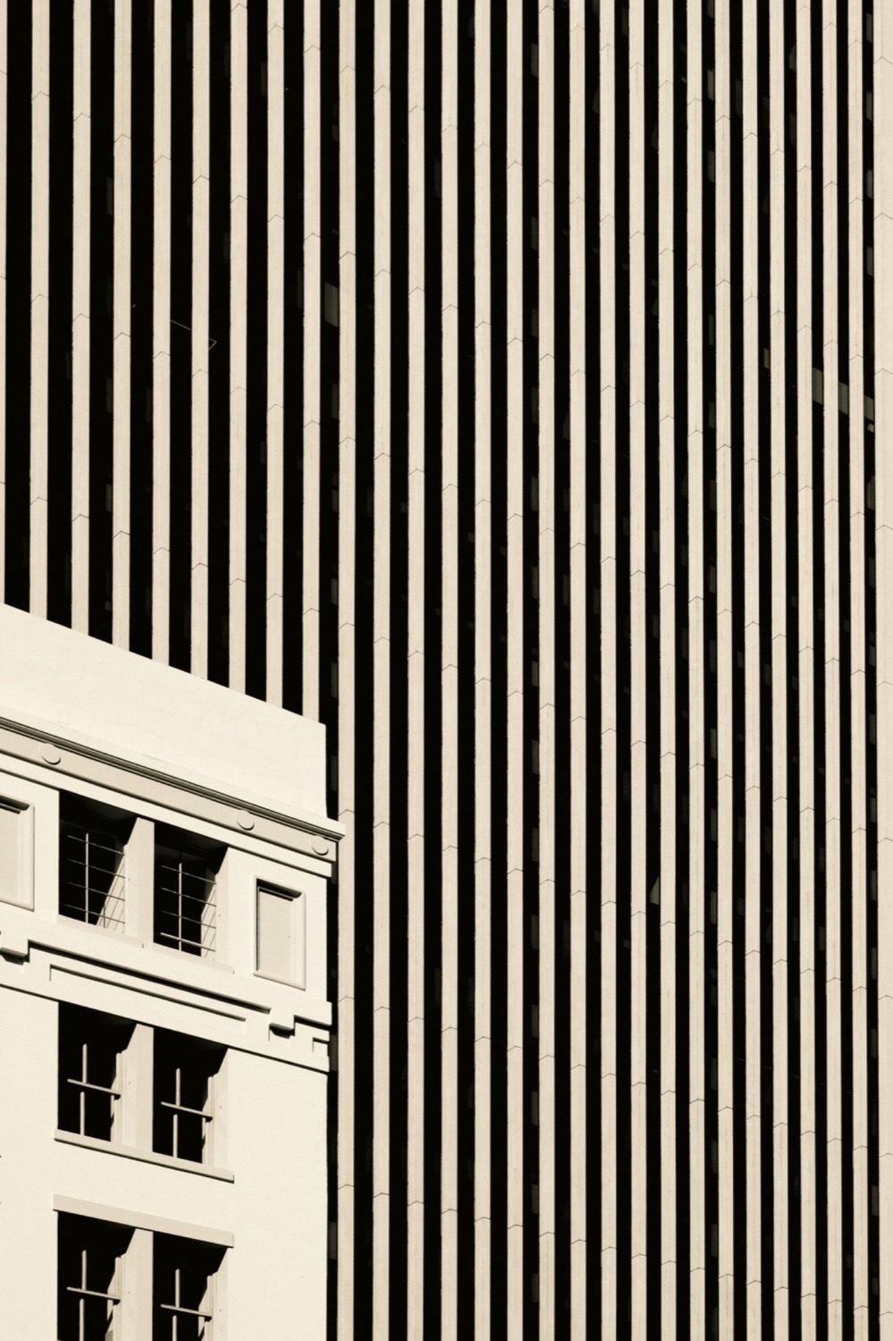
| Vertical | Strength, height, authority, dignity, and upward movement - perpendicular to the horizon | Navigation bars, sidebars, columns |
| Diagonal | Movement, dynamism, tension, speed, and energy - inherently unstable | Action layouts; forces the viewer's eye to move quickly across the page |
| Curved | Grace, fluidity, natural feel, organic naturalism, and smoothness | Lifestyle brands, flowing and natural illustration |
| Zigzag / Angular | Energy, chaos, excitement, sharpness, and high energy - sharp direction changes | Youthful, loud, high-tempo graphics |
| Dotted / Dashed | Subtlety, a technical feel, and suggestion - broken continuity | Temporary boundaries, connections, and instructions such as a "cut here" line |
| Implied | Not actually drawn but suggested - by aligned elements or the eyeline of a subject in a photograph | Rows of text, series of dots; invisible pathways for the viewer to follow |
| Contour / Gestural | Outlines the edges of a form or captures the spontaneous movement of a subject | Gesture drawing, contour illustration |
Line Qualities and Properties
Beyond their type, five properties fine-tune exactly what a line says - and how loudly it says it:
| Property | What it controls | What it communicates |
|---|---|---|
| Weight (Thickness) | Bold versus thin strokes | Bold lines: emphasis, strength, dominance, and barriers. Thin lines: delicacy, precision, and fragility |
| Texture | Smooth versus rough strokes | Smooth lines: precision and modernity. Rough lines: an organic, handmade, or tactile feel |
| Direction | The trajectory the eye is pushed or pulled along | Guides the viewer through the composition |
| Length and Spacing | The variation of line length and the gaps between multiple lines | Rhythm and pattern |
| Style | Solid, dashed, or dotted | The line's decorative voice and functional meaning |
The Role of Lines in Design
- Direction and movement: lines guide the viewer's eye across a layout - horizontal lines suggest calm and stability, vertical lines imply strength, and diagonal lines create dynamism.
- Organizing layout and structure: they divide space, organize content, and create hierarchy. Invisible grid lines structure a page, aligning text and images to create order.
- Separation: lines divide content, establishing clear boundaries between different sections of a design.
- Emotion and tone: curved lines feel organic and soft, while sharp, angular lines feel rigid and intense.
- Pattern and texture: repeated lines can create a tactile illusion (like corduroy) or a dynamic background pattern.
2. Shapes in Graphic Design - The Building Blocks
A shape is a two-dimensional, enclosed area defined by a line or color boundary. Shapes are the building blocks of visual composition - they carry meaning, create structure, and communicate identity. Unlike lines, shapes have area and can be filled with color, pattern, or texture. When a line connects back to itself, it creates a shape. In most design software, the filled (inside) and the outline (outer/border) are defined separately - a division every vector editor still uses today.
Categories of Shapes - the shape lab
Five categories, one silhouette rule: the silhouette of a shape allows instant identification of an object before any details are processed - which is why strong, simple outlines win at small sizes and at a glance.
The Psychological Impact of Shapes (Mood and Meaning)
Shapes carry a lot of visual weight in how compositions and moods are perceived. Four families do most of the emotional work:
| Shape family | What it represents | The mood it sets |
|---|---|---|
| Circles and Rounded Shapes (ellipse/oval) | Unity, wholeness, community, eternity, harmony, movement, and completeness | Soft, approachable, and protective - a calm mood, because they have no sharp edges |
| Squares and Rectangles | Stability, order, reliability, conformity, peacefulness, solidity, security, and professionalism | Familiar and trusted - think of buildings and screens |
| Triangles | Direction, energy, hierarchy, action, and tension | Upright triangles are stable and represent growth (like a pyramid); pointing down they imply instability and create tension. Highly dynamic - they point the eye sharply and set an energetic mood |
| Irregular / Organic Shapes | Creativity, nature, uniqueness, and the human touch | Calm and free-flowing, or chaotic depending on their sharpness and arrangement |
Shape psychology is strategy: never use chaotic zigzag lines and sharp triangles for a meditation app - reach for soft organic curves and circles to convey a calm mood instead.
The Role of Shapes in Design
- Basic communication: shapes are instantly recognizable symbols - squares suggest order, circles imply unity, and triangles convey energy or tension. The silhouette of a shape allows instant identification of an object before details are processed.
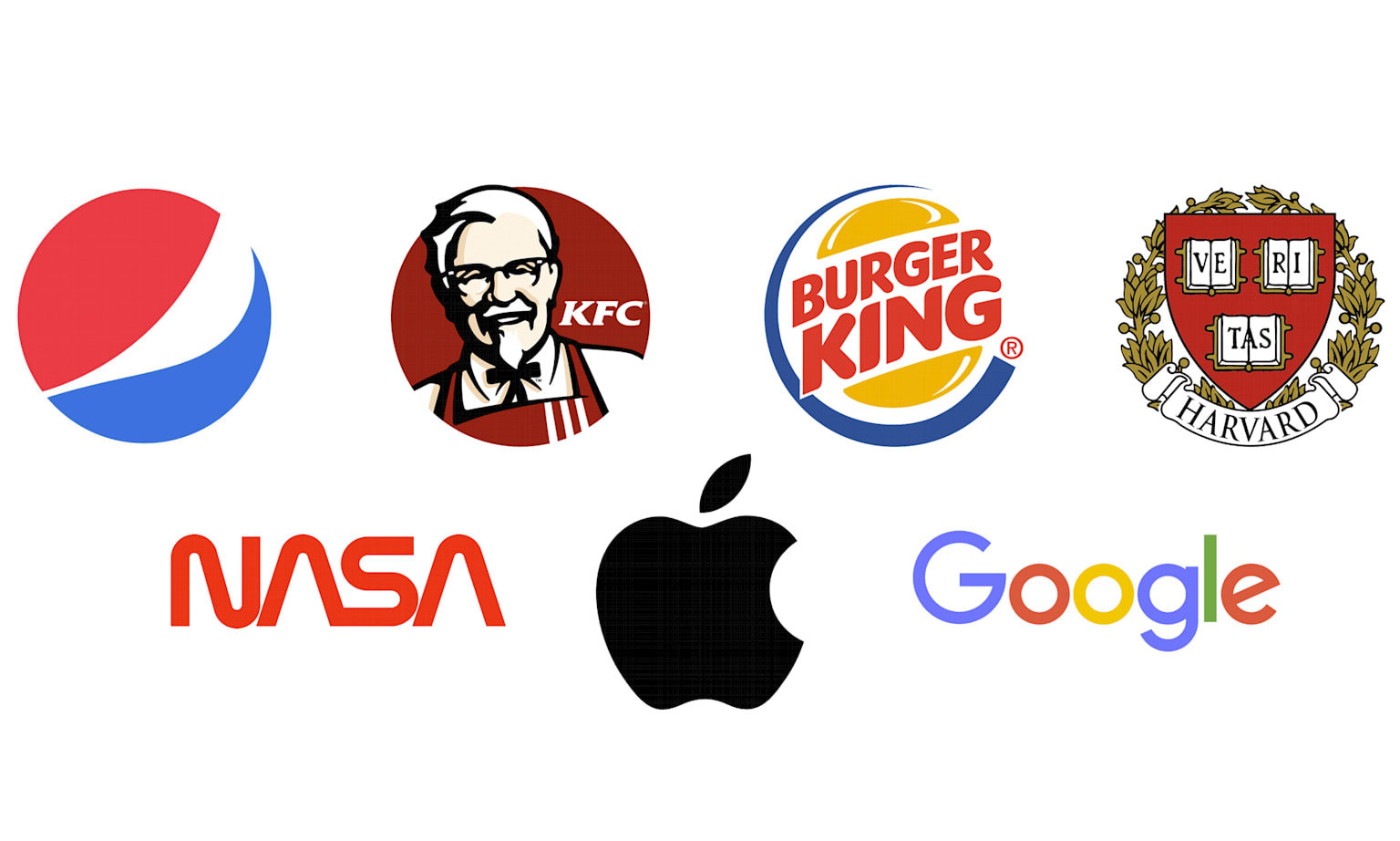
- Visual identity: logos often rely on simple geometric shapes to be memorable and versatile.
- Grouping and framing (organizing information): shapes act as containers for information, grouping related elements together into distinct "cards" or zones that help organize complex data.
- Balance and contrast: shapes create focal points and help balance negative space. Large, dark shapes carry heavy visual weight and anchor a composition, while small, light shapes feel airy.
3. The Interplay - How Lines and Shapes Work Together
Lines and shapes are two of the most fundamental building blocks in graphic design, and they are inextricably linked. Together they carry a lot of visual weight in how compositions are perceived: lines give shapes their birth, shapes give lines their meaning, and the space between them becomes a design tool in its own right.
flowchart TD
    P(["Point"]) --> L["Line - a mark connecting two points"]
    L --> T{"Actual or implied?"}
    T -->|"Actual, physically drawn"| H["Horizontal - Vertical - Diagonal - Curved - Zigzag - Dashed"]
    T -->|"Implied by alignment, spacing or eyelines"| I["Invisible pathways for the eye"]
    H --> C{"Does the line close on itself?"}
    I --> C
    C -->|"Yes - Closure, a Gestalt principle"| S["Shape - an enclosed 2D area"]
    C -->|"Not yet"| L2["It stays a gesture, boundary or contour"]
    L2 --> C
    S --> G{"Geometric or Organic?"}
    G -->|"Precise and mathematical"| GE["Geometric - order, logic, structure"]
    G -->|"Irregular and flowing"| OR["Organic - natural, fluid, spontaneous"]
    GE --> K["Composition - layout, identity, meaning"]
    OR --> K
    K --> Z(["The 2D foundation of design"])
Six principles describe how the two elements feed each other:
Outlines, borders, and contours create enclosed areas. A continuous, closed line creates a shape - and even a single curved line can imply a circular shape, because the brain tends to "close" the gap (Closure, a Gestalt principle).
A triangle made of three lines conveys meaning - tension, direction - beyond the lines themselves. The shape is the message.
When shapes are aligned, they create an implied line that the eye will follow. A diagonal alignment of circles creates a strong visual line of movement.
A line drawn across a shape divides it into two new shapes. The way lines intersect shapes creates complex compositions, dynamic tension, and rhythm.
Designers use lines and shapes together to create rhythm, emphasis, and harmony in layouts - lines provide structure and movement while shapes organize information, producing a clear visual direction.
The interplay between a shape (figure) and the lines and space around it (ground). Mastering it unlocks optical illusions and clever, memorable logos where the negative space forms a secondary shape.

flowchart LR
    A["A line defines an edge"] --> B["A closed line becomes a shape"]
    B --> C["Positive shape - the figure"]
    B --> D["Negative space - the ground"]
    C --> E["Figure-ground relationship"]
    D --> E
    E --> F{"How do lines meet shapes?"}
    F -->|"A line divides a shape"| G["Two new shapes - dynamic tension and rhythm"]
    F -->|"Shapes align"| H["Implied lines the eye loves to follow"]
    G --> I["Rhythm, emphasis and harmony"]
    H --> I
    I --> Z(["Memorable marks - dual-meaning logos and optical illusions"])
Negative space is a shape too. Actively design the space around your positive shapes - giving them room to breathe is what makes a layout feel premium and uncluttered.
4. Visual Design Aesthetics and Application Scenarios
The specific use of lines and shapes defines many major historical and modern design aesthetics. Lines and shapes are the backbone of visual design, and each aesthetic bends them in unique ways to communicate mood, function, and cultural identity - from the mathematical grids of Switzerland to the neon wireframes of cyberpunk. Six of them, live from the CSS below:
Twenty-four aesthetics, one shared alphabet - scroll inside the table below; the header row and the Style column stay frozen:
| Style | Signature lines | Signature shapes | Mood and keywords |
|---|---|---|---|
| Swiss Style / International Typographic Style | Stark, mathematical grids - invisible structural lines | Simple geometric blocks of color anchoring sans-serif typography | Clean, objective, highly structured |
| Bauhaus | Thick, horizontal, and vertical lines | Basic geometric shapes: circles, squares, triangles | Form follows function; no decorative lines |
| Minimalism | Ultra-thin lines delineating content | Large empty negative-space shapes; simple, unadorned forms | Stripped down to the essentials |
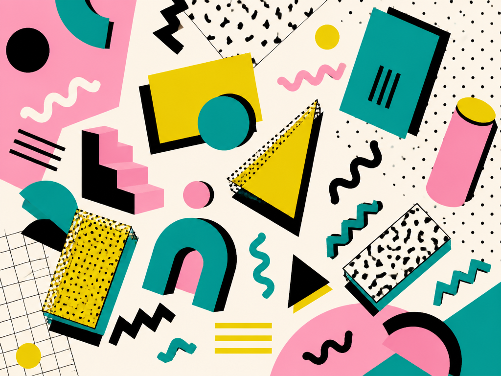
| Memphis Design (1980s) | Thick, squiggly, and zigzag lines | Bright, abstract geometric shapes placed asymmetrically | Chaotic, bold, playful |
| Art Deco | Strong, straight, vertical lines | Sharp geometric shapes: trapezoids, triangles, sunbursts | Luxury, symmetry, modernity |
| Abstract Line Art | Continuous, flowing, singular lines | Implied organic shapes | Elegance and simplicity; modern illustration and luxury branding |
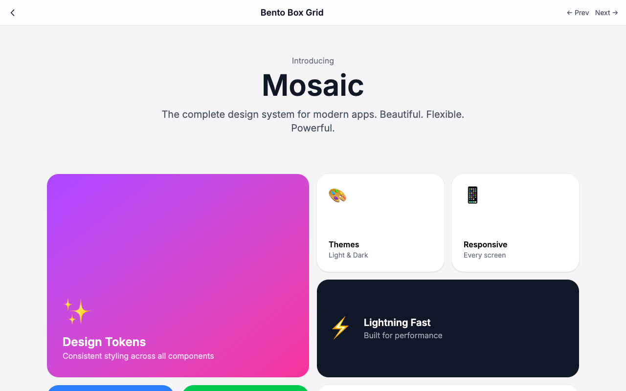
| Bento Box Design (Modern UI) | Clean dividers between content blocks | Crisp, rounded rectangles (cards) organized into grids | Modular, compartmentalized, orderly; maximizes screen real estate |
| Futurism | Dynamic, forceful, intersecting diagonal lines | Fractured, overlapping triangles and sharp polygons | Speed, movement, and violence; industrial-age energy and disruption |
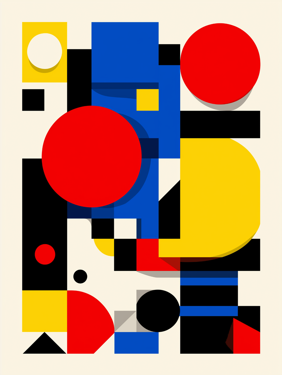
| De Stijl (Dutch Neoplasticism) | Thick, bold, black lines - strictly horizontal and vertical | Primary squares and rectangles | Asymmetric but perfectly balanced; red, blue, yellow with black, white, gray; highly abstract and grid-based |
| Constructivism | Strong diagonal lines; industrial and structural | Circles, wedges, and bold geometric forms intersected by diagonals | Momentum, architectural dynamism; guides the eye through textual propaganda; industrial strength and political urgency |
| Organic Modernism | Sweeping, curvilinear, aerodynamic lines | Asymmetrical, pebble-like, biomorphic forms | Harmony and human-centered design; smooth, continuous flows |
| Pop Art | Bold, thick, comic-book-style black outlines | Flat, unshaded shapes; circles, speech bubbles, halftone dot patterns | Playful, exaggerated, high-contrast; consumer culture |
| Brutalism (Digital/Graphic) | Harsh, high-contrast borders | Basic, unstyled blocks - monolithic rectangles with no rounded corners | Raw, jarring, unpolished; intentionally "ugly" to challenge design norms |
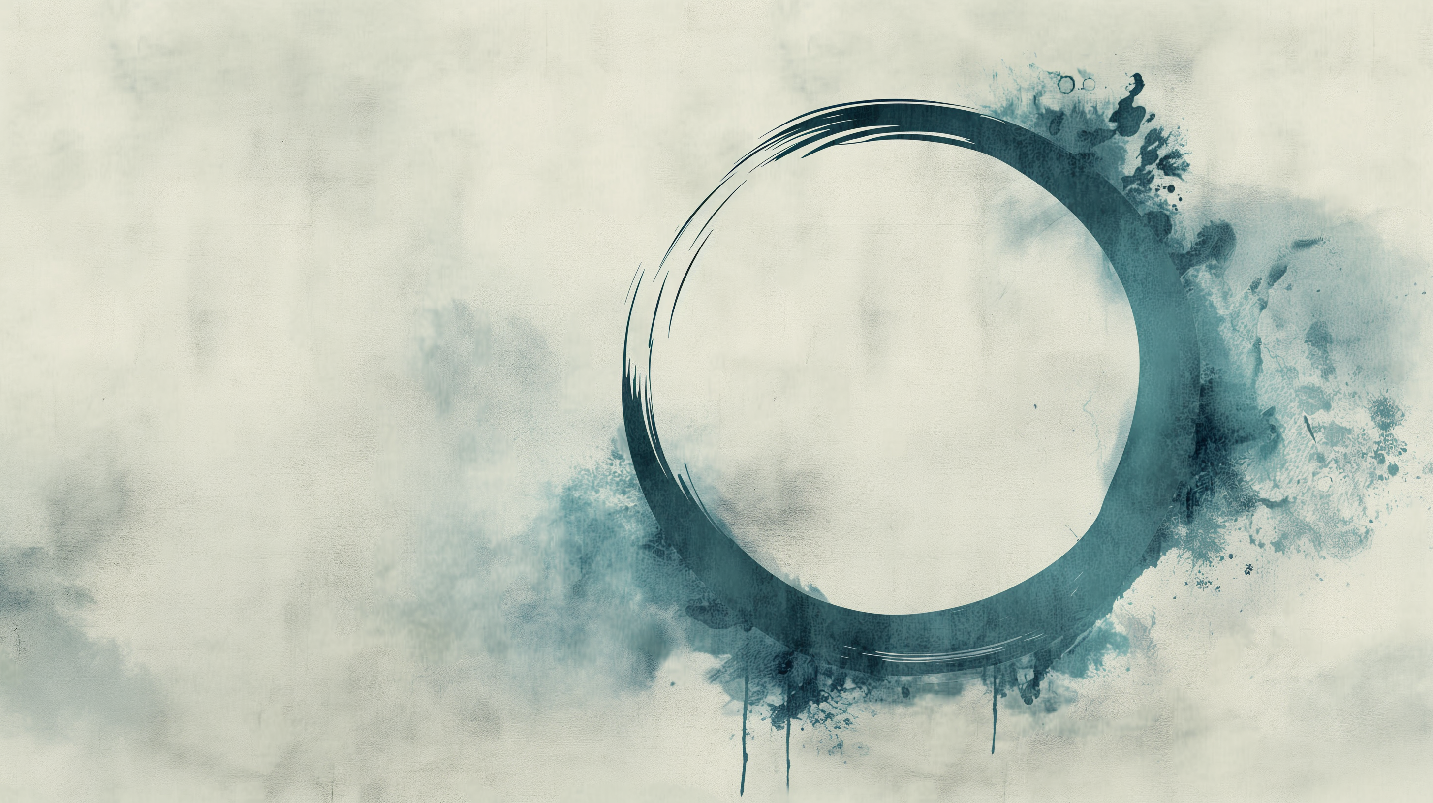
| Zen / Japanese Minimalism | Deliberate, often hand-drawn thin, delicate lines (like an enso circle) | Mostly empty voids punctuated by singular, grounding forms; balanced asymmetry | Ma (negative space); understated elegance; nature references - waves, leaves, stones |
| Japanese Folk Style (Mingei) | Slightly irregular, textured, unrefined - the hand of the maker | Organic, utilitarian cylinders, spheres, and asymmetrical pottery | Beauty of everyday functional objects, without mathematical precision |
| Bantu (Central/Southern African) | Thick, woven or painted lines in rhythmic repetition | Angular zigzags, chevrons, triangles, and diamonds | Dense, interlocking visual textures; symbolic meaning |
| Art Nouveau | Long, sinuous, asymmetrical "whiplash" curves | Highly stylized, elongated organic forms | Vine-like growth mimicking nature rather than strict geometry |
| Neumorphism (Soft UI) | Lines replaced entirely by subtle, dual-tone shadows | Rounded, extruded soft rectangles or circles that push out of or sink into the background | Tactile, monochromatic, 3D soft UI |
| Glassmorphism | Ultra-thin, semi-transparent white or light-gray borders | Floating, translucent, frosted-glass rounded rectangles | Airy depth through background blur |
| High-Tech / Cyberpunk | Sharp, glowing, neon lines | Aggressive, asymmetrical polygons, isometric grids, and wireframe outlines | Digital, dystopian, futuristic |
| Vaporwave / Y2K Aesthetic | Early 3D wireframe lines and perspective grids of receding horizontals | Cheap, early-internet pixelated squares plus glossy 3D-rendered primitives and lava-lamp blobs | Nostalgic, irreverent, retro-future |
| Mid-Century Modern | Clean, confident lines; sweeping curves paired with sharp, acute angles | Atomic-age shapes: starbursts, boomerangs, kidney beans, amorphous blobs | Playful but structured |
| Skeuomorphism | Highly detailed, realistic lines mimicking wood grain, leather stitching, brushed metal | Rendered 3D objects with heavy gradients, drop shadows, and bevels | Familiar, physical, ornate |
| Bunto / Artisanal Folk | Handcrafted, organic lines with slight imperfections | Rustic natural motifs and traditional geometric patterns | Cultural heritage and artisanal craftsmanship |
Tip: drag horizontally inside the table - the orange header row and the Style column never move.
Application Scenarios
The combined use of lines and shapes is essential across a wide range of design applications:
Stripping a brand down to its most basic geometric or abstract shapes and lines for instant recognition - the Apple logo and the Nike swoosh are the textbook cases.
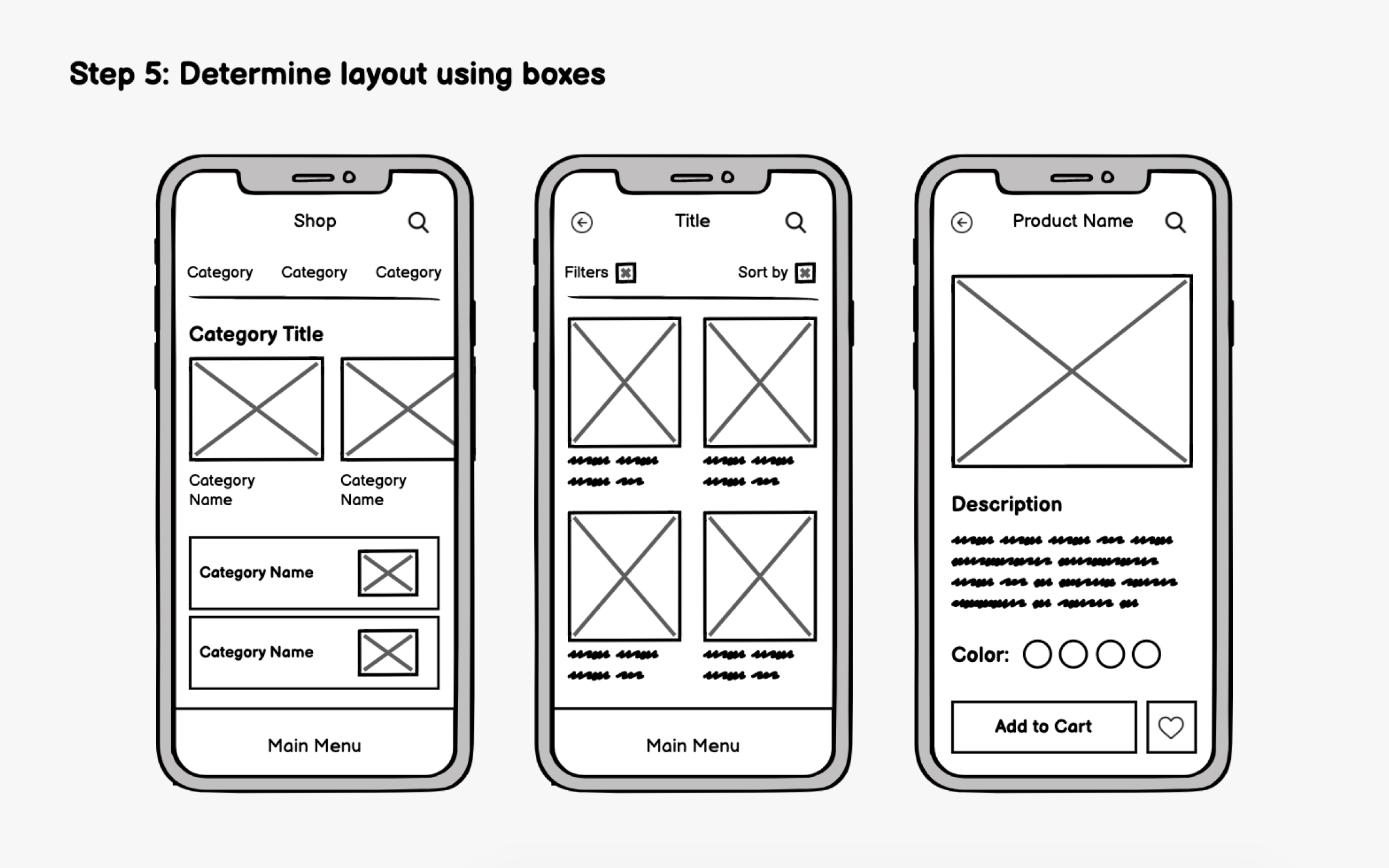
Simple placeholder shapes - gray boxes for images, lines for text - establish layout and hierarchy before applying content or visual effects.
Reducing complex ideas into simple line drawings or flat geometric shapes that communicate universally across language barriers.
Using lines to connect data points and shapes to contain statistics, organizing complex information visually.
Bounding boxes, bordered rectangles, and drop-shadowed shapes group related information, create visual hierarchy, and make content digestible.
Structural lines (rules) or subtle background shapes anchor typography, guiding the reader's eye and establishing a clear reading flow.
Platforms such as Canva elements and SVG asset packs rely on scalable, vector-based shapes and lines to create modular, drag-and-drop components that maintain visual consistency across different layouts and brand assets.
5. Aesthetic Selection - How to Choose
Choosing the right aesthetic depends on the psychological impact and the functional needs of the project. Start from the mood the brand must project and the job the layout must do - then borrow from the movement that was invented for exactly that job.
| Project goal | Styles to reach for | Why it works | Specific uses |
|---|---|---|---|
| Corporate and data-driven | Swiss Style, Bento Box, Minimalism | Clean, trustworthy, and highly structured - best for reading heavy text, digesting data, and presenting professional authority | Corporate branding, editorial layouts, modernist websites, tech interfaces |
| Luxury and elegance | Art Deco, Abstract Line Art, Organic Modernism | Sophisticated, flowing, and premium | High-end fashion, jewelry, hospitality, and exclusive branding; luxury goods, boutique branding, illustrations, social media aesthetics |
| Edgy, creative, or youthful | Brutalism, Memphis Design, Cyberpunk | Rebellious, energetic, and disruptive | Indie games, streetwear, agency portfolios, and crypto/web3 startups; youth culture, fashion, playful packaging, experimental websites, underground art collectives |
| Calm, wellness, and lifestyle | Zen Minimalism, Mingei, Neumorphism, Organic Modernism | Soft, grounding, and comforting | Meditation apps, skincare brands, organic foods, and mental health platforms; wellness apps, eco-friendly brands, interior design, lifestyle apps |
| Retro and nostalgic | Pop Art, Vaporwave, Mid-Century Modern | Vibrant, playful, and referential | Entertainment, music festivals, nostalgic products, and quirky e-commerce; advertising, entertainment, pop culture merchandise |
| Industrial and functional | Bauhaus, Futurism, Constructivism | Emphasizes structure, momentum, and utilitarian strength | Physical products, architectural concepts, and high-energy tech branding; product design, architecture, industrial design, tech startups, sports branding, political posters |
| Cultural and artisanal | Bunto, Japanese Folk Style, Bantu | Connects deeply with heritage, handcraft, and tradition through rhythmic or organic geometry | Cultural festivals, artisanal packaging, folk-inspired branding |
flowchart TD
    Q{"What should the design communicate?"} --> W1["Corporate and data-driven"]
    Q --> W2["Luxury and elegance"]
    Q --> W3["Edgy, creative and youthful"]
    Q --> W4["Calm, wellness and lifestyle"]
    Q --> W5["Retro and nostalgic"]
    Q --> W6["Industrial and functional"]
    Q --> W7["Cultural and artisanal"]
    W1 --> S1["Swiss Style - Bento Box - Minimalism"]
    W2 --> S2["Art Deco - Abstract Line Art - Organic Modernism"]
    W3 --> S3["Brutalism - Memphis Design - Cyberpunk"]
    W4 --> S4["Zen Minimalism - Mingei - Neumorphism - Organic Modernism"]
    W5 --> S5["Pop Art - Vaporwave - Mid-Century Modern"]
    W6 --> S6["Bauhaus - Futurism - Constructivism"]
    W7 --> S7["Bunto - Japanese Folk Style - Bantu"]
    S1 --> R["Mind the grid - respect shape psychology - vary weight for hierarchy"]
    S2 --> R
    S3 --> R
    S4 --> R
    S5 --> R
    S6 --> R
    S7 --> R
    R --> Z(["A clear visual direction"])
6. Best Practices for Using Lines and Shapes
Lines and shapes are simple elements, but their misuse leads to chaotic, confusing designs. Six principles keep them on their best behavior:
Use the underlying grid lines to align your shapes. Shapes misaligned by even a few pixels create unintended tension and look amateurish.
Do not throw a line across the page for decoration. Lines should separate content, align elements, or guide the eye - if a line is not serving a function, remove it.
The "hidden" shape: do not just design the positive shapes - actively design the space around them. Giving shapes room to breathe makes a design feel premium and uncluttered.
Choose shapes that align with the brand's message. No chaotic zigzag lines and sharp triangles for a meditation app - soft organic curves and circles convey a calm mood.
Not every line or shape needs the same visual weight. Thicker, bolder lines and bolder shapes draw attention to primary content; thinner lines and lighter shapes handle secondary content.
The brain loves simplicity. If a complex illustration can be reduced to a stronger, simpler abstract shape, do it - strong silhouettes are more memorable than noisy details.
7. Conclusion - The Visual Alphabet
In graphic design, lines provide the direction, structure, and connective pathways, while shapes provide the mass, identity, and spatial boundaries. Together, they form the 2D foundation upon which forms (3D), effects (texture and lighting), typography, and color are built.
Lines and shapes are the visual alphabet. Great design is not about using every line and shape available - it is about:
- ✓ Using lines purposefully to guide, structure, and create movement
- ✓ Understanding the psychological weight of geometric vs. organic shapes
- ✓ Mastering the interplay between positive and negative space
- ✓ Aligning elements with invisible structural lines
- ✓ Communicating complex ideas through simplified silhouettes
- ✓ Using shapes effectively to organize information
- ✓ Recognizing that a strong layout relies on a strong underlying shape
By understanding and skillfully applying lines and shapes, designers can create compelling, clear, and structurally sound work that captures attention, communicates effectively, and stands the test of time.
- Horizontal - calm, stability, rest, grounding; separates content and anchors elements.
- Vertical - strength, height, authority, dignity, upward movement; navigation bars and sidebars.
- Diagonal - movement, dynamism, tension, speed, energy; pushes the eye quickly.
- Curved - grace, fluidity, natural feel, organic smoothness.
- Zigzag / Angular - energy, chaos, excitement, sharpness.
- Dotted / Dashed - subtlety, technical feel, suggestion; temporary boundaries and "cut here" instructions.
- Implied - suggested by alignment or eyelines; invisible pathways.
- Contour / Gestural - outlines of form; spontaneous movement.
- Geometric - order, efficiency, logic, structure; corporate and technical design.
- Organic - naturalism, comfort, spontaneity, fluidity.
- Abstract - the essence of a thing without being literal; icons, symbols, logos.
- Positive - the figure, the foreground subject.
- Negative (negative space) - the ground; a shape in its own right, capable of dual meanings.
- Circles - unity, wholeness, harmony, calm. Squares - stability, order, trust. Triangles - direction, energy, tension. Irregular - creativity, nature, the human touch.
- Mind the grid - a few pixels of misalignment read as amateur.
- Purposeful lines only - if a line serves no function, remove it.
- Design the negative space - let shapes breathe.
- Respect shape psychology - match shapes to the brand's message.
- Vary weight - bold for primary, light for secondary.
- Simplicity wins - strong silhouettes beat noisy details.
Lines provide the direction, structure and connective pathways; shapes provide the mass, identity and spatial boundaries - and together they are the 2D foundation every other element stands on.
The photographs and illustrations on this page were located through an automated web image search and are reproduced here for educational, illustrative purposes only. All artwork, screenshots, brand logos, product names and trademarks remain the property of their respective owners. No copyright infringement is intended - rights holders who would like an image credited differently or removed can contact the site administrator.
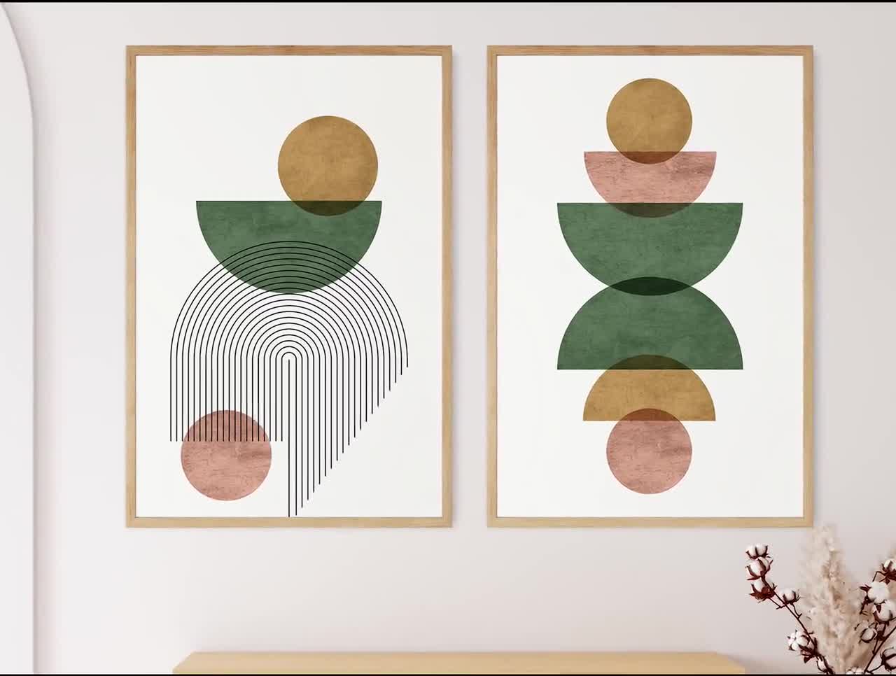
- Etsy - framed mid-century abstract geometric art prints (header image)
- Artdoc Magazine - minimalist black-and-white architecture photography (striped facade)
- Vistaprint - famous brand logo collage (Pepsi, KFC, Burger King, Harvard, NASA, Apple, Google)
- Behance - "Gentleman" negative-space logo by Jonas Söder
- eBay - geometric primary-color art print listing
- Carat AI - Memphis-style pattern illustration
- uistyleguide.com - "Bento Box Grid" design system page
- WonderMural - ink-wash ensō artwork
- Uxcel - "Determine layout using boxes" wireframing lesson